Typography through the eras!
We’re continually evolving as humans, we’ve all come from a past we’re thankful about. Be it the wars our country may have been a part of or the technology that has slowly evolved through the ages. For once we’re leaving behind personal fables, politics and even revolutions and are instead venturing out to witness typography across the farthest ends of the earth.
Tracking back the oldest typeface styles to the new, we’re out to understand how we’ve evolved through the years.
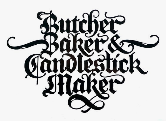
Blackletter
Commencing with the oldest typeface style, this type was scripted by prisoner tattoos and black metal albums and was soon adopted by Hitler, literally making it their official kind. What was earlier positioned as a national identity during the Nazi regime is now considered a taboo. Nevertheless, Blackletter is said to have originated around 1150 AD and yet echoes its presence amongst the modern type. Blackletter is now recognized as the gothic, old english, block, texture and fraktur font.
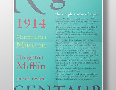
Humanist
Developed around 1460, this typeface could be drawn back to Italian humanist thinkers. A lot easier and lighter on the eyes, this style could as well draw attention to the modern era. Today, we’d come to recognize it through the centaur, verona and adobe jenson fonts.
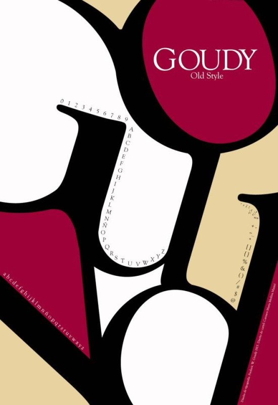
Old Style
The Old Style type was one of the first to develop in the late 15th century. Offering a rather sophisticated and rich style, this type forwarded our tastes to great heights having introduced us to a rather appealing contrast between thin and thick strokes. Quite a modern approach, we’d now come to recognize this type through the palantino and goudy old style fonts.
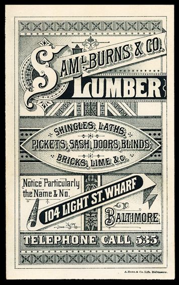
Victorian
The Victorian era also recognized as Queen Victoria’s era welcomed complex objects influencing art and typography during the 1700’s. This era was remembered for its typical victorian style elements that encompassed decorative borders and symmetry. Typography during this era was therefore seen with curves and borders and banners.
Transitional
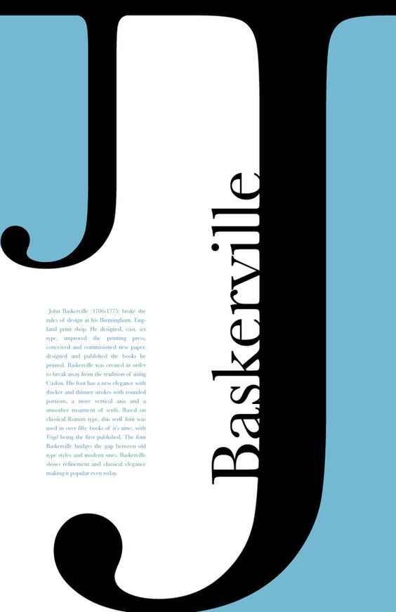
This style grew heavily during the 18th century ditching out the old style, bringing in the invention. Through this type, we see a shift in type pattern, where the thin strokes got even thinner and the thick, thicker. Today, we’d come to know them through the following fonts: georgia, baskerville and the times new roman font.
Modern
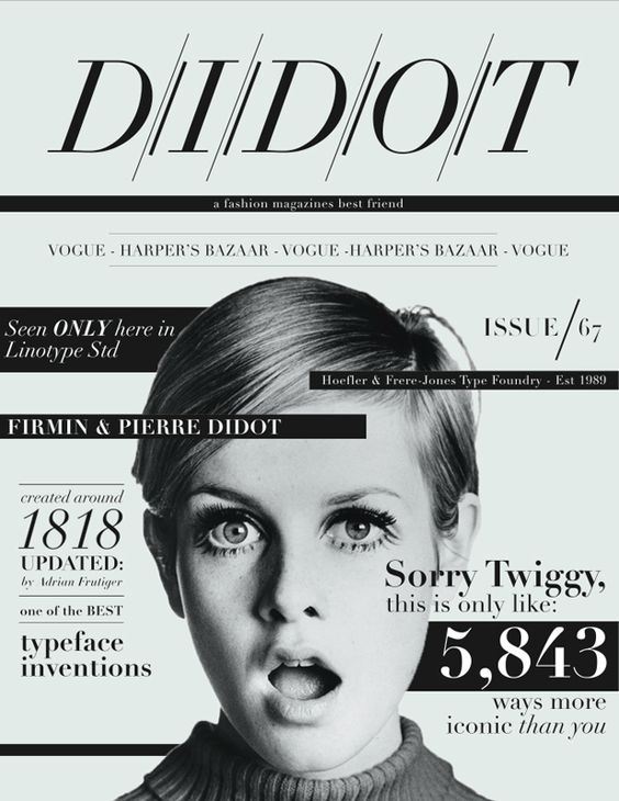
The modern type came to be in vogue in 1784 and eventually saw a fusion of thick strokes merging with hairline crisp thin strokes. Although, today, we’ve come to see this type scratch out the luxury and fashion it once possessed, making it absolutely simple. An example being, bodoni, walbaum and didot.
Sans Serif
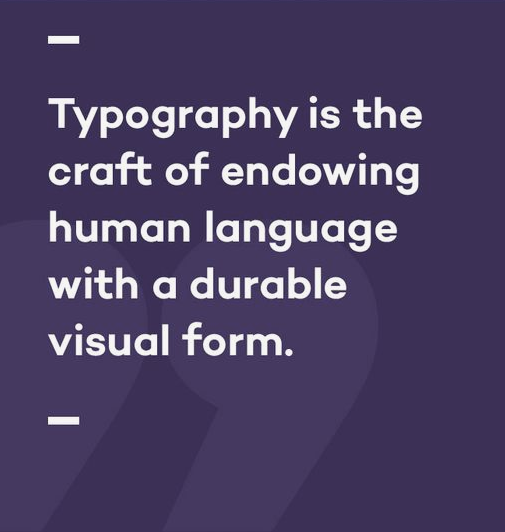
Sans Serif, in its truest sense was breaking tradition, opposing every idea or norm from the earlier years. The word ‘Sans’ literally means ‘without’. Sans Serif was therefore without most of the tails and tabs seen until the 1800’s. Quiet a rebel, Sans Serif was the advent of modern typefaces. We see similar rebel typefaces amongst the following font types: script, mimicry, symbol and ornamental.

Typography has come a long way and has certainly evolved through the years. From thicker and thinner strokes to transitional types, we’ve seen unbelievable waves of patterns. Although, we’ve noticed a particular distinction from the Victorian type that showcases symmetry and decorative patterns to the Sans Serif type. Two extremes, while the Victorian represented the Queen’s era and unfolded a beautiful symmetrical typeface, the Sans Serif type brushed off all traditions and modernized its way.
Well, now we have it all. You’d just have to choose which era you’d like to look back at or print over a piece of paper.


