Ounce Organics, strives to simplify skincare by offering thoughtfully crafted and research-powered products, cocooned in nature’s inherent goodness. Ounce products are a reflection of clean beauty with a promise of a brighter looking skin.
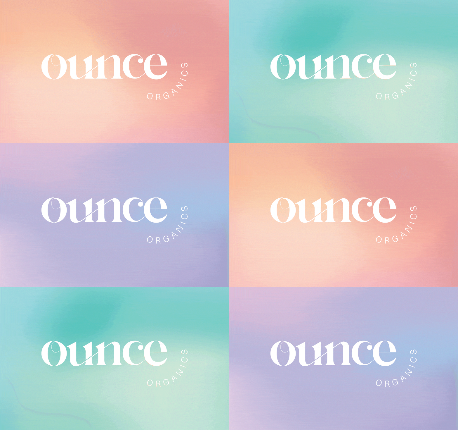
The logo was designed in a way where we can see the connection in the letters which show the product being like a best friend to the customers, always with them and giving them confidence and the feeling of security.
Clean Beauty Branding Built on Connection
Working on a brand identity for a skincare brand is a particular kind of design assignment. Skincare is personal in a way that most product categories are not. The customer is not just buying a product. They are making a decision about what they trust to interact with their skin every day. The brand identity has to communicate that trustworthiness from the first encounter, before any product has been opened or tried. Wishbox Studio’s work for Ounce Organics was built around that reality.
The Brief
Ounce Organics set out to simplify skincare with research-powered products rooted in natural ingredients. The brand’s promise is clean beauty: products that deliver on their claims without unnecessary ingredients, presented with the transparency that a modern skincare audience expects. The identity needed to communicate both scientific credibility and the warmth of nature-inspired formulation.
The Design Approach
As an eco-friendly branding agency with experience in the beauty and lifestyle sector, Wishbox approached Ounce Organics as an identity problem centred on relationship. The brand’s positioning is not simply about what the products contain. It is about how those products make the customer feel: confident, secure and supported. The visual identity was designed to carry that emotional register.
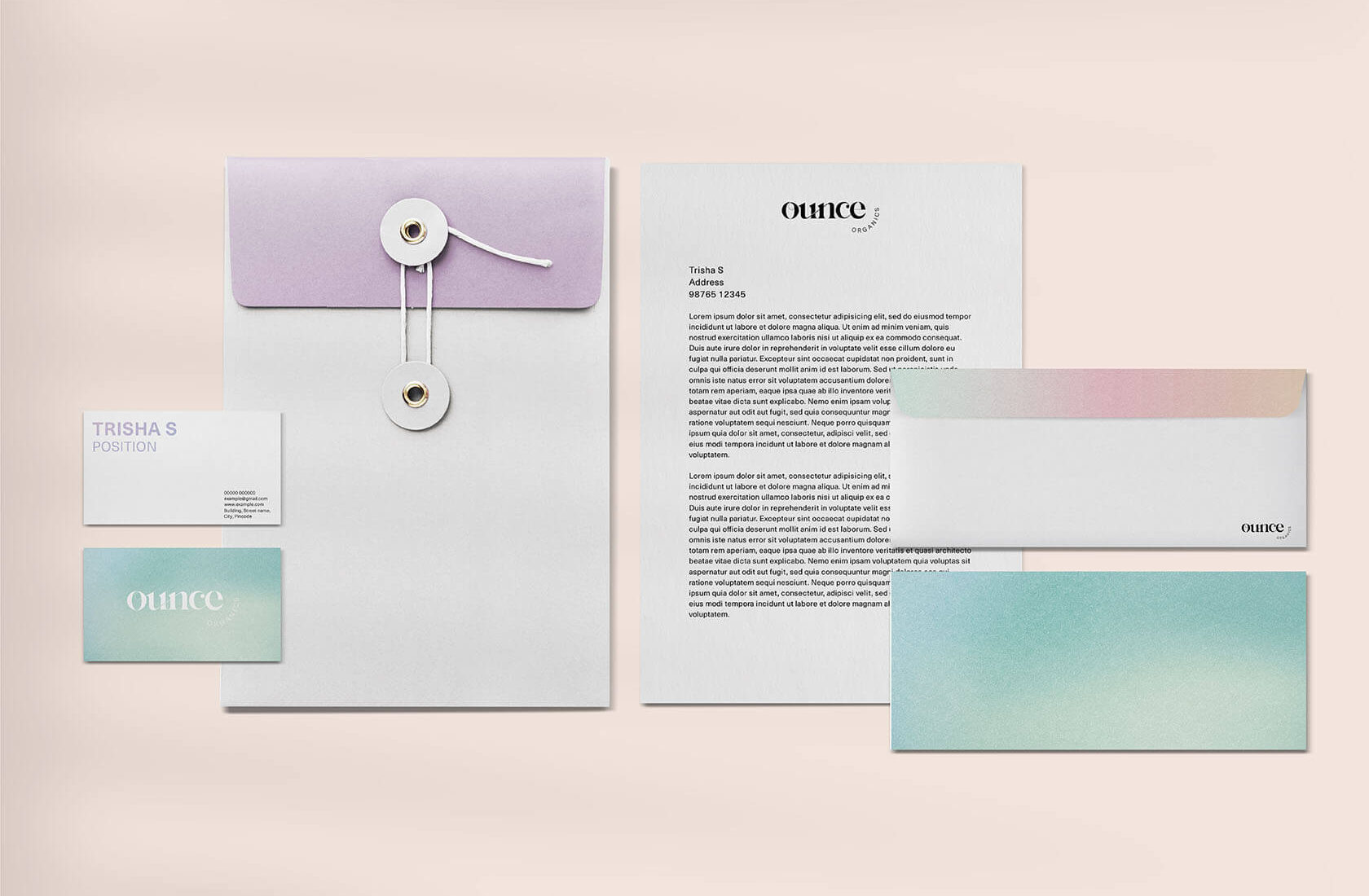
The logo was designed with deliberate connection in the letterforms. The visual link between characters was built to communicate closeness and constancy, the feeling of a brand that is always present and reliable, like a trusted friend. In natural packaging design, the logo is often the smallest but most repeated brand element. It had to work with meaning at every scale.
A Palette for Clean Beauty
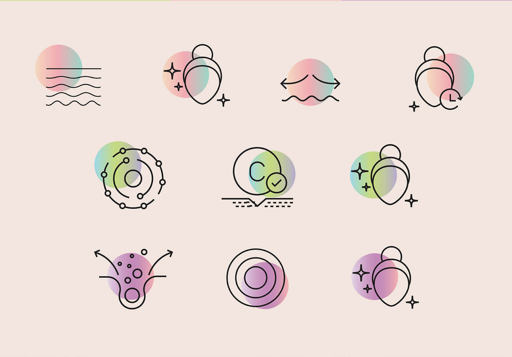
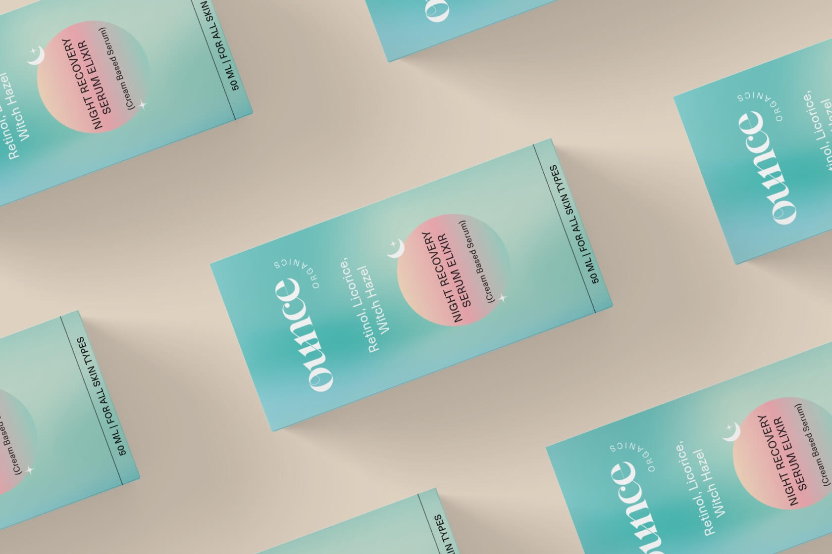
The colour system was developed to reflect the brand’s clean beauty positioning without defaulting to the muted greens and earthy tones that have become visual shorthand for the organic category. Ounce Organics operates in a more contemporary register: confident, fresh and grounded in the clarity that its formulations embody. The palette uses gradients and considered tonal combinations that feel modern and premium while remaining accessible.
Packaging as Promise
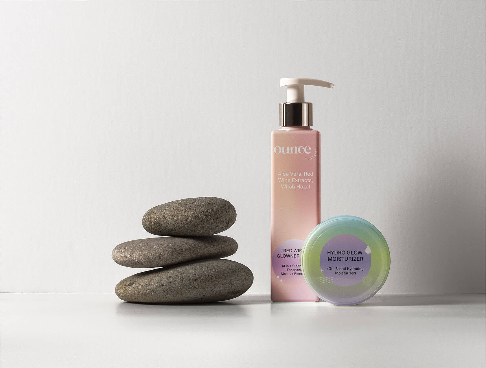
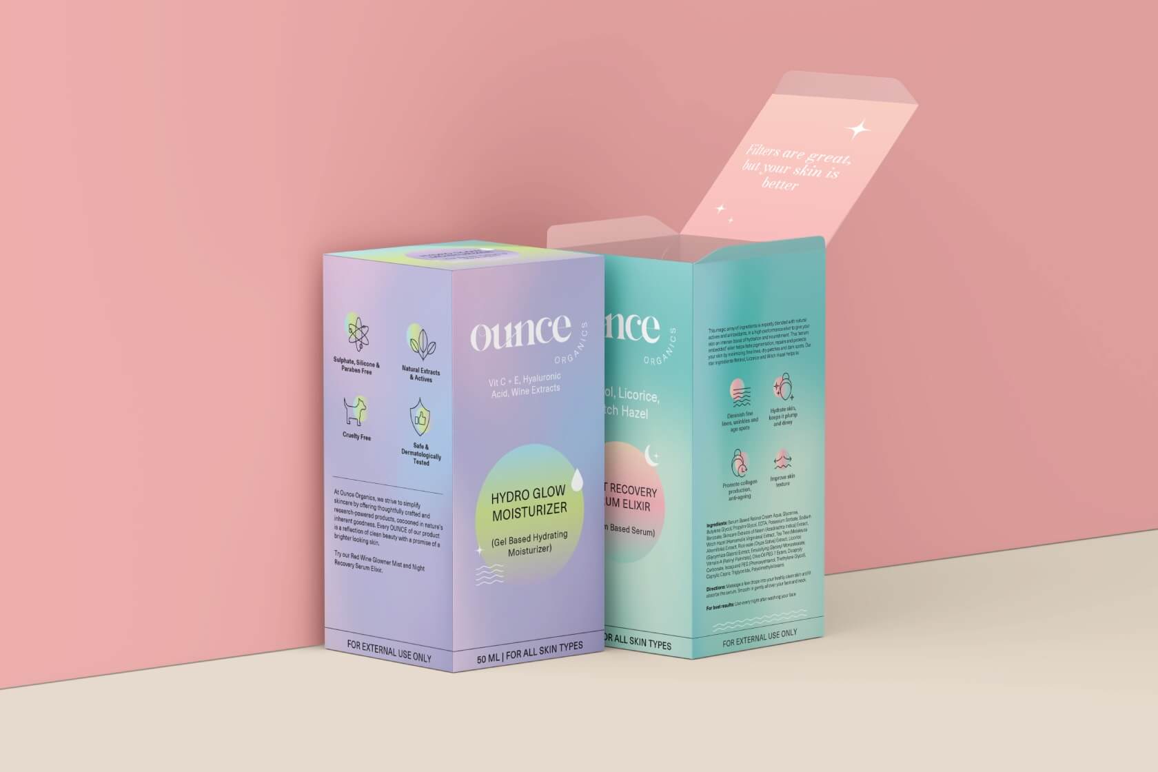
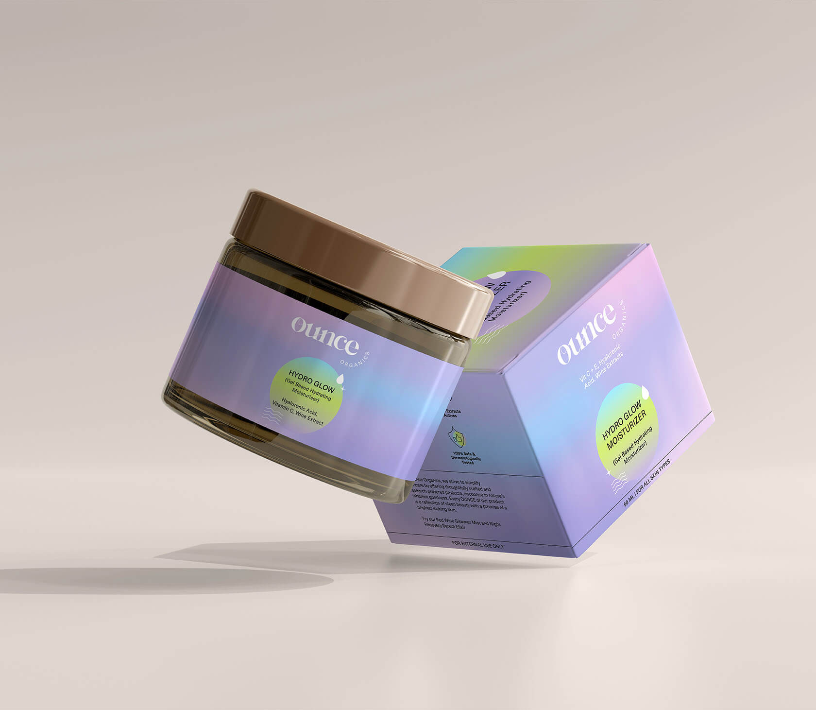
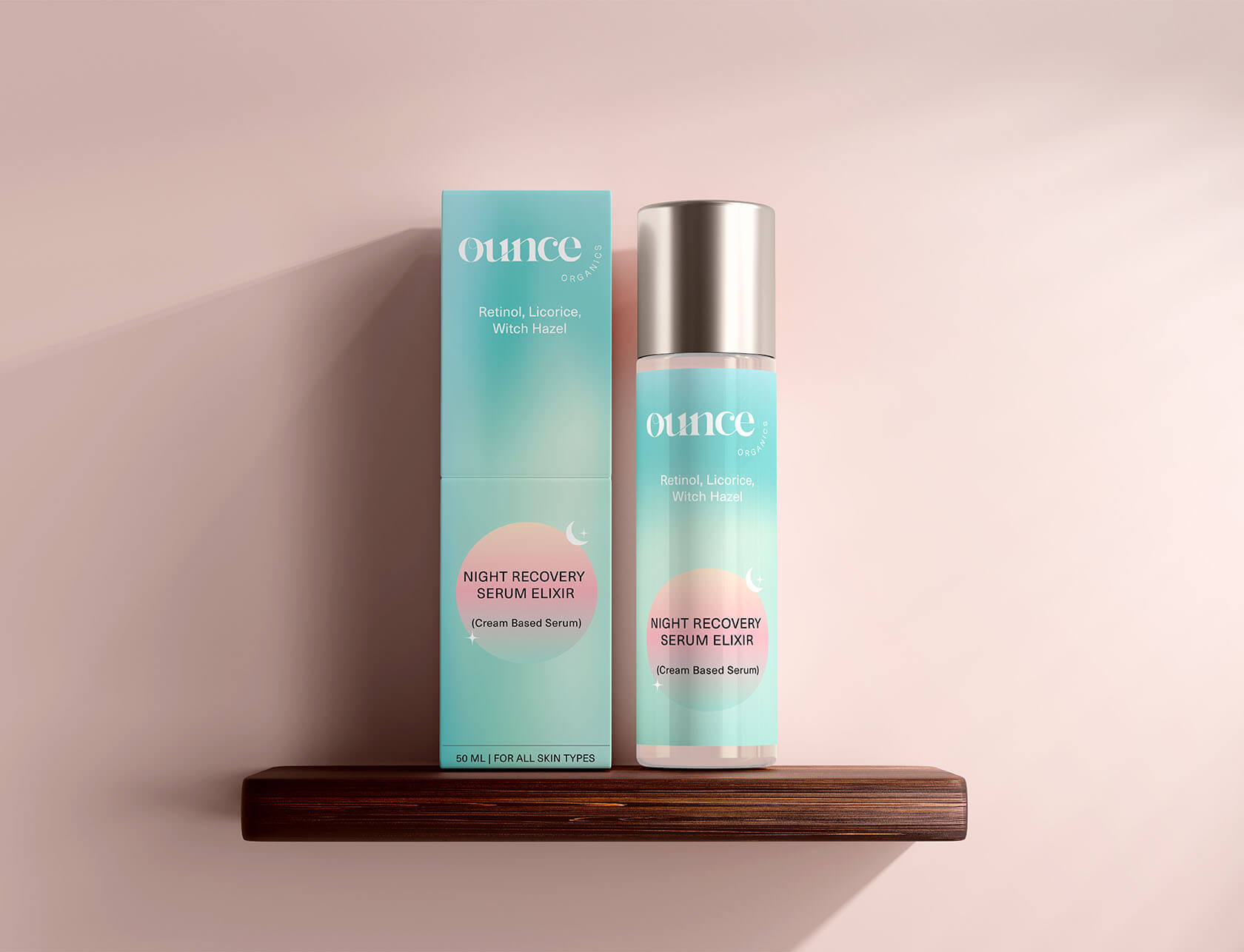
In organic product branding, packaging is the most important brand touchpoint. It is the object the customer holds before they buy and returns to every time they use the product. Every packaging decision, material feel, label hierarchy and colour application, communicates something about whether the brand can be trusted to deliver what it promises. Wishbox’s packaging design for Ounce Organics was built to communicate trust, simplicity and quality in every detail.
What This Work Represents
Ounce Organics demonstrates what Wishbox brings to clean beauty brand builds: a design system that earns trust before the product is experienced and deepens it with every use. The brand’s visual identity and packaging were built to position Ounce in a competitive category as a brand that knows exactly who it is for.

Big ambition. Small brand presence?
Let’s design the strategic positioning that attracts the right opportunities.