Why Everyone Hates Comic Sans? — The Story of The Unlikely Villain of Typography
If fonts were characters in a high school drama, Comic Sans would be the nerdy kid everyone loves to hate. Born from a desire to make digital communication more playful and accessible, Comic Sans has instead become the butt of countless jokes, a “blunder” in the font world that sparks eye-rolls and indignation among designers and laypeople alike. But how did this unassuming typeface earn such infamy? Let’s dive into the unfortunate journey of Comic Sans and discover why it’s been labelled the black sheep of the typography world.
The Birth of Comic Sans: The Typographic Adventure That Started It All
Comic Sans was created in 1994 by Vincent Connare, a typographer at Microsoft, for a seemingly innocent purpose. Connare designed it for the speech bubbles of an animated cartoon dog in a programme called Microsoft Bob, which aimed to make navigating Windows easier for first-time users. Connare, noting that “Comic dogs don’t talk in Times New Roman,” sought to create a friendly, hand-drawn look inspired by comic book lettering.
“My original idea was it was going to be used for kids. It wasn’t made for everybody to like it,” Connare told Live Science. The font was intended to be playful and informal, targeting a younger audience. Ironically, Comic Sans never made it into Microsoft Bob but found its way into the core fonts for Windows 95, marking the beginning of its widespread — and often inappropriate — use.
The Rise and Misuse: Comic Sans Takes Over
 With the release of Windows 95, Comic Sans became readily available to millions of new computer users. This was a time when desktop publishing was becoming accessible to the masses. People were thrilled to have a variety of fonts at their fingertips and were eager to experiment. However, this newfound freedom came with a steep learning curve.
Users began applying Comic Sans to all sorts of documents — resumés, business cards, memos, signs — essentially any document that should have projected professionalism but ended up looking like a kindergarten craft project. The playful nature of Comic Sans was at odds with the serious tone of these contexts, causing a jarring visual mismatch. It was like showing up to a black-tie event in a clown costume — not appreciated at all.
The Typographical Critique: Why Comic Sans Is the Font Foe
From a typographic standpoint, Comic Sans commits several cardinal sins. Firstly, it has a relatively unmodulated stroke, meaning the thickness of the letters doesn’t change much, giving it a monotonous texture. Arial, another sans-serif font, also features unmodulated strokes like Comic Sans. However, it handles visual weight distribution with much greater finesse. For example, Arial’s strokes are designed to be more consistent and balanced across different letterforms. Unlike Comic Sans, which often suffers from awkward, heavy spots, Arial maintains a more even texture, particularly where strokes meet or change direction. This careful design ensures that Arial text remains clear and readable, akin to how a well-paved road provides a smoother journey compared to a bumpy trail.
One of the most glaring issues with Comic Sans is its poor letter fit. Good fonts are designed with kerning tables that ensure letters sit well next to each other, maintaining consistent spacing. Comic Sans, unfortunately, has many awkward gaps and tensions between letters. For example, the pairing of ‘f’ and ‘o’ often looks uncomfortable and imbalanced, like a mismatched pair of shoes.
The Psychology of Font Perception: What Your Typeface Says About You
Fonts carry nuanced cues that influence our perception. Studies from Wichita State University have shown that typefaces are perceived to have distinct personalities. Serif fonts, with their elegant extenders, are seen as formal and refined, suitable for professional documents. Sans serif fonts, like Comic Sans, are viewed as casual and informal. When used improperly, such as in a formal context, this can lead to a perception of unprofessionalism.
Comic Sans’s playful, childlike aesthetic is fine for casual, fun contexts but becomes problematic in serious settings. It’s like inviting a clown to deliver a eulogy — no matter how heartfelt the words, the delivery undermines the message.
The “Ban Comic Sans” Movement: The Origin of Hatred
The typographical community’s disdain for Comic Sans culminated in the creation of the “Ban Comic Sans” movement in 2002 by two typographers, Dave and Holly Combs. Their campaign gained worldwide traction, with many designers voicing their frustration over the font’s inappropriate usage. The movement highlighted the importance of context-appropriate design choices and pushed back against the overuse of Comic Sans in serious contexts.
Vincent Connare himself faced backlash, including complaints about his speaking engagements, which once even required a bodyguard. Despite this, Connare remains amused by the font’s notoriety, often receiving secret confessions from fans who appreciate Comic Sans but dare not admit it publicly.
Comic Sans vs. Helvetica: A Battle of Fundamentals
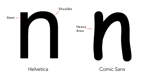 To understand the poor fundamentals of Comic Sans, let’s compare it to Helvetica, a paragon of typographic design. Both fonts have unmodulated strokes, but Helvetica’s design is rooted in principles that ensure readability and visual harmony. Comic Sans, on the other hand, was designed to mimic the casual, uneven strokes of hand-drawn comic lettering, which makes it inherently less balanced and harmonious.
When viewed in a block of text, Comic Sans’s uneven texture becomes apparent. It has dark spots where certain characters, like ‘e’ and ‘t’, are disproportionately heavy. This uneven weight distribution makes reading a block of Comic Sans text an unpleasant experience, akin to walking on a path with random, unexpected bumps.
The Misfit E and Poor Letterfit: Comic Sans’s Design Dilemmas
The letter ‘e’ in Comic Sans is a particular troublemaker. Unlike its counterparts in Helvetica and Garamond, the Comic Sans ‘e’ has a small eye and a large aperture without the balancing stroke modulation. This results in a disproportionately dark spot in text, drawing unwanted attention and disrupting the visual flow.
Additionally, the poor letter fit of Comic Sans means that letters don’t nestle well together. The awkward spacing and ill-fitting kerning create visual tension, making text set in Comic Sans look clumsy and amateurish.
The Unintended Consequences: How Comic Sans Fell From Grace
Comic Sans was designed for on-screen use in the mid-90s, a time when anti-aliasing technology was not widespread. Anti-aliasing smooths the jagged edges of fonts on screens, but in its absence, fonts needed to be designed to look good in low resolution. Comic Sans was relatively successful in this context, as its chunky, round shapes remained legible without anti-aliasing. However, as technology evolved and high-resolution screens became the norm, the flaws of Comic Sans became more apparent.
The Cultural Backlash: Comic Sans in the Meme Era
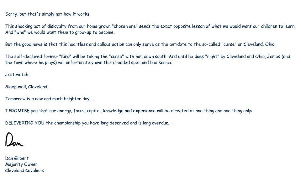 Comic Sans became a cultural punching bag as it was misused more frequently. The internet amplified this disdain, with memes and jokes about the font’s inappropriateness spreading like wildfire. One notable incident was when Cleveland Cavaliers owner Dan Gilbert wrote an open letter in Comic Sans, leading to widespread ridicule and cementing the font’s reputation as a design blunder.
The Silver Lining: Comic Sans’s Unexpected Admirers
Despite its notoriety, Comic Sans has a secret fanbase. Many people appreciate its friendly, approachable design, particularly in informal settings. Preschool teachers and comic artists, for example, often find it a useful tool. Connare himself enjoys the ongoing conversation about his creation, taking the criticism in stride and finding humour in the situation.
Moreover, Comic Sans has sparked important discussions about design literacy. Its widespread misuse has highlighted the need for better understanding of typography among the general public. Just as the advent of desktop publishing democratised typesetting, the backlash against Comic Sans underscores the importance of educating people about good design practices.
Conclusion
Comic Sans’s journey from a well-meaning, playful typeface to the most reviled font in the design world is a tale of misapplication and misunderstood intentions. It’s a reminder that with great power — like the ability to choose from a variety of fonts — comes great responsibility. So next time you’re tempted to use Comic Sans, remember: with a world of elegant and sophisticated fonts at your fingertips, you might be picking the typographic equivalent of wearing flip-flops to a formal dinner! However, in the right context, like a playful invitation or a child’s project, even Comic Sans can have its moment to shine. Use it wisely, and it just might bring a smile where it’s needed.