Stacked simplicity
We cannot believe half a year has gone already. Was it not just a while ago we made new resolutions (and broke them the next day)?
Six months into this year and we have already witnessed innumerable graphic design trends surface. While some did not make the cut, many of them developed into better styles as brands all over adopted them.
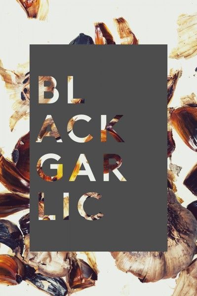
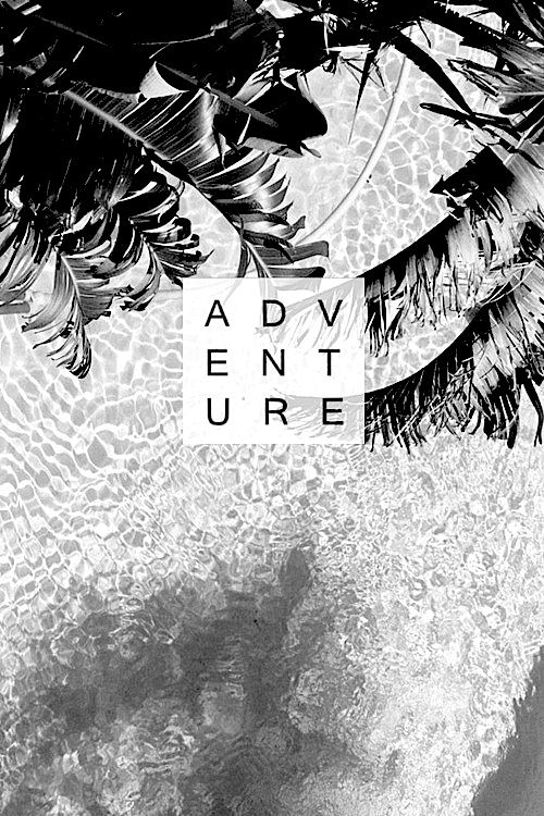
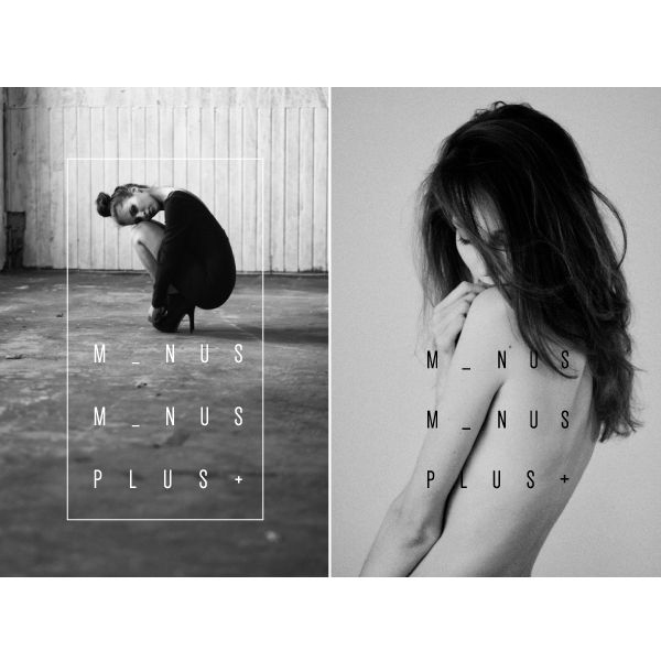
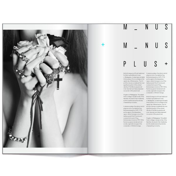
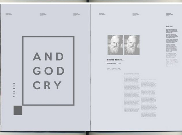
Ever since Apple and Google moved to a cleaner look, minimal elegance is making it’s way to the design industry. The design is maturing and it is bringing with itself the beautiful possibilities of stacked typography. What is not to love about this trend? A counter to all the visual clutter that we have been a victim to lately, this is like a breath of fresh air with it’s regal sophistication.
The bit we love about this trend is that it is not just restricted to a particular kind of application. According to our prediction, it will be largely seen in brand identity design but will be used across print and publication designs, publication designs, user interface designs, the list is endless!
Needless to say, companies are putting a greater emphasis on design standards and consistency due to which a lot of premium brands or brands aspiring to be premium would adopt this design trend.
Contributed by
Unnika
Communication Designer
Image source – Pinterest


