
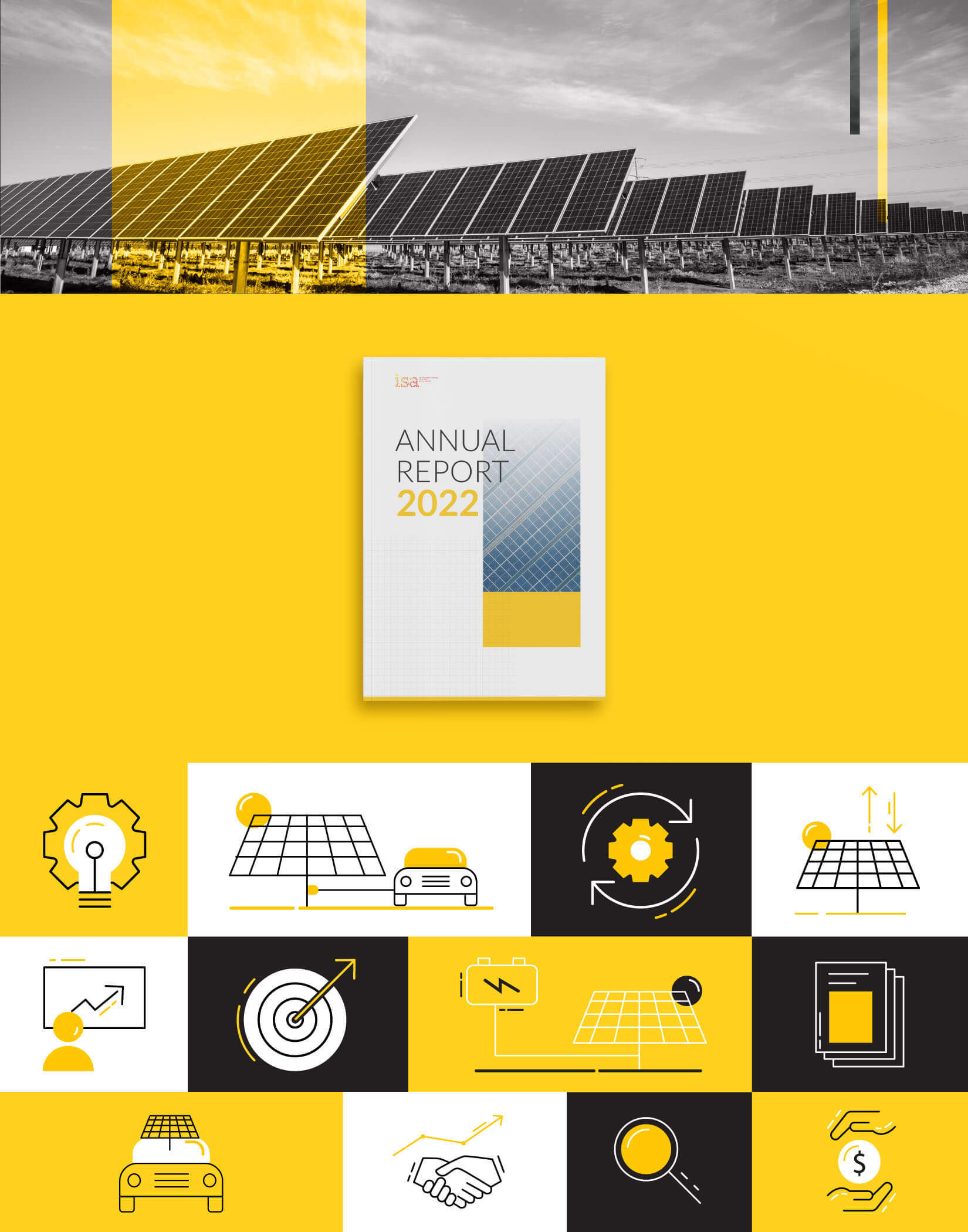
Working on a publication for the International Solar Alliance is a particular kind of design assignment. The ISA operates at the intersection of climate policy and global diplomacy. Its stakeholders include member nations, multilateral institutions and senior government representatives across the world. A publication for an organisation of this reach has to communicate with equal credibility to all of them.
The Brief
The ISA annual report assesses the importance of solar energy, the challenges in making it universally accessible and the pathways toward 24×7 solar power at affordable cost. The alliance was jointly launched by Prime Minister Narendra Modi and former French President François Hollande in November 2015, and the report carries the weight of that institutional history. As an institutional report design project, the work needed to position the ISA as a credible, organised and forward-facing global body.
The Design Approach
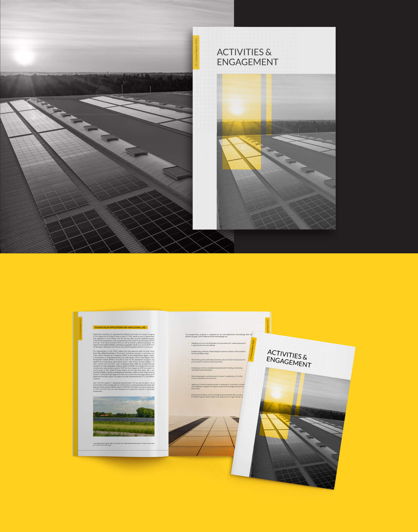
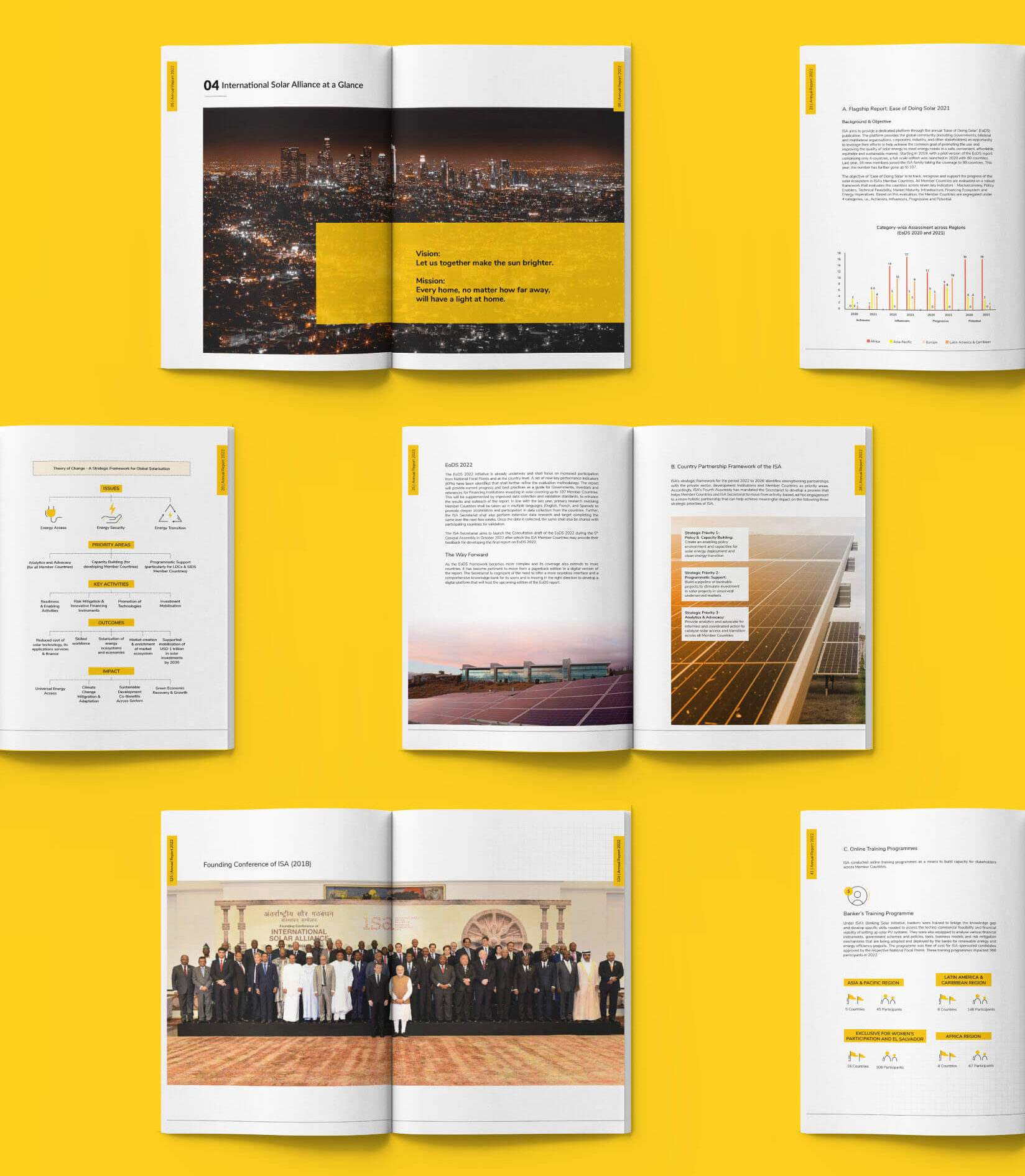
Wishbox approached this as a policy publication design challenge before it was a visual one. The report arrived as a volume of dense text, programme updates, member data and policy language. The first step was not design, it was content architecture. We built a hierarchy that separated primary narrative from supporting data, created navigable sections and ensured that the most critical information was never buried in body copy. This structural work is where publication design earns its value.
Visually, the design language was built around three elements: negative space, iconography and image treatment. Generous white space gave the pages authority that text-heavy layouts cannot achieve. Custom iconography was developed to represent programme areas and data categories, creating a consistent visual vocabulary that reduced cognitive load across the full length of the document.
Making Data Legible
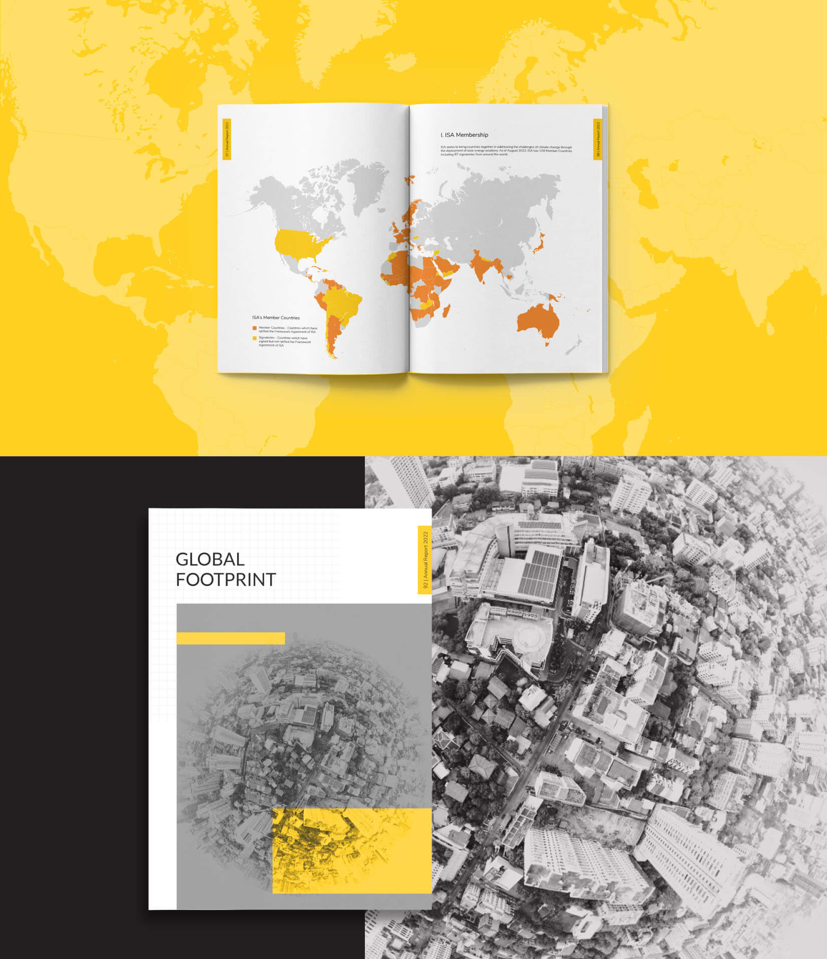
Annual report layout for an organisation like the ISA must handle significant numerical content, member country statistics, installed capacity figures, funding commitments and programme reach data. These were translated into bespoke infographics designed to communicate core insights at a glance without sacrificing accuracy. Each visualisation was built for its specific data type, not adapted from a generic template.
A Palette With Purpose
The colour system was straightforward in concept and disciplined in execution. A predominantly white background gave the report a clean and globally legible visual register. Yellow served as the primary accent, a fitting choice for an organisation whose entire mandate is the power of the sun. The accent was used with restraint: section markers, data callouts, typographic emphasis and iconographic highlights. Enough to direct the eye, not enough to distract from the content.
What This Work Represents
For the ISA, the annual report is a primary diplomatic document as much as it is a programme summary. Wishbox’s design approach treated it accordingly. The result is a publication that represents the ISA’s institutional stature, clean, structured and globally legible, built to build confidence in the alliance’s work and ambition among the broadest possible international audience.

Big ambition. Small brand presence?
Let’s design the strategic positioning that attracts the right opportunities.