University libraries have always been more than repositories of books. They are the intellectual infrastructure, the engine rooms of research, curiosity and academic rigour. Ashoka University, one of India’s most respected liberal arts institutions, understands this. Their library holds over 62,000 print volumes alongside a substantial collection of e-books, e-journals and digital research resources. When Ashoka University approached Wishbox Studio to revamp the library’s existing website, the project was as much about access as it was about aesthetics.
The Problem Being Solved
The previous website was not keeping pace with how students and researchers actually sought information. A university library website today needs to do several things simultaneously: communicate the breadth of its collection, guide users to what they need quickly and feel intuitive enough that it encourages regular use rather than reluctant necessity.
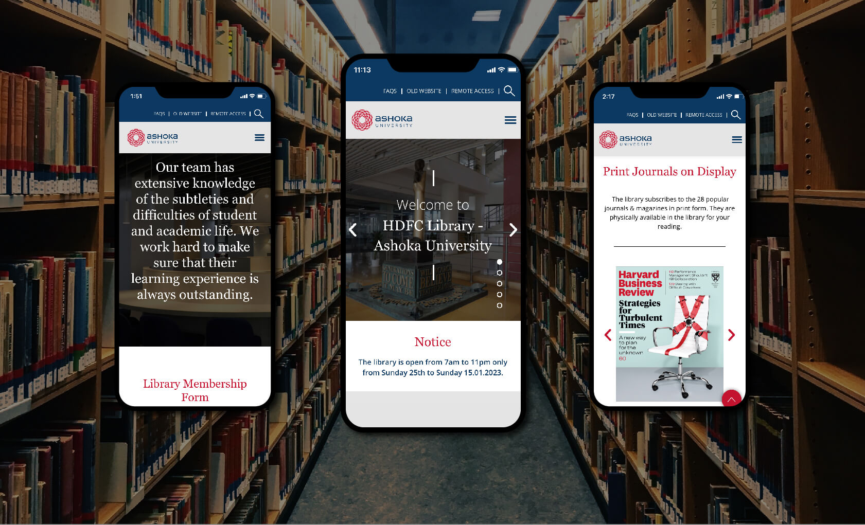
For Ashoka’s student population, engaged, independent and digitally native, a dated or confusing interface is not just inconvenient. It creates friction between the learner and the resource. Reducing that friction was the central goal of this education branding and UX project.
How Wishbox Approached It
The collaboration began with a detailed understanding of Ashoka University’s vision for the library, what it wanted to be, not just what it currently was. Wishbox worked closely with the university team to map out the site architecture before a single design decision was made.
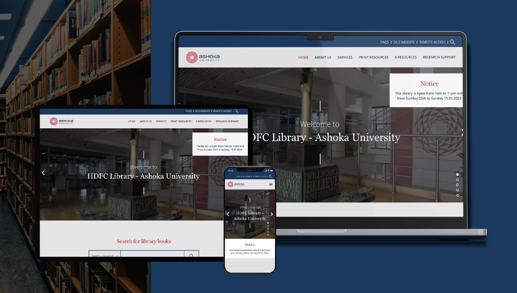
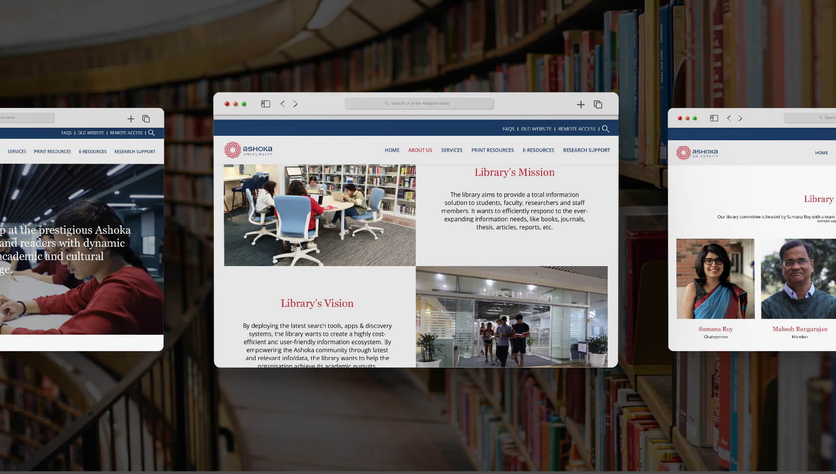
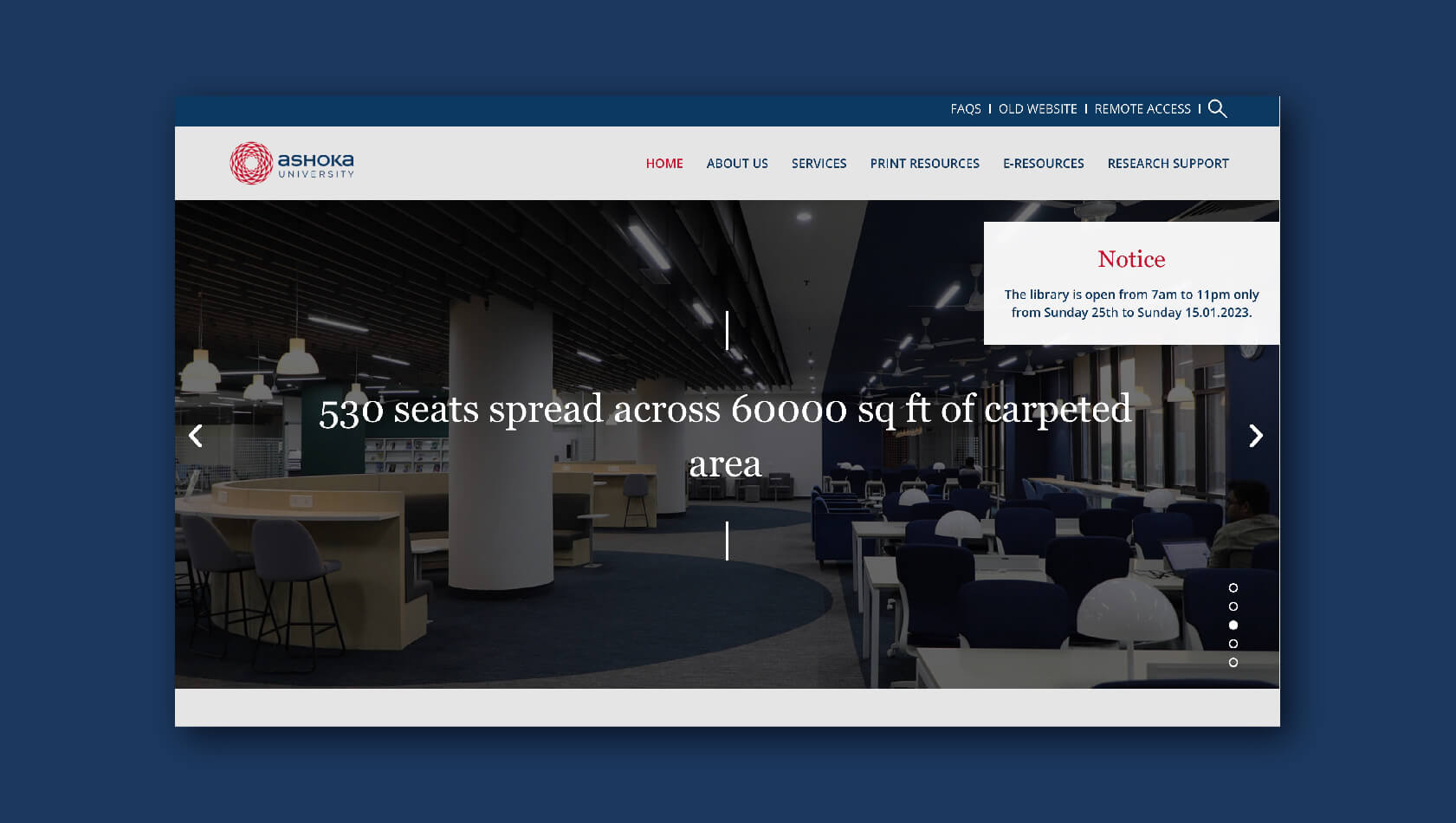
The resulting website is structured across six clearly defined sections: Home, About Us, Services, Print Resources, E-Resources and Research Support. This structure reflects the way users actually navigate a library, moving from understanding what is available to accessing the specific resource they need.
The visual design is modern but restrained. In keeping with Ashoka University’s institutional identity, the aesthetic stays clean and minimal. There are no unnecessary elements competing for attention. Navigation is clear. The hierarchy of information is immediately legible.
Who Benefits and How
The primary users of the library website are Ashoka’s students and faculty. Students needed a site that would make it easy to locate print volumes, access digital journals and understand what research support services are available to them. Faculty needed confidence that the digital interface reflected the seriousness of the institution’s academic resources.
By designing with both groups in mind, Wishbox created a website that works as a functional tool and as a representation of Ashoka’s academic identity. The improved user experience means that students spend less time navigating and more time engaging with what the library actually offers.
The Wider Significance
For a university of Ashoka’s standing, the library website is not a peripheral concern. It is one of the most frequently used digital touchpoints for the student community. A well-designed, responsive and easy-to-use library site signals institutional seriousness. It tells students that the university values their time and their learning. Wishbox’s work here demonstrates how thoughtful publication design principles, clarity, hierarchy and visual calm translate powerfully to the digital environment.
You can also have a look at their website here

Big ambition. Small brand presence?
Let’s design the strategic positioning that attracts the right opportunities.