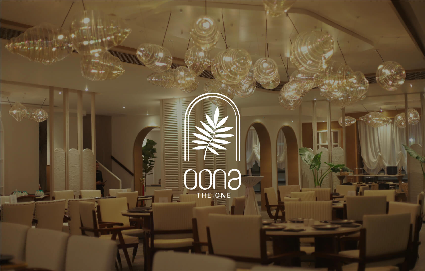
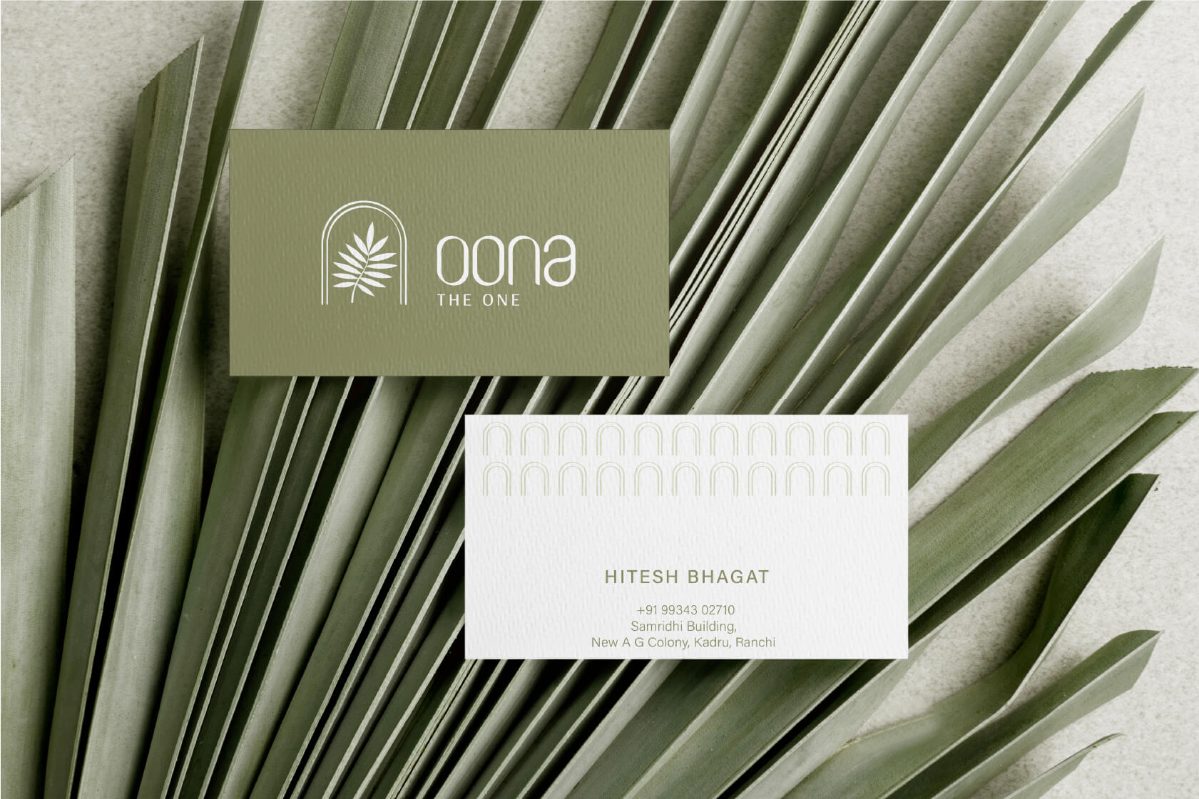
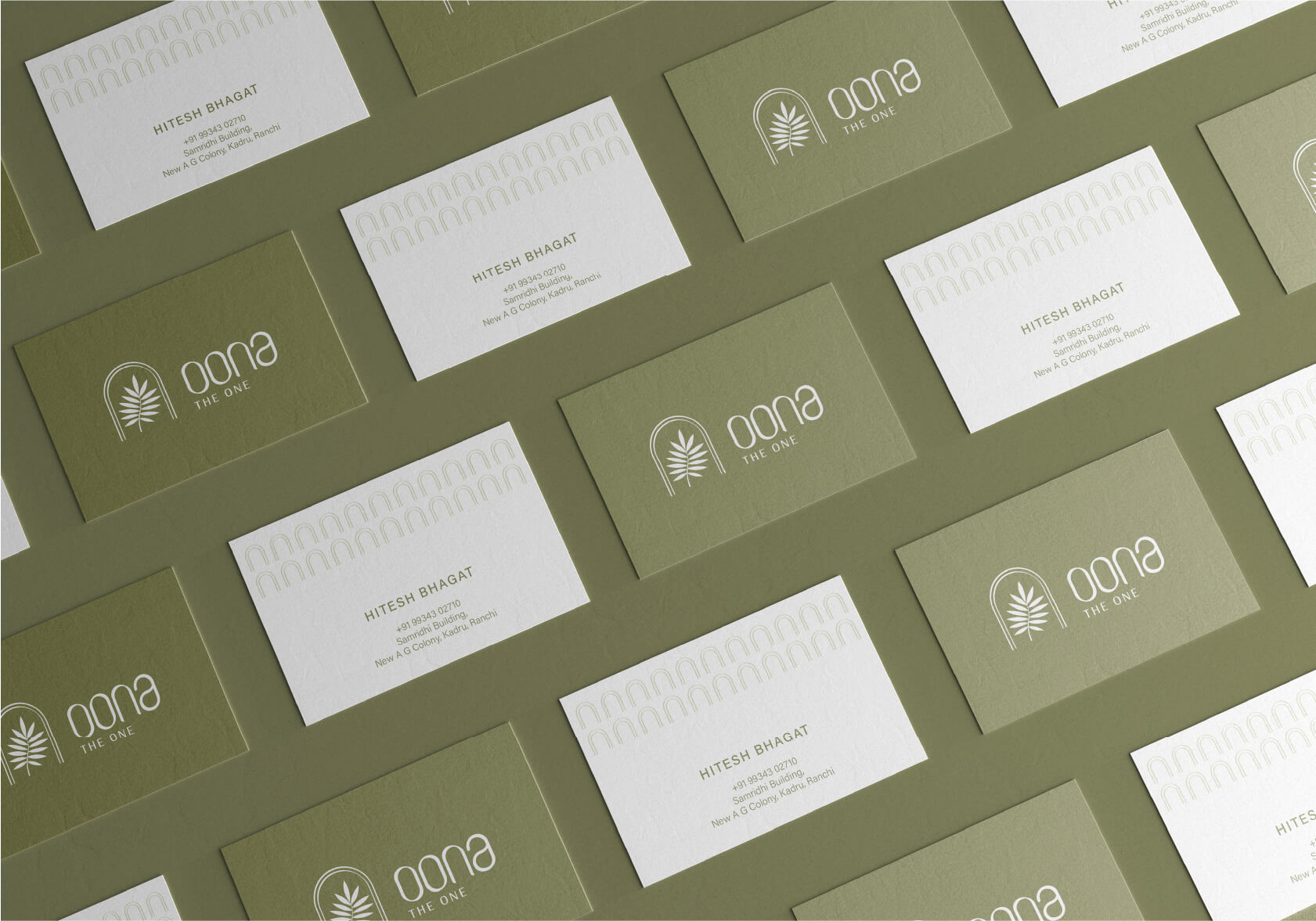
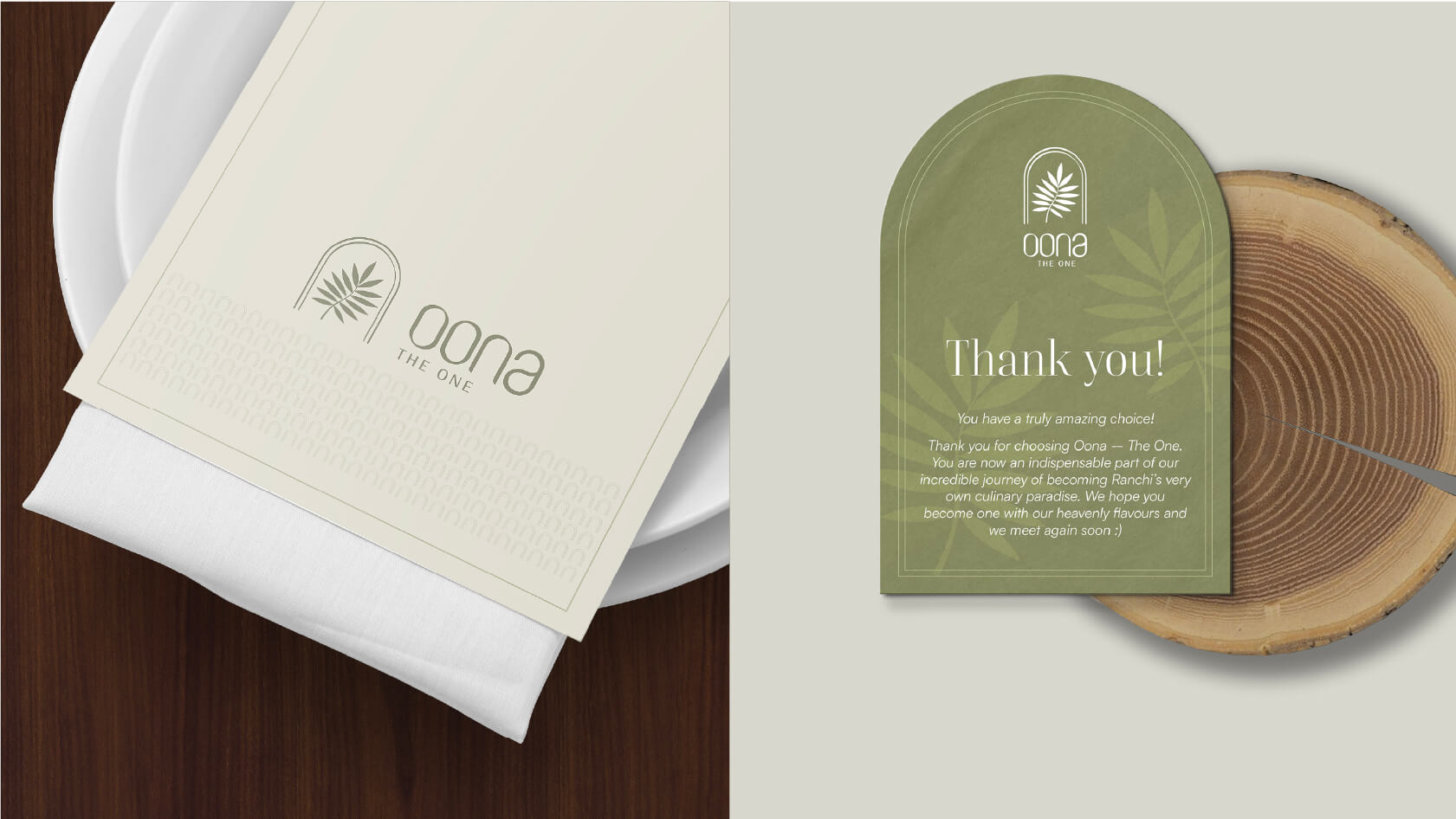
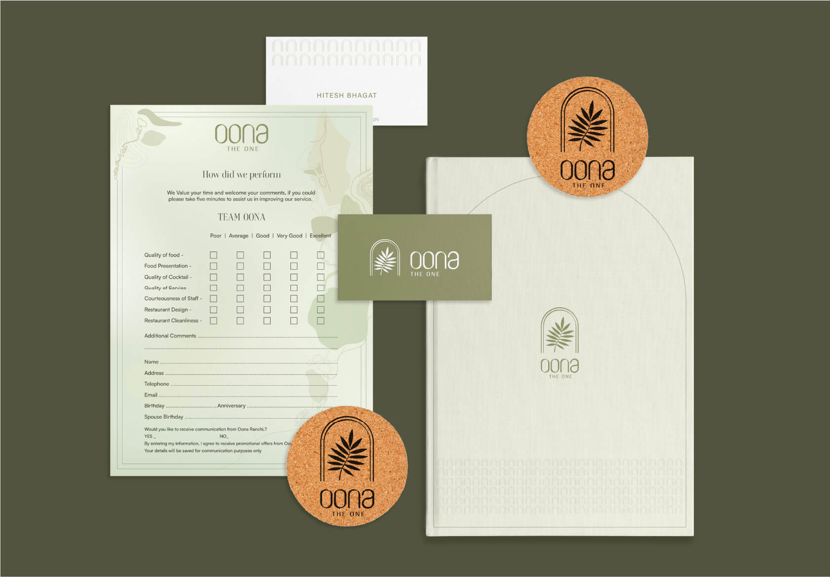
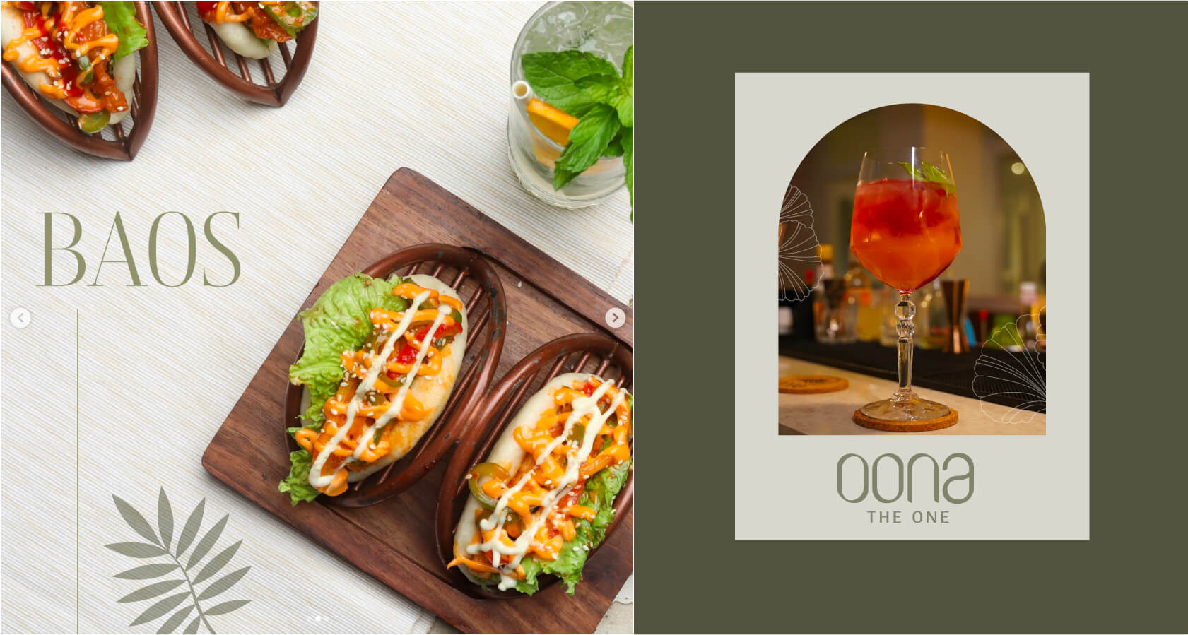
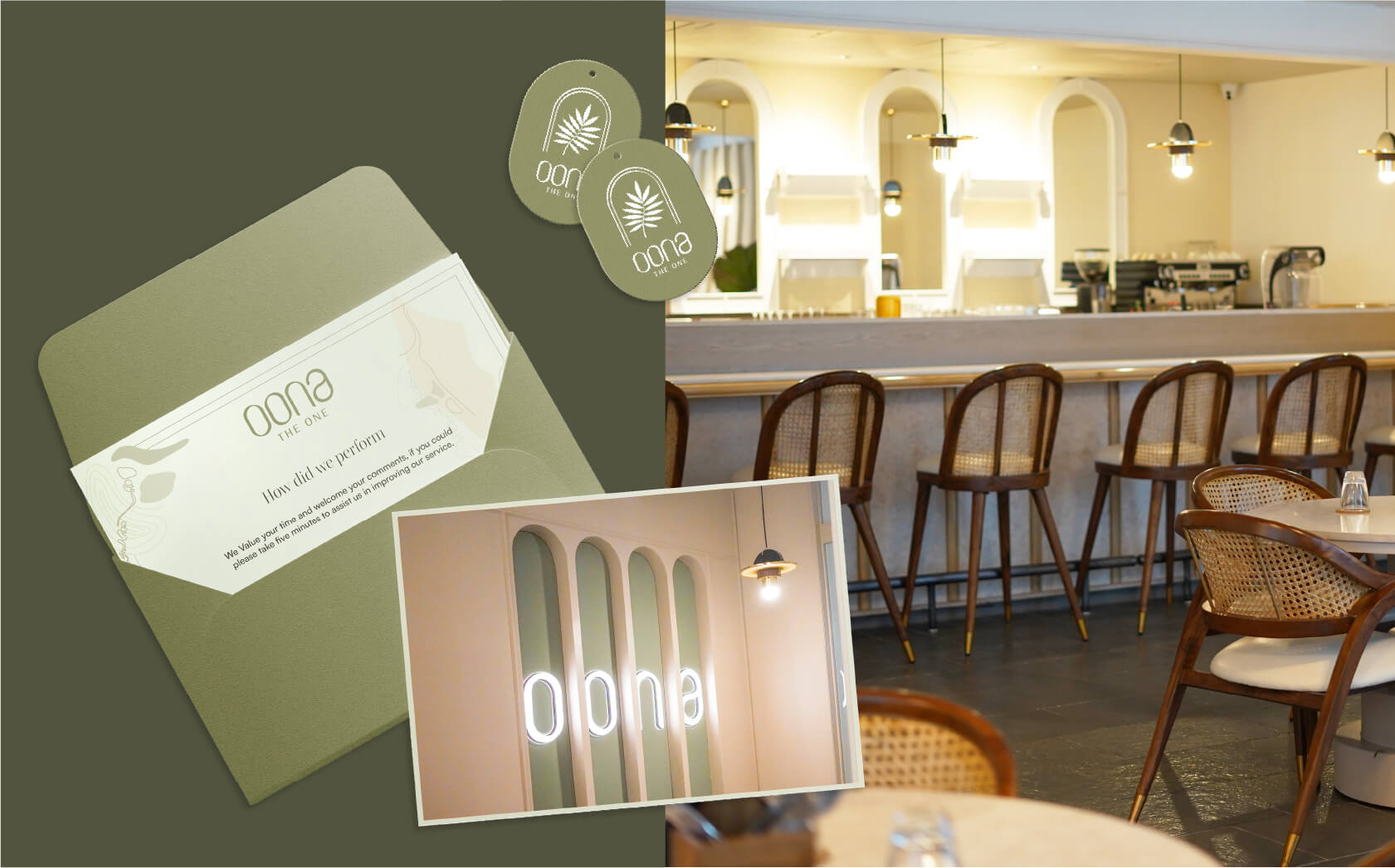
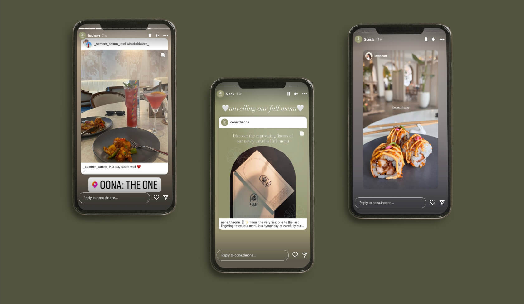
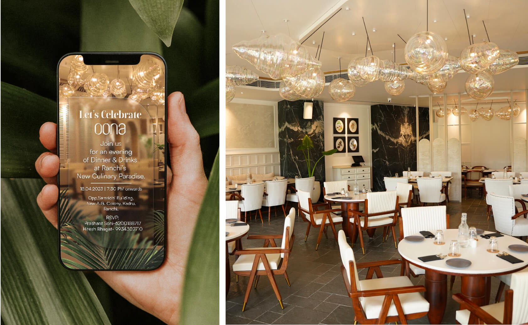
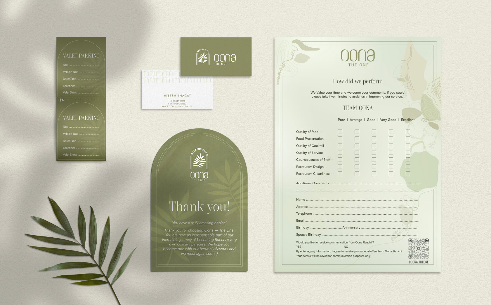
We embarked on a branding journey with Oona, a modern dining hotspot in Ranchi. Their quest for a premium identity inspired us to design a mesmerizing colour palette, beautiful coasters, menu, and other collaterals.
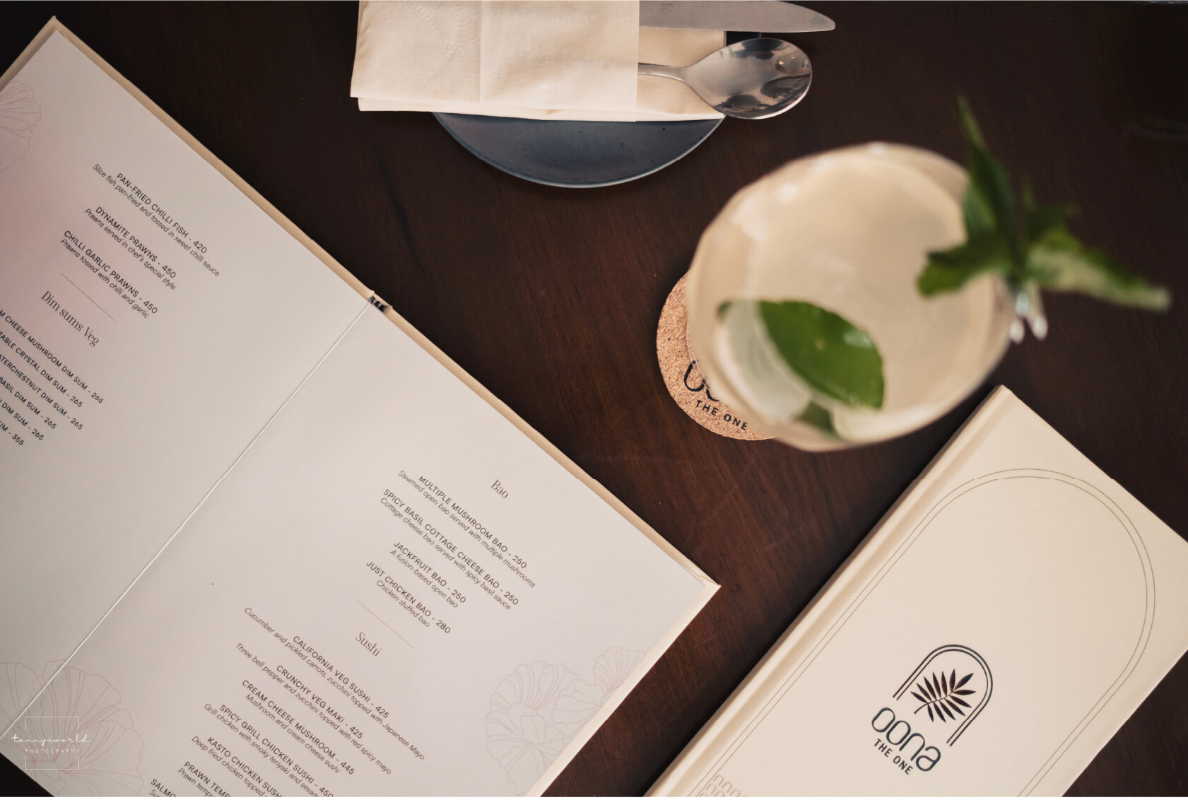
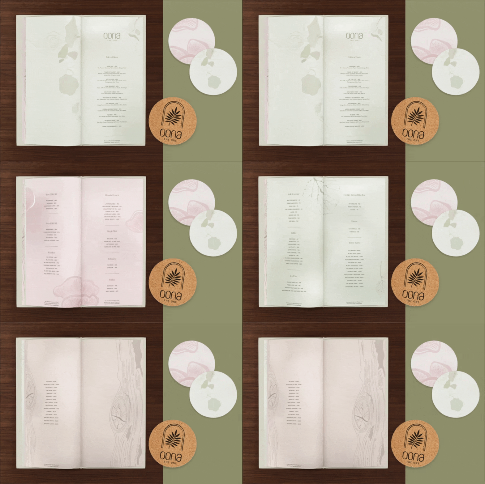
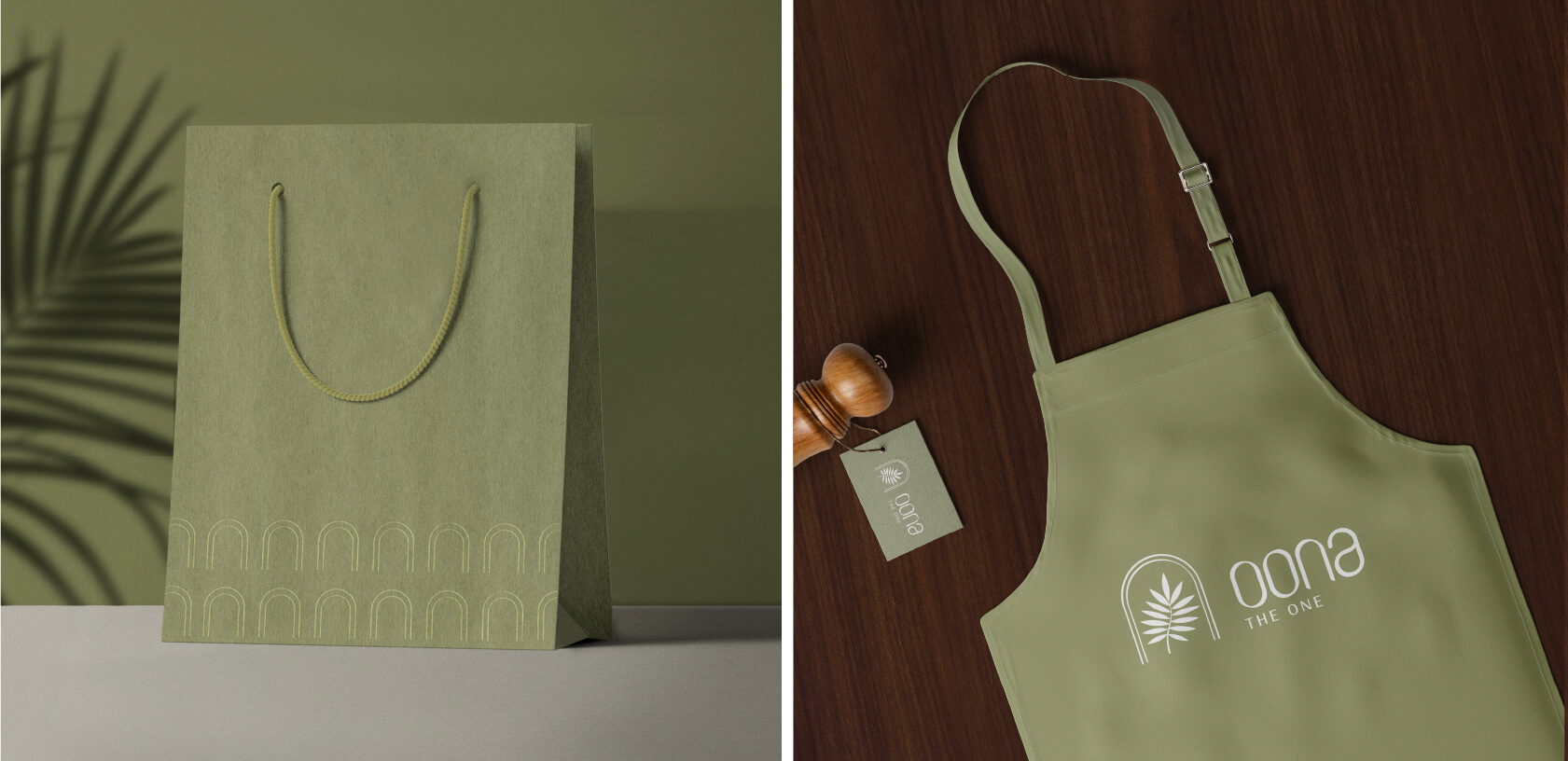
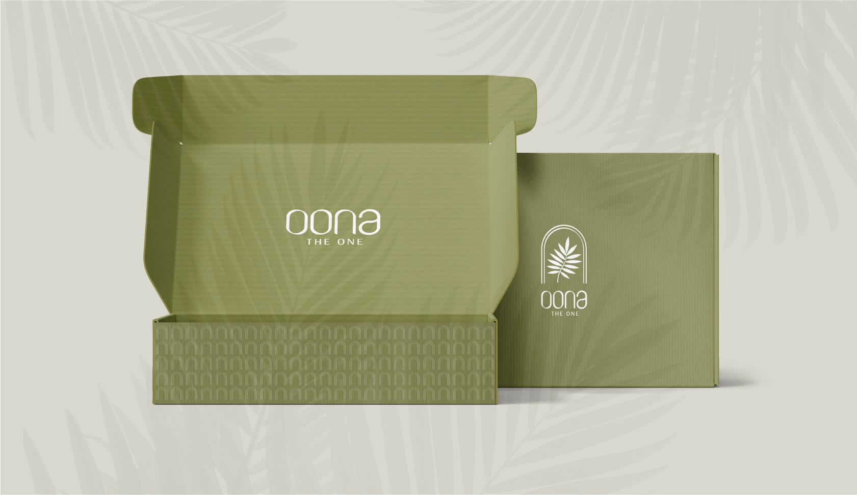
Crafting Brilliance: Our strategic approach blended subtle colours, sophisticated patterns, and textures, along with graceful arches, igniting a cohesive and luxurious aura. Every element was meticulously curated, breathing life into Oona’s brand story.
Elevating Experiences: With unwavering attention to detail, we infused Oona with a distinctive and unforgettable brand identity.
The result? Oona radiates a refined elegance, captivating patrons and offering a dining experience like no other.
You can view the site here.
A Fine Dining Brand Identity Built Around a Single Idea
Working on a brand identity for a fine dining restaurant is a particular kind of design assignment. The dining experience is sensory and immediate. The brand, by contrast, must do its work before the guest arrives and long after they have left. Every visual element, every piece of collateral, every interaction with the brand outside the restaurant itself has to sustain and amplify what the experience delivers inside it. Wishbox Studio’s work for OONA was built on that responsibility.
The Brief
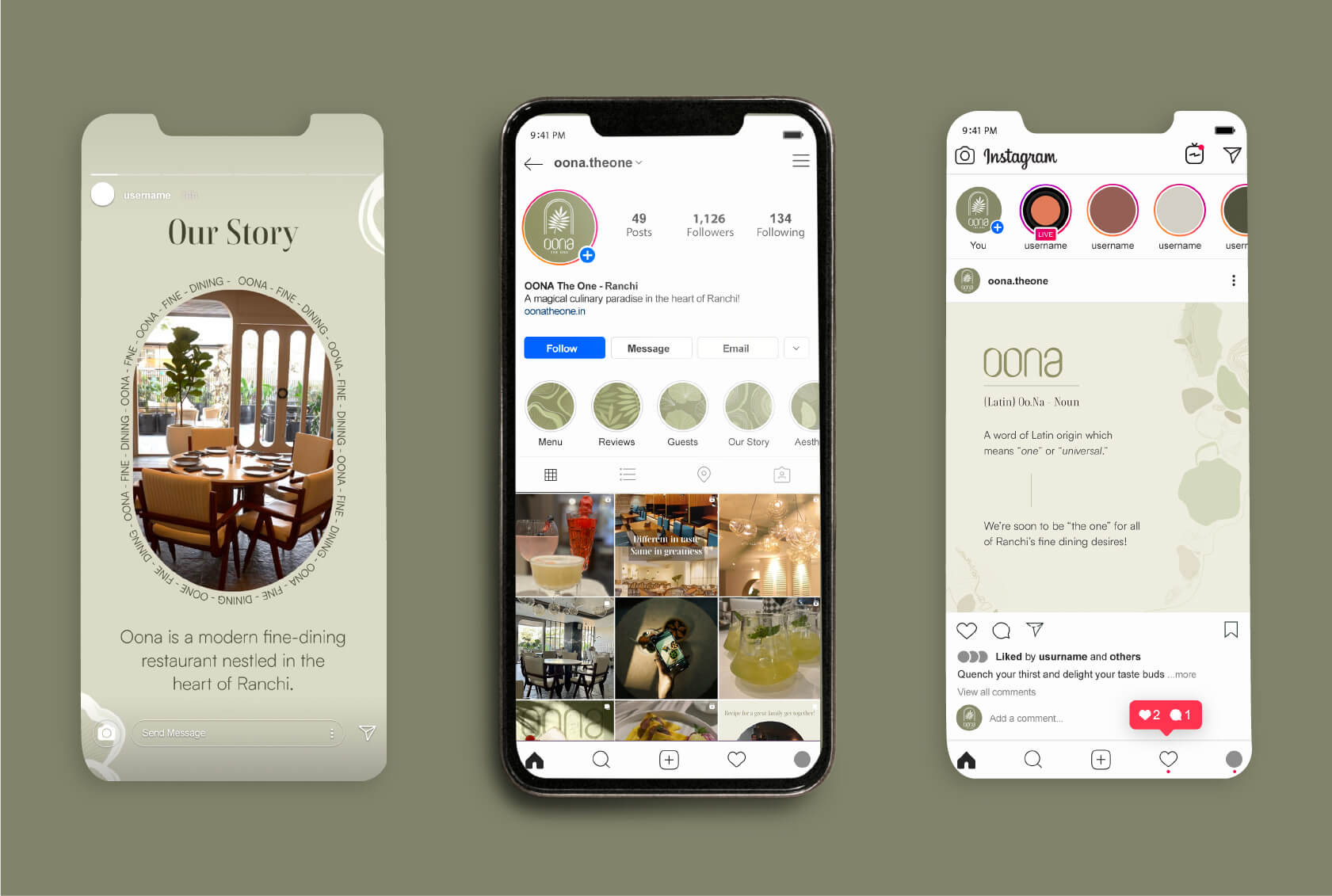
OONA is a modern fine dining destination in Ranchi, conceived as the definitive dining experience the city had been missing. The name itself carries the brand’s positioning: derived from the Latin word unus, OONA means “one.” The brand aspired to be exactly that, the one restaurant in Ranchi that combined international dining standards with a warm, considered guest experience. The identity needed to make that aspiration legible and credible from the first point of contact.
The Design Approach
As a packaging design agency and brand studio with experience in the hospitality and lifestyle sector, Wishbox approached OONA as an identity problem centred on a single powerful idea. Everything that followed, the colour palette, the graphic language, the collateral design, was developed in service of the brand’s core claim: singular, refined and entirely its own.
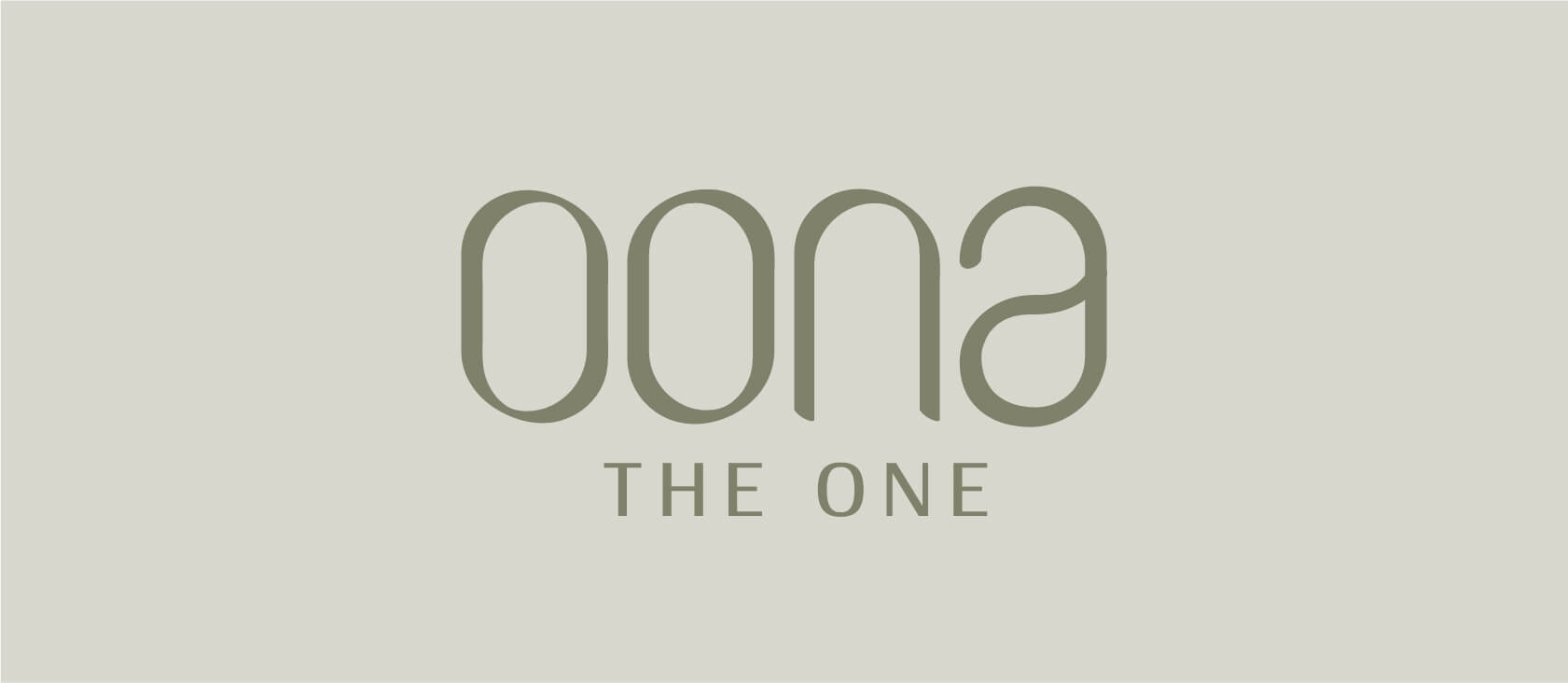
The colour palette was built around subtlety and sophistication. Rather than the high-contrast drama common in premium restaurant branding, OONA’s palette uses layered tones that feel luxurious without being aggressive. Colour combinations were chosen to feel contemporary while remaining timeless, the standard that any fine dining brand with long-term ambitions must meet.
The Role of Texture and Pattern
Sophisticated patterns and textures were developed as part of the brand language, applied across collaterals to create visual depth that flat colour alone cannot achieve. In beauty and lifestyle brand identity work, and equally in hospitality, the tactile quality of a brand’s physical touchpoints communicates as much as the visual choices. A menu that feels considered in the hand has already begun the guest experience before a dish arrives.
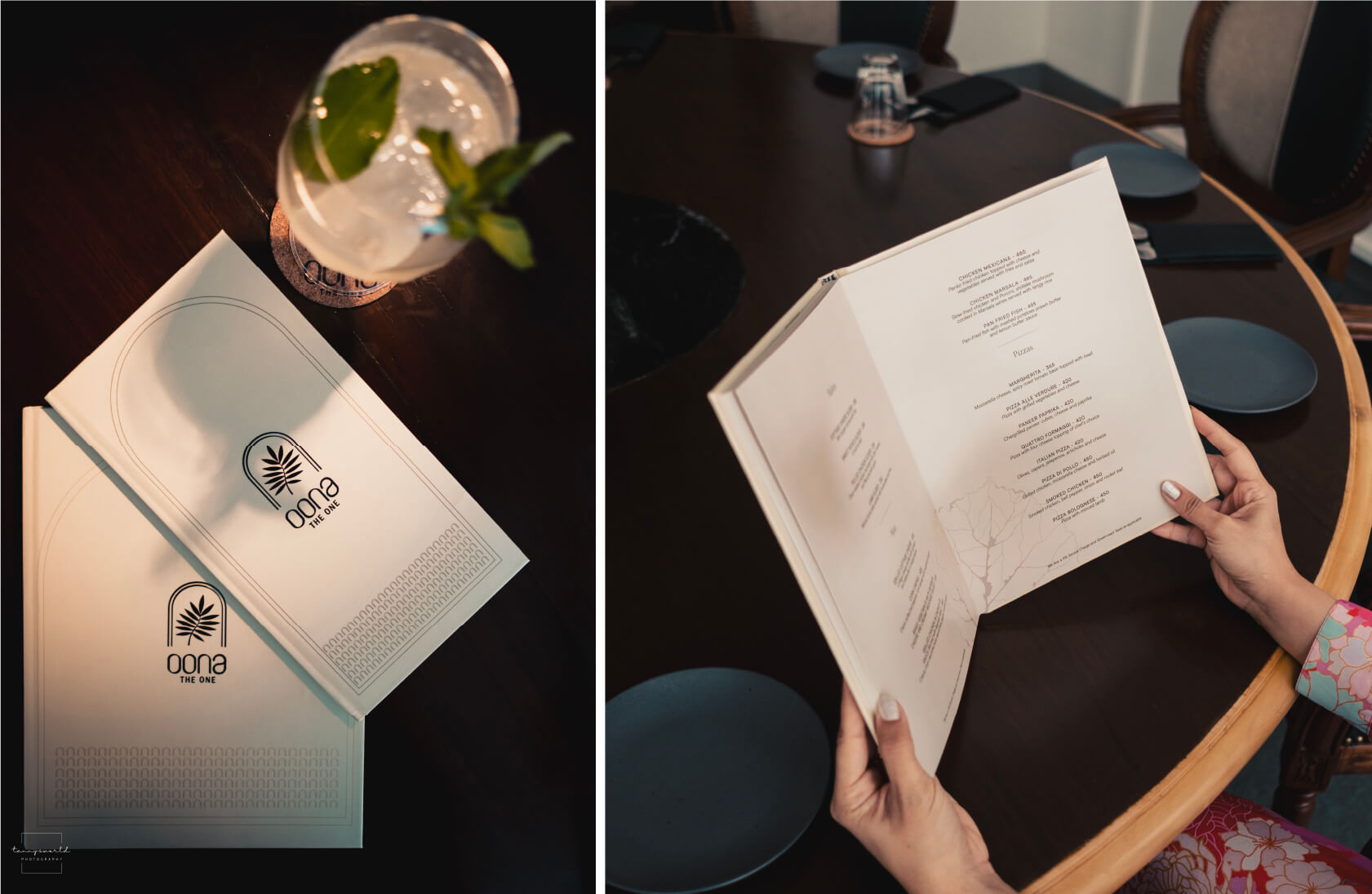
Graceful arch forms were introduced as a recurring graphic element, carrying the sense of refined structure and warmth that OONA’s physical space embodies.
Collateral as Guest Experience
The brand extended across menus, coasters and stationery, each piece designed with the same attention to detail as the identity itself. In a fine dining context, these objects are part of the meal. A thoughtfully designed coaster or menu is not incidental, it is evidence that the restaurant takes every dimension of the experience seriously.
What This Work Represents
OONA’s identity demonstrates what Wishbox brings to restaurant and lifestyle brand builds: the ability to translate a brand’s core idea into a visual and material system that makes the guest feel the standard before they have tasted a single dish. The full brand and digital experience can be explored at oonatheone.in.
Big ambition. Small brand presence?
Let’s design the strategic positioning that attracts the right opportunities.