A wedding invitation is the first physical encounter guests have with the event. Before the venue, before the food, before the family introductions, they are holding a piece of designed stationery in their hands. That object sets an expectation. It communicates the personality of the couple and signals what kind of celebration this will be. The Love Birds collection was designed with that weight in mind.
The Brief
The brief asked for a suite of wedding cards and envelopes that felt simultaneously sophisticated and vibrant. This combination is harder to achieve than it sounds. Sophistication in wedding invitation design tends toward restraint, muted palettes and fine paper. Vibrancy tends toward colour and decorative elaboration. The challenge was to hold both qualities in one design system without either overpowering the other.
The Design Approach
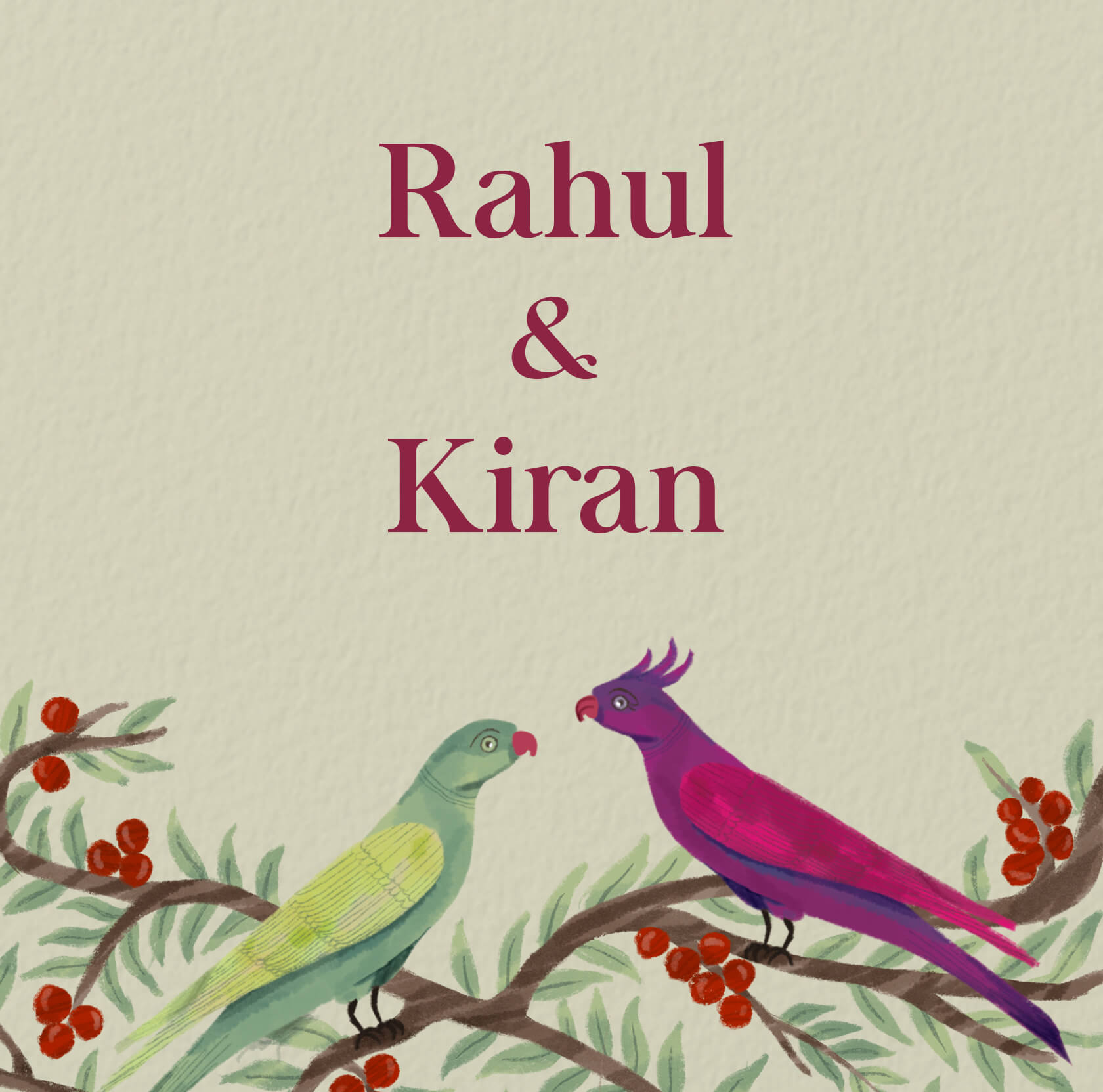
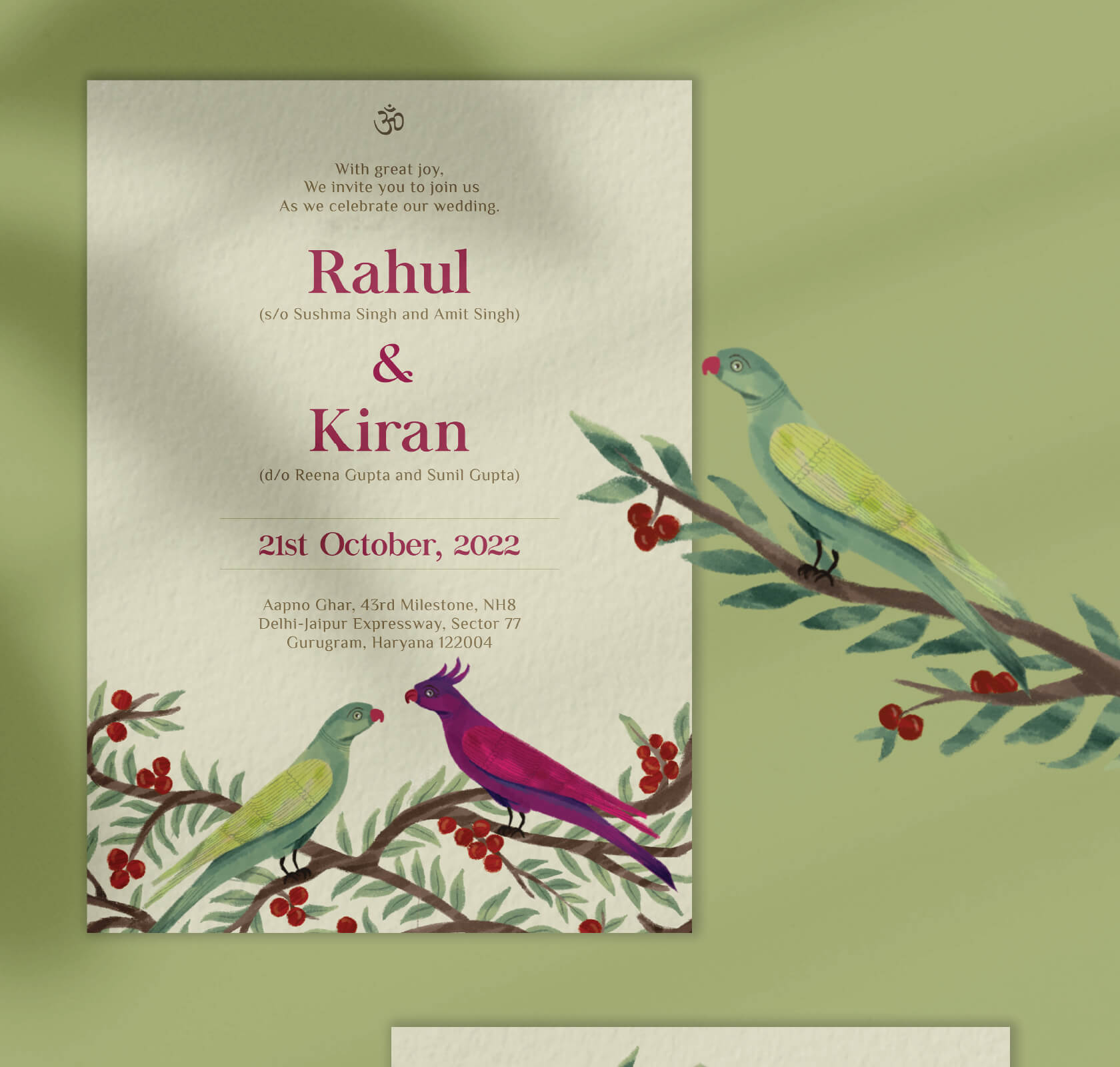
The solution arrived through illustration. The entire Love Birds concept is built around digital watercolour artwork, birds rendered in a style that is delicate without being precious and detailed without becoming cluttered. Watercolour was chosen deliberately: it carries the warmth and organic imprecision of hand-painted work while allowing the colour consistency and repeatability that custom invitation card design requires across a full suite. Every card in the collection feels individual. Every card reads as part of the same family.
The colour palette reflects Indian aesthetics, rich and celebratory, without defaulting to the traditional combinations that can feel dated in a contemporary wedding context. The result sits comfortably at a destination wedding or an intimate urban celebration alike.
Typography That Serves the Card
Typography was selected to complement the illustration without competing with it. The fonts carry the softness appropriate to a wedding context while maintaining the legibility required for the information every invitation must communicate clearly: date, time, venue, dress code and RSVP details. Luxury stationery design never lets the decorative overwhelm the functional. The card must be beautiful and it must be read.
The Envelope as Part of the Experience
The envelope was designed as an extension of the card, not its container. Illustration elements continue across the envelope flap so that opening the invitation is itself a moment in the experience rather than a transactional step toward the card inside. This is the kind of detail that elevates stationery from something guests glance at and set aside to something they keep.
What This Work Represents
The Love Birds collection demonstrates what Wishbox brings to print and paper work: design for the moment of encounter, for the object held in the hand, for the impression made before a single word is read. For couples who want their wedding stationery to reflect the same care they are bringing to every other element of the celebration, this is what that looks like.


Big ambition. Small brand presence?
Let’s design the strategic positioning that attracts the right opportunities.