top


A Sustainability Brand Built for Usefulness
Working on a digital identity for Karma Recycling is a particular kind of design assignment. The service addresses a real and growing problem, India generates millions of tonnes of electronic waste annually and responsible disposal is neither convenient nor well understood by most consumers. The brand needed to make that problem, and its solution, feel approachable rather than guilt-inducing or complicated.
The Brief
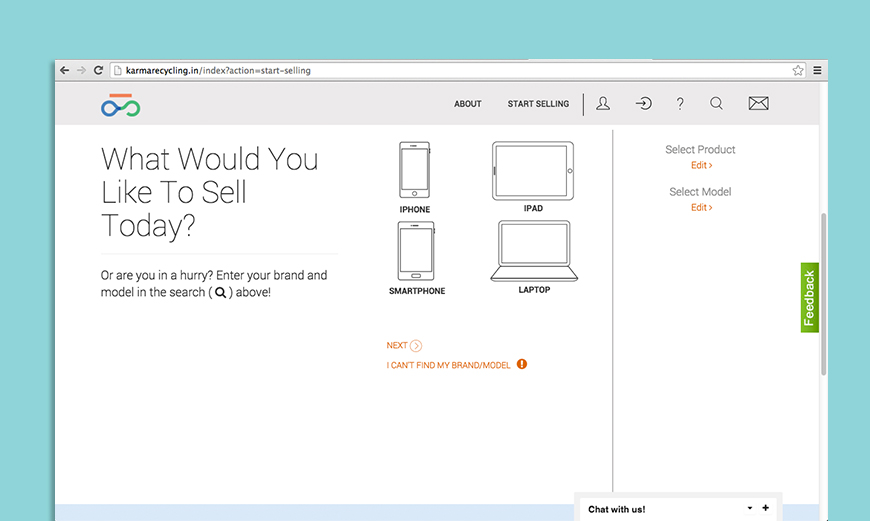
Karma Recycling was started with the intention of buying old electronic devices from consumers and ensuring they are recycled responsibly rather than discarded into landfill. The website was the primary touchpoint for this business. Users arrive, select their device, receive a valuation, send it in and receive payment. The entire exchange process needed to be communicated with complete clarity, from landing page to completed transaction.
The Design Approach
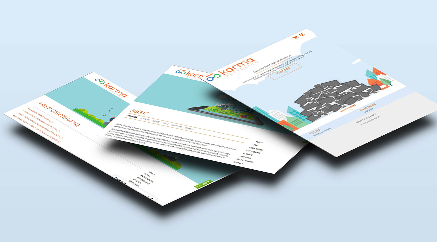
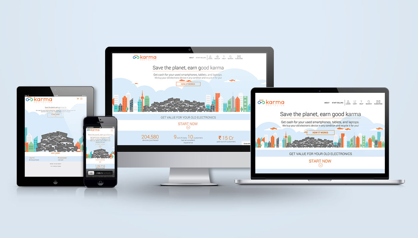
As an eco brand agency with experience in digital-first business design, Wishbox approached Karma Recycling as a UX problem before it was a visual one. The structural decision that shaped everything else was to use a single-page layout to walk users through the exchange process end to end. Rather than requiring navigation across multiple pages and back again, the full service logic — what Karma does, how it works, what the user needs to do — is available in a single scrollable experience. The interface is unique in how comprehensively it explains a multi-step process without overwhelming the visitor.
Recycling Brand Design Without the Clichés
Sustainability brand identity work has a visual cliché problem. Flat greens, leaf motifs, stock photographs of the planet: these choices signal environmental concern but they also signal a particular kind of brand that appeals to a narrow audience. Karma Recycling’s service is not for sustainability advocates. It is for anyone with an old phone in a drawer, which is most people. The visual language was built accordingly.
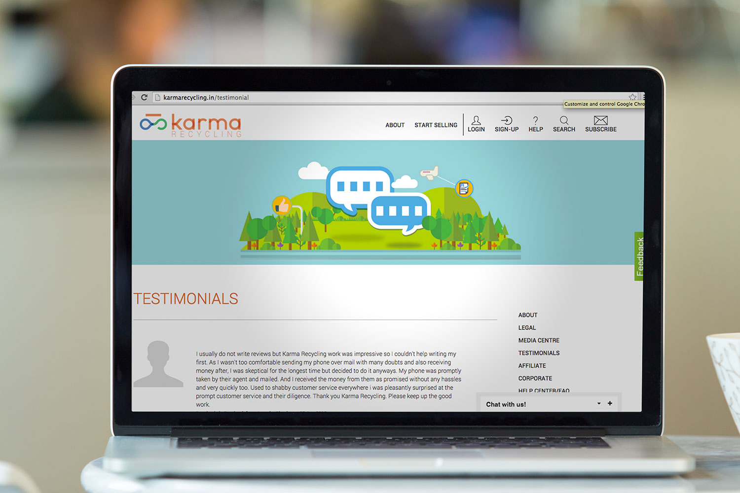
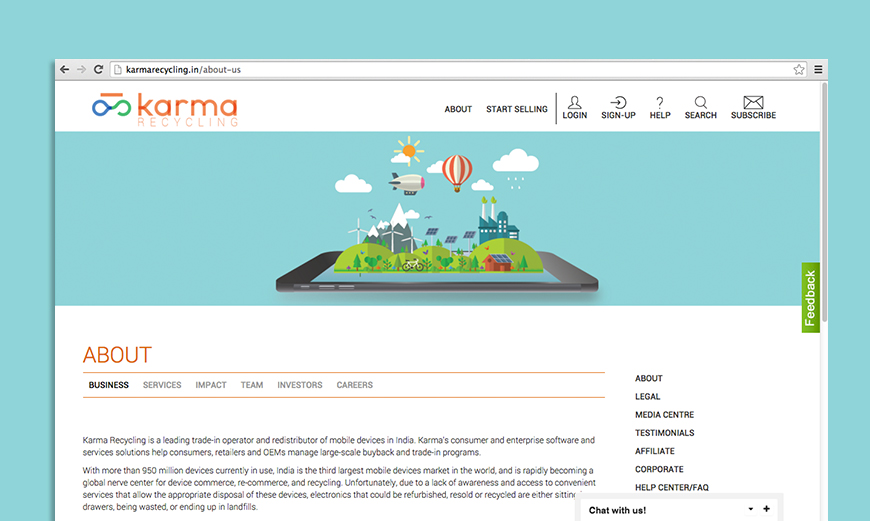
The UI is sharp and modern, the visual vocabulary of a technology-first service business. This positions Karma Recycling more accurately as a functional service that happens to be in the sustainability space, rather than an environmental campaign dressed as a business. Clean design, clear hierarchy and direct copy make the service feel like what it is: simple, trustworthy and worth trying once.
Keeping the Experience Simple
The key challenge was highlighting the service’s features in a way that felt interesting rather than instructional. Clean visual language and considered use of space carried this work. The website avoids the information overload that undermines most recycling-adjacent platforms and arrives instead at the simplicity that builds user confidence.
What This Work Represents
For brands like Karma Recycling, the website is the entire brand experience for most users. Wishbox’s design work ensured that the experience reflected what the business actually is: efficient, modern and built around making responsible disposal the path of least resistance.
Big ambition. Small brand presence?
Let’s design the strategic positioning that attracts the right opportunities.