top


Evidence Action: An Identity Built on Proof
The development sector has long understood that good intentions are not enough. What separates organisations that genuinely move outcomes from those that merely report activity is the quality of evidence behind their work, and the discipline with which they scale only what has been shown to work. Evidence Action stands precisely on this principle. Its name is its philosophy.
The Brand Challenge
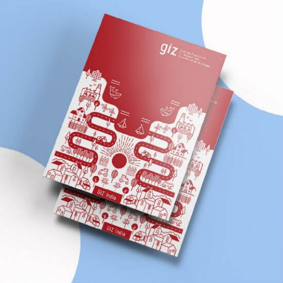
When Wishbox Studio engaged with Evidence Action on its brand identity, the central design question was how to translate this evidence-led philosophy into a visual identity that felt credible, focused and human at the same time. The organisation’s work is grounded in rigorous research and operational discipline, but its purpose, expanding access to proven interventions, is fundamentally about people. A brand identity that leaned too far into the analytical would risk feeling cold. One that leaned too far into the human would risk feeling sentimental.
The Design Approach
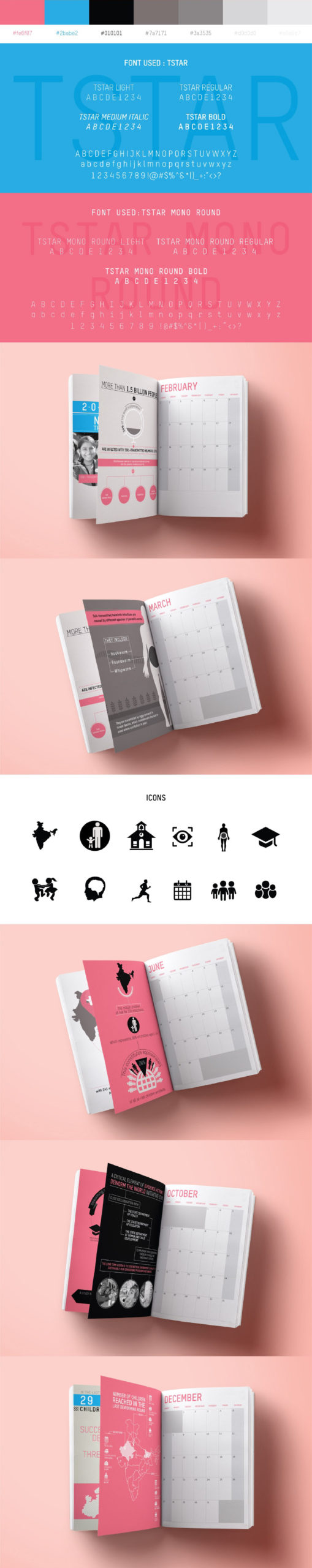
The identity Wishbox developed for Evidence Action holds both registers with intention. The logotype is structured and confident, signalling the organisational rigour the brand is built on. The supporting visual system carries warmth through colour and photography, ensuring the brand reads as people-led rather than purely technocratic.
As an NGO branding agency in India working with global development organisations, Wishbox is particularly attentive to this balance. Foundation branding is most often undone by extremes: identities that feel either bureaucratic or naive. The Evidence Action system was built to occupy the considered middle ground where credibility and humanity coexist.
Who the Brand Speaks To
The audience for the Evidence Action brand is unusually demanding. Major institutional funders, including some of the most rigorous foundations in global philanthropy, engage with the brand as a signal of organisational quality. Government partners across multiple countries read the brand for evidence of seriousness and alignment. Researchers and peers in the development field assess the brand for intellectual credibility. Programme participants and field staff need the brand to feel grounded in real work, not abstracted from it.
A single visual identity must serve all of these audiences without becoming generic. The Evidence Action brand achieves this through restraint and coherence rather than visual gymnastics.
The Broader Significance
In social sector communication design, the strongest brands are those whose visual language is an honest reflection of organisational values. Evidence Action’s commitment to evidence, scale and operational discipline is mirrored in a brand identity that is precise, scalable and disciplined in its own right. Wishbox’s work supports the organisation as it continues to expand its reach, ensuring that its visual presence holds up at every stage of growth and across every market in which its programmes operate.
Big ambition. Small brand presence?
Let’s design the strategic positioning that attracts the right opportunities.