Working on a sub-brand identity for Jehan Numa is a particular kind of design assignment. The parent brand is one of central India’s most respected heritage hotel groups, known for properties that blend architectural legacy with genuine warmth. The new extension, Jehan Numa Wilderness, required its own distinct identity while remaining recognisably connected to the group. Getting that balance right is the central challenge of sub-brand work for any hospitality branding agency.
The Brief
Jehan Numa Wilderness is set within the forests of the Satpura Tiger Reserve, one of India’s most ecologically significant wildlife destinations. The offering is designed for a wide range of guests: the serious wildlife enthusiast, the discerning experiential traveller, the casual tourist and the adventure-focused visitor looking for a programme-led stay. The identity needed to speak to that breadth without fragmenting into different registers for different audiences.
The Design Approach
Sub-brand work begins with understanding the relationship to the parent. The Jehan Numa group identity is refined, heritage-led and elegantly restrained. Jehan Numa Wilderness needed to inherit those core qualities — gravitas, warmth and a sense of considered quality — while introducing a new emotional register: movement, wildness and the spirit of exploration. The identity had to feel like it belonged to the Jehan Numa family while earning its own distinct character.
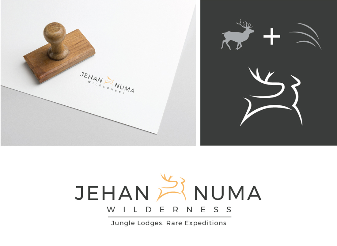
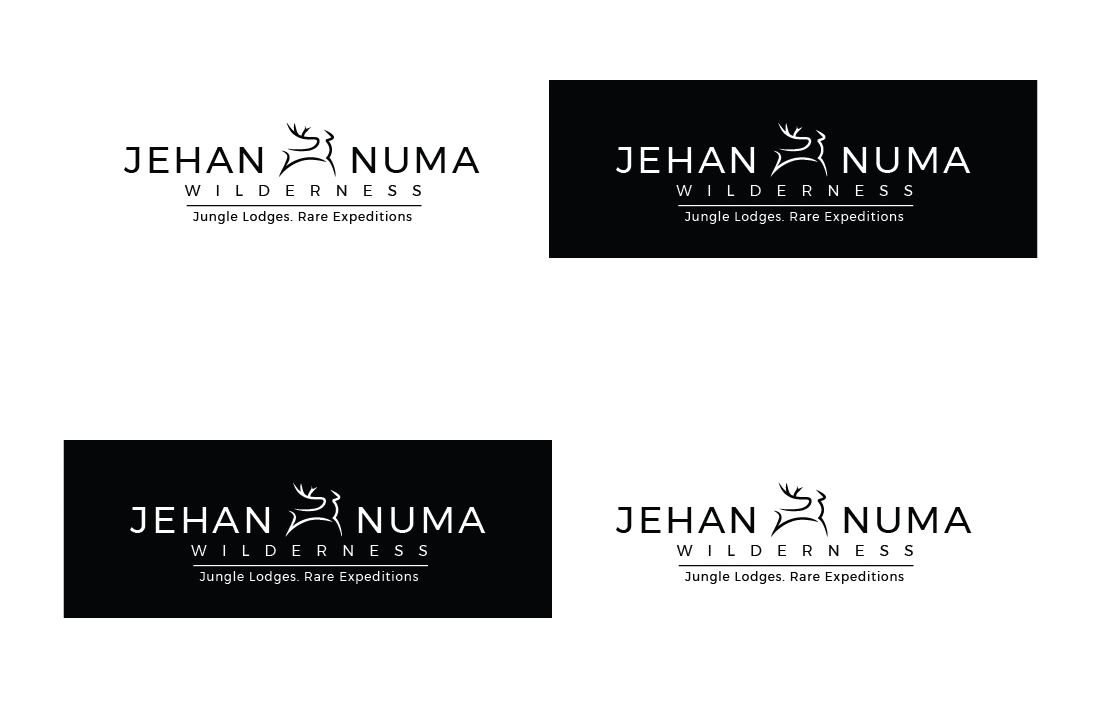
The logo at the centre of this identity is a running stag rendered in curved lines. The stag communicates speed and dynamism. The curved line treatment softens what could be an aggressive symbol into something graceful and adventurous. It is a mark that holds its character at every scale, from embossed welcome collateral to signage in a forest setting to small-format branded merchandise.
Luxury Hotel Identity Design at Scale
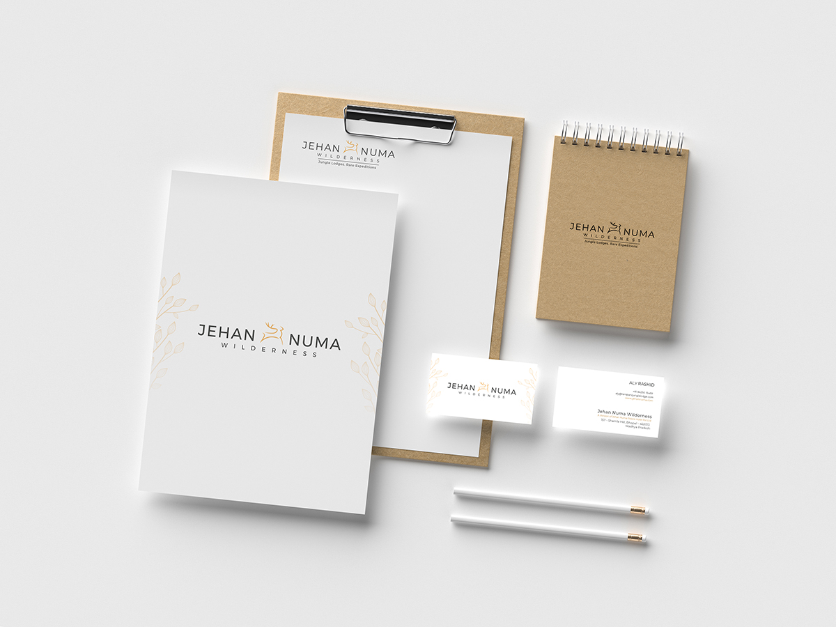
Luxury hotel identity design is a system problem as much as a logo problem. The brand language extended across expedition literature, programme booklets, wayfinding signage and digital presence. The overall system was kept clean and elegant, maintaining visual continuity with the Jehan Numa parent brand while incorporating naturalistic elements that rooted the Wilderness sub-brand in its physical environment.
Positioning Through Design
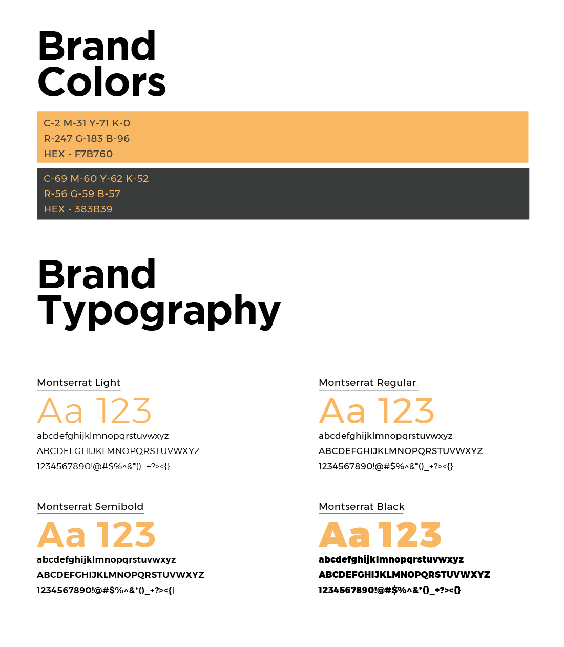
Hospitality marketing for an experiential wilderness property operates in a competitive space where most competitors lean on the same visual vocabulary: earthy tones, wildlife photography and heritage script fonts. The Jehan Numa Wilderness identity was deliberately designed to cut through that convention. Clean lines and a restrained palette signal a curated, design-conscious experience. The mark speaks before the marketing copy does.
What This Work Represents
For Jehan Numa, the Wilderness sub-brand represented an opportunity to expand the group’s offering into a growing segment of Indian luxury travel. Wishbox’s identity work was built to support that expansion with the same authority the group’s primary brand carries. The result is an identity that is confident, coherent and entirely its own.


Big ambition. Small brand presence?
Let’s design the strategic positioning that attracts the right opportunities.