
Working on a digital identity for a lighting company is a particular kind of design assignment. The product is light itself — something experiential and atmospheric that is almost impossible to photograph or describe in a way that does justice to what it actually does to a space. The challenge Wishbox Studio took on with Innovative Lighting Designs Limited was to make that experience the design concept.
The Brief
ILDL came to Wishbox for a digital presence that could represent their capabilities and position them credibly in a competitive industrial and architectural lighting market. As a corporate identity design project with a strong web component, the work needed to reflect both the technical precision of the brand and its genuine design sensibility. ILDL is not just a manufacturer. They are a company that thinks carefully about how light shapes environments. The website had to prove that.
The Design Approach
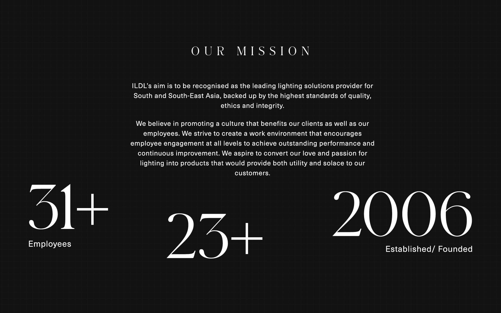
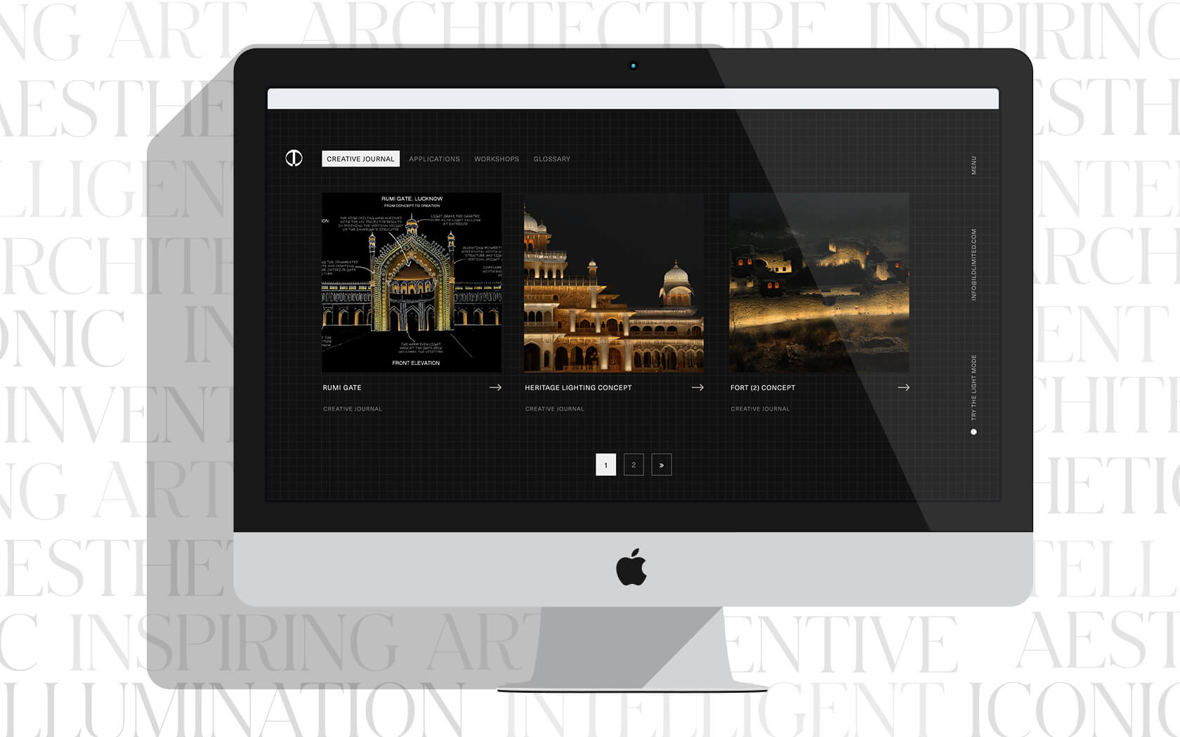
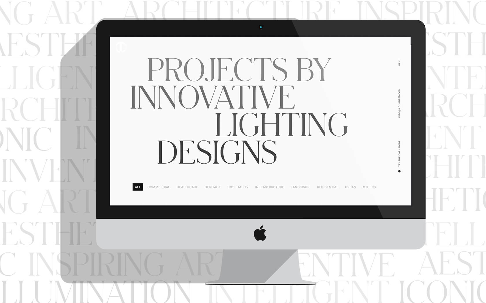
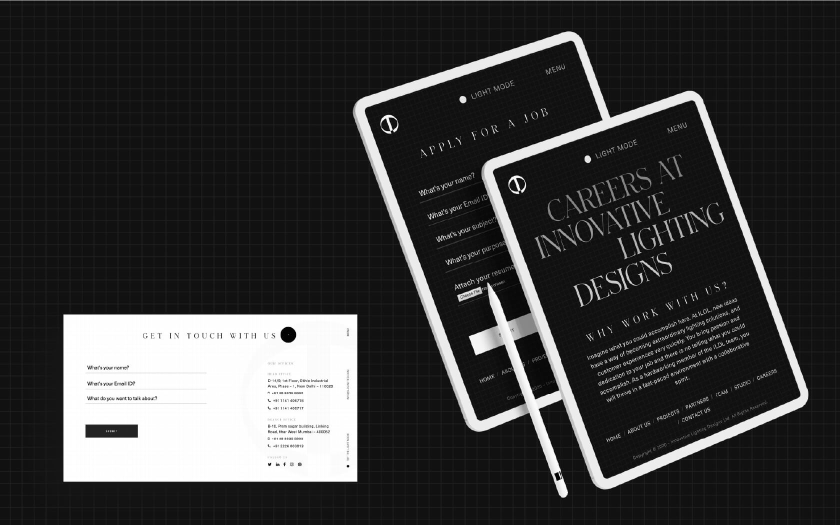
As an industrial branding agency, the central creative decision Wishbox made was to build the design concept around the product’s core behaviour: duality. Light and dark. Illuminated and shadowed. The website was built with two modes, a bright and vibrant light mode and a deep atmospheric dark mode, and switching between them is not a utility feature. It is the product demonstration. It shows rather than tells what ILDL understands about light.
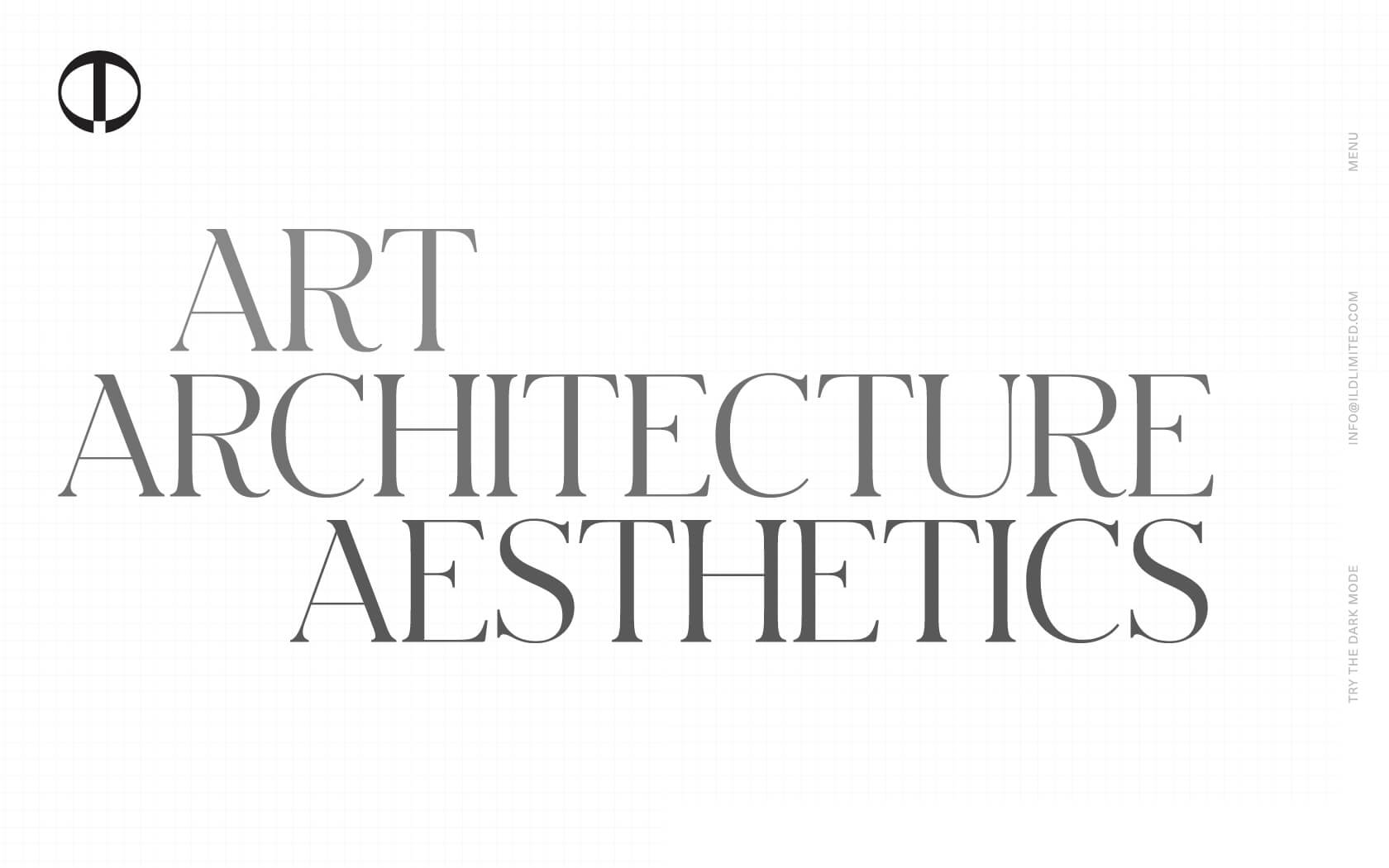
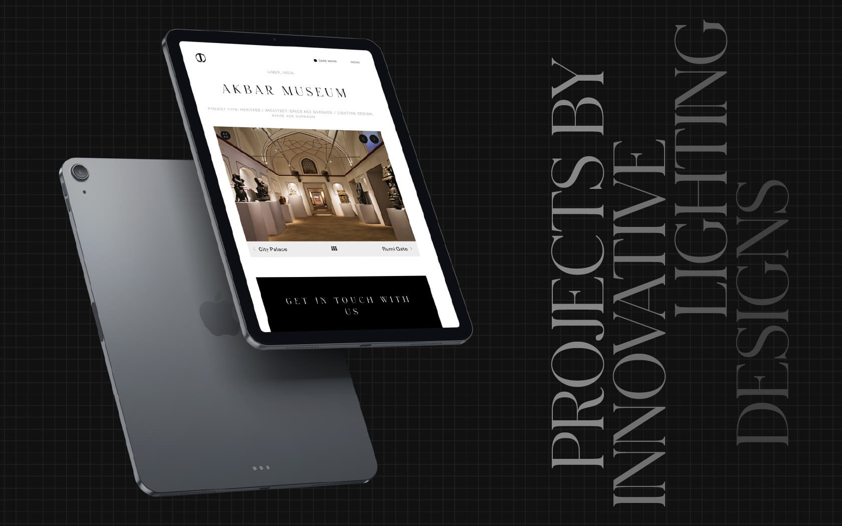
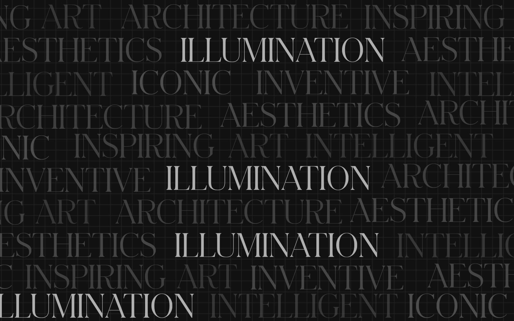
Typography was selected to carry this dual identity. An elegant serif font provides the design sophistication associated with high-end architectural lighting. A strong medium-weight sans-serif delivers the technical credibility the industrial market expects. Together they signal a company that operates fluently in both worlds.
Interactivity as Product Branding
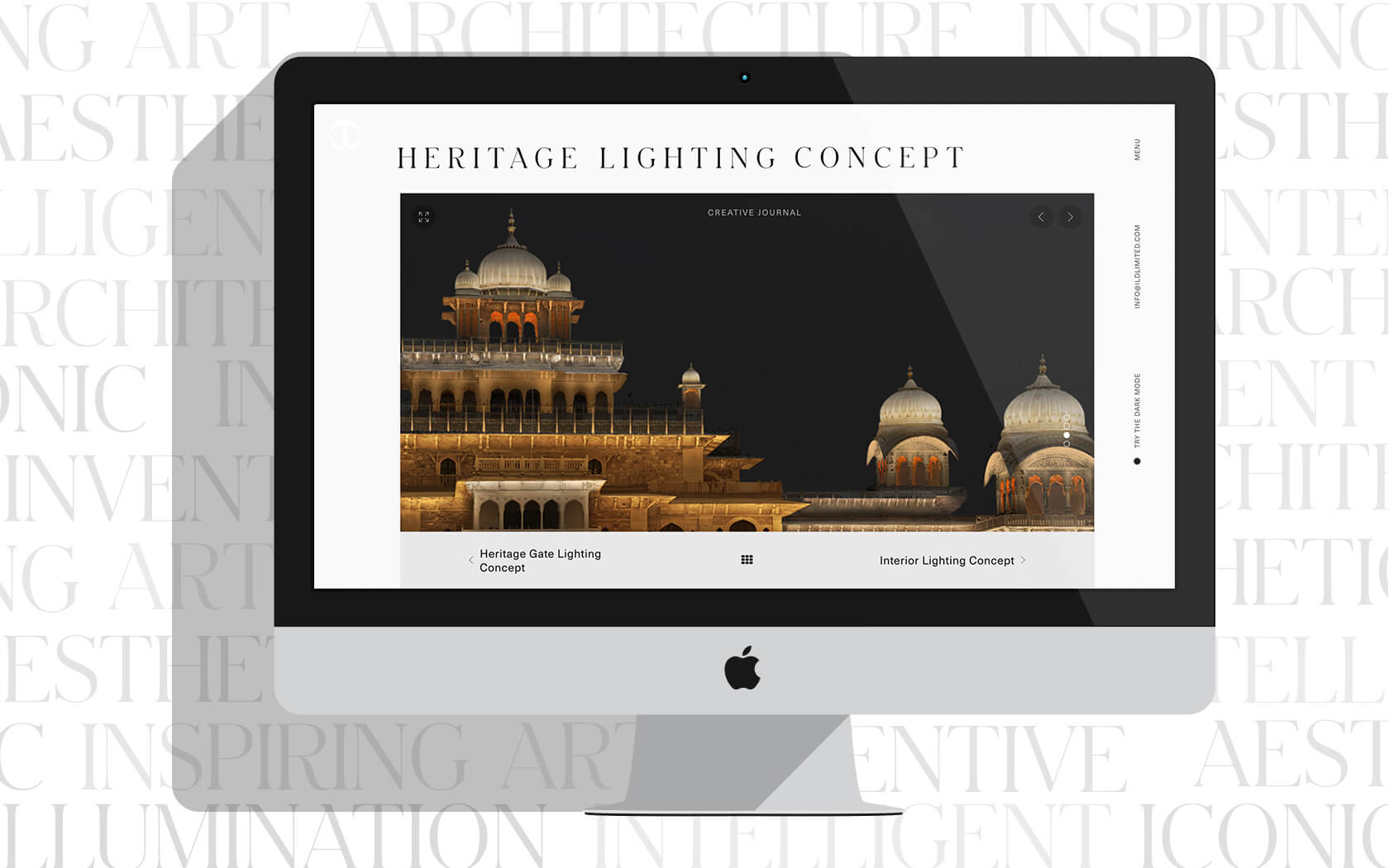
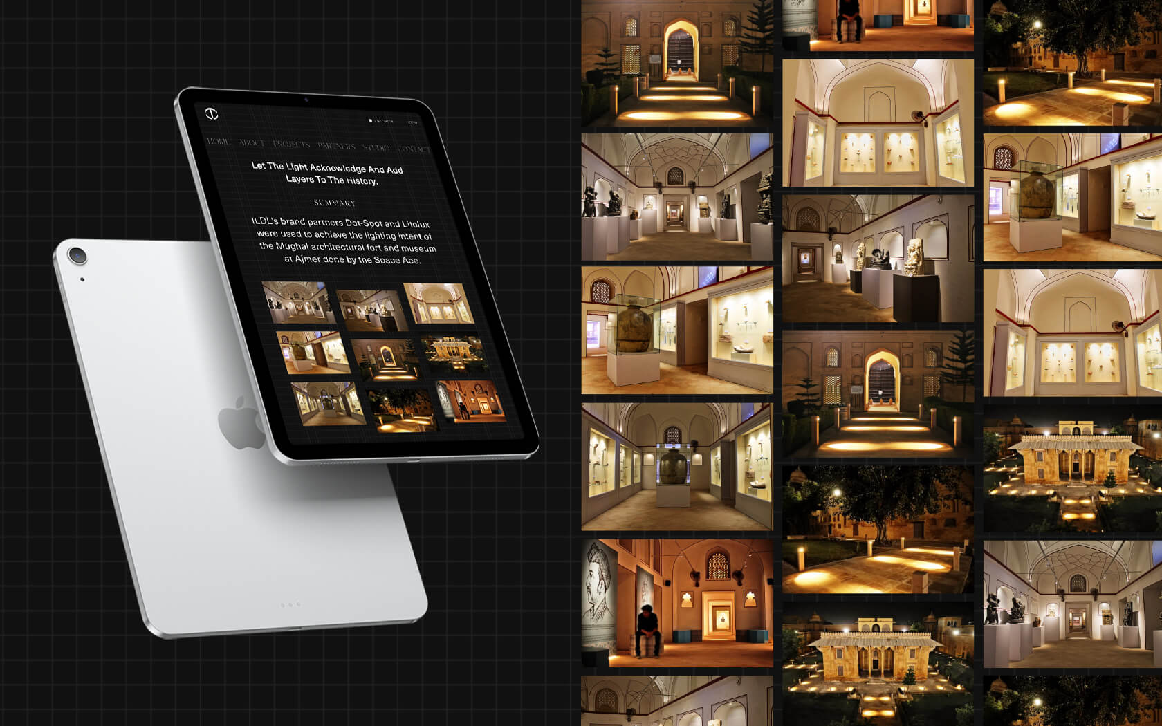
The design decisions extended beyond mode switching. Hover states on product imagery reveal a negative of the same photograph, a direct visual metaphor for what light does: it transforms a space, makes visible what was invisible, inverts what you expected to see. These are product branding services decisions made at the interface level, using the product’s own behaviour to animate the brand experience.
For ILDL, this approach meant the website could communicate something that a spec sheet never could: that this is a brand that thinks about light the way their clients do.
Consistency Across a Complex Brand System
The identity decisions made across typography, mode behaviour and image treatment were developed to work as a coherent system, not as a collection of interesting effects. Corporate identity design at this level requires every element to reinforce the same central idea. ILDL’s central idea was duality, and every design choice was in service of that.
What This Work Represents
ILDL’s revamped digital identity positions them not as a domestic lighting supplier but as a design-driven company with a genuine point of view. For a brand competing in a category where international players set the aesthetic standard, that repositioning is commercially significant. The website can be explored in full at ildlimited.com.

Big ambition. Small brand presence?
Let’s design the strategic positioning that attracts the right opportunities.