top


The nonprofit sector in India is large, diverse and increasingly competitive for attention, funding and public trust. Organisations working on social impact, whether in education, health, livelihoods or community development, face a communication challenge that is distinct from the corporate world. Their work is urgent and meaningful, but without a clear and compelling identity, it can be difficult to cut through the noise and build the credibility needed to sustain partnerships and funding relationships over time.
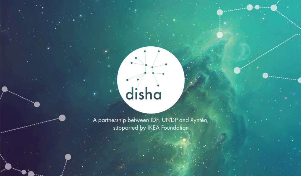
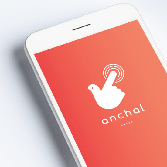
Disha is an NGO working in this space. Its name, the Hindi word for direction, carries an inherent sense of purpose and forward movement. The brief to Wishbox Studio was to build a brand identity that reflected this sense of mission: purposeful, credible and human.
The Challenge of NGO Branding
Nonprofit identity design presents specific tensions that commercial branding does not. The identity must feel serious enough to command the trust of institutional donors and government partners. At the same time it must feel warm and accessible enough to resonate with the communities the organisation serves and the individuals who support its work. An NGO that looks too corporate can feel disconnected from its mission. One that looks too informal can struggle to be taken seriously by the stakeholders whose engagement it depends on.
This balance, between authority and approachability, was the central design challenge for the Disha brand identity.
The Design Approach
Wishbox approached the Disha identity with a clear understanding of what the brand needed to communicate. As a social impact communication design project, every visual choice was guided by the organisation’s mission and the diverse audiences it needed to speak to. The identity was built to feel grounded and purposeful, reflecting the directional quality of the name while conveying the human focus that sits at the core of Disha’s work.
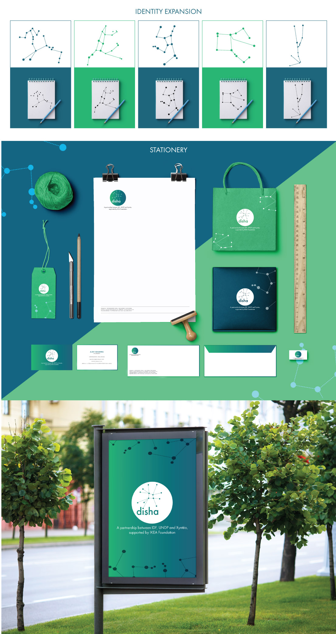
The visual language developed for Disha is clean and considered, avoiding both the visual complexity of corporate design systems and the generic iconography that can make nonprofit identities feel interchangeable. The goal was an identity that felt genuinely specific to Disha, ownable rather than generic.
Who the Brand Speaks To
Disha’s audience spans several distinct groups. Institutional funders and CSR partners look for signals of credibility and governance. Community members and program beneficiaries need to feel that the organisation is accessible and genuinely committed to their welfare. Individual donors and volunteers want to feel connected to a mission they can believe in. The brand identity designed by Wishbox had to function across all of these relationships simultaneously, maintaining coherence while allowing for different tones across different communication contexts.
Why Identity Matters for Social Impact Organisations
For an NGO like Disha, brand identity is not an indulgence, it is a strategic necessity. In a sector where many organisations are competing for limited attention from funders, media and the public, a clear and compelling visual identity directly supports the organisation’s ability to fulfil its mission. It builds recognition across touchpoints, signals professionalism to institutional partners and gives the organisation a consistent voice with which to tell its story.
Wishbox’s work with Disha demonstrates how thoughtful NGO branding agency work goes beyond aesthetics. It is about giving a social mission the visual credibility and communicative clarity it needs to grow its reach and deepen its impact.
Big ambition. Small brand presence?
Let’s design the strategic positioning that attracts the right opportunities.