Branding Communication Design Promotion Design Web and App / September 29, 2021
top
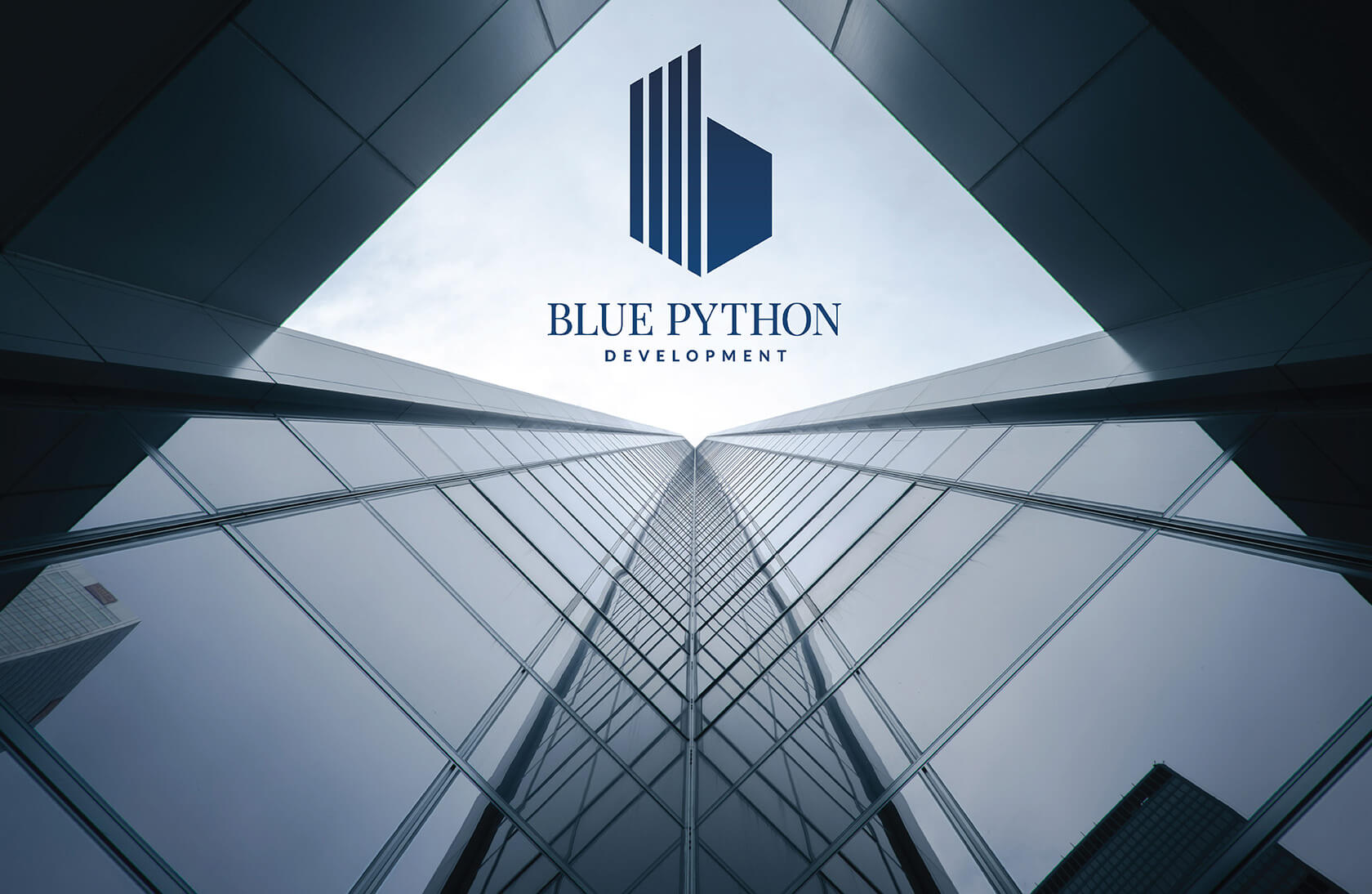
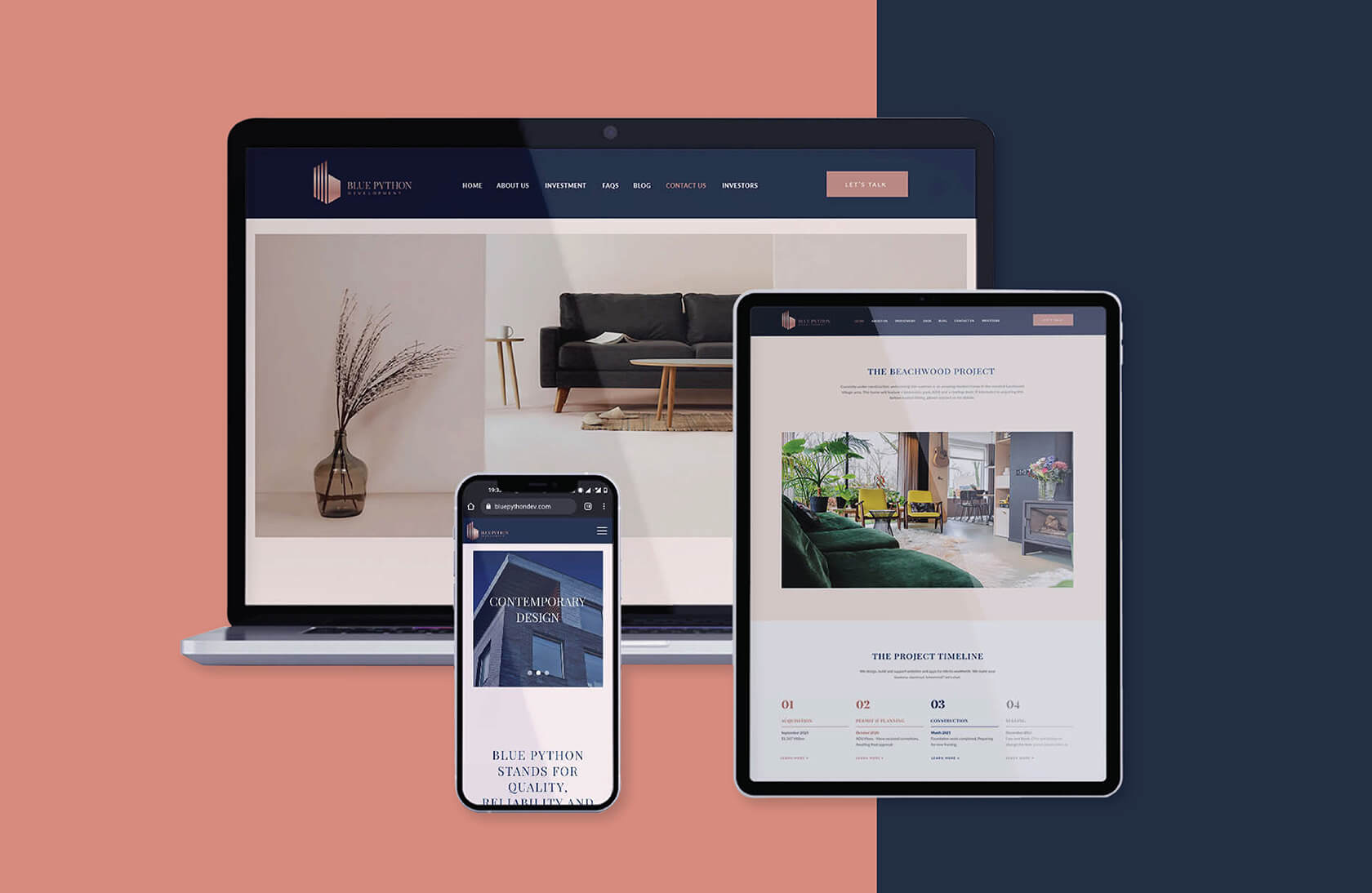

Blue Python invests in residential real estate projects in the Greater Los Angeles market. They use their proprietary model to identify investment opportunities and maximize the investment potential for each project. We got the opportunity to work closely with the brand as its branding and communication partners. The idea was to incorporate a classic and premium design sensibility in order to speak to the right audience.
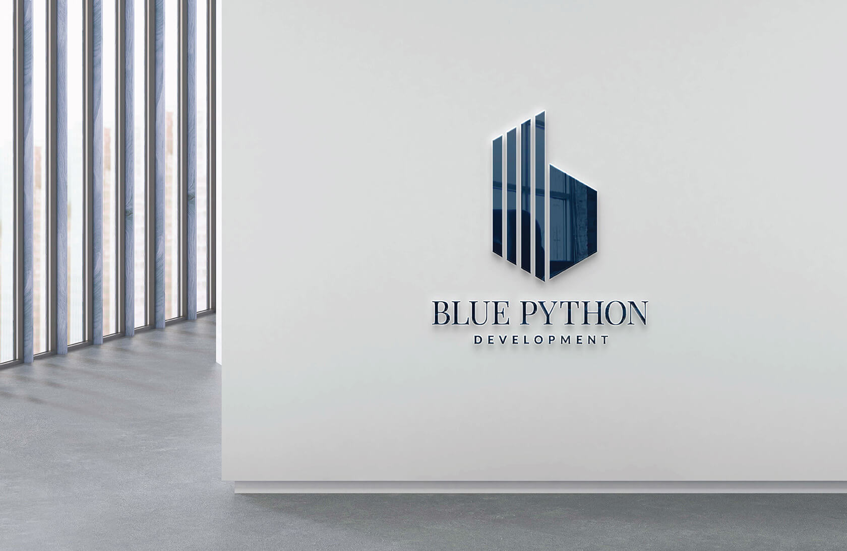
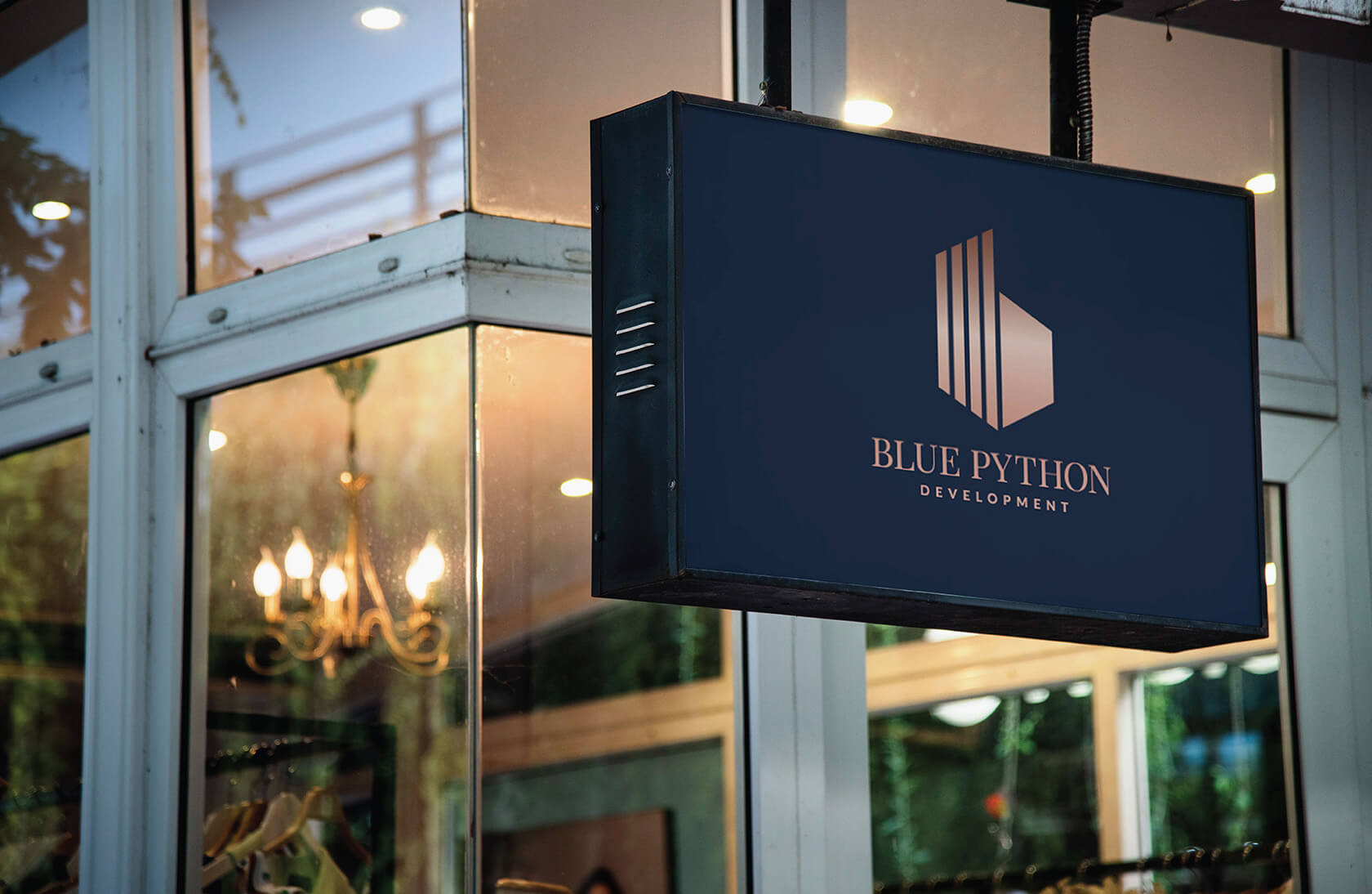
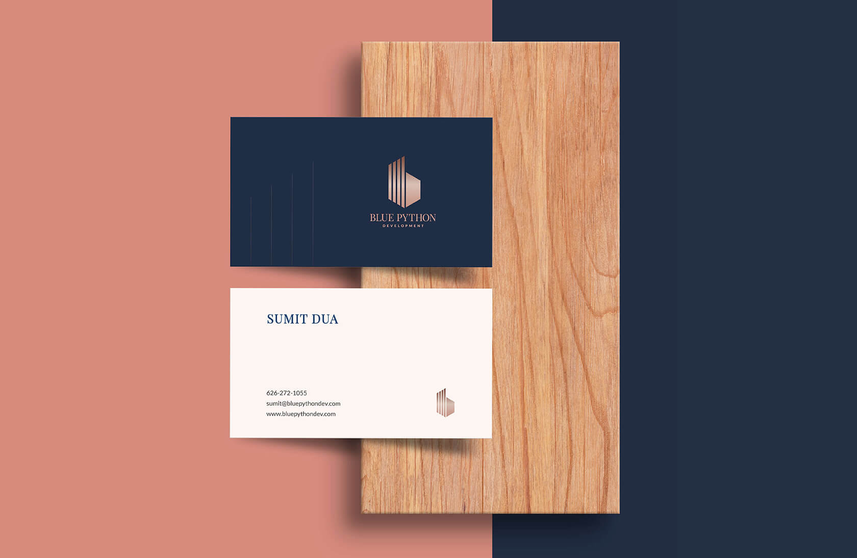
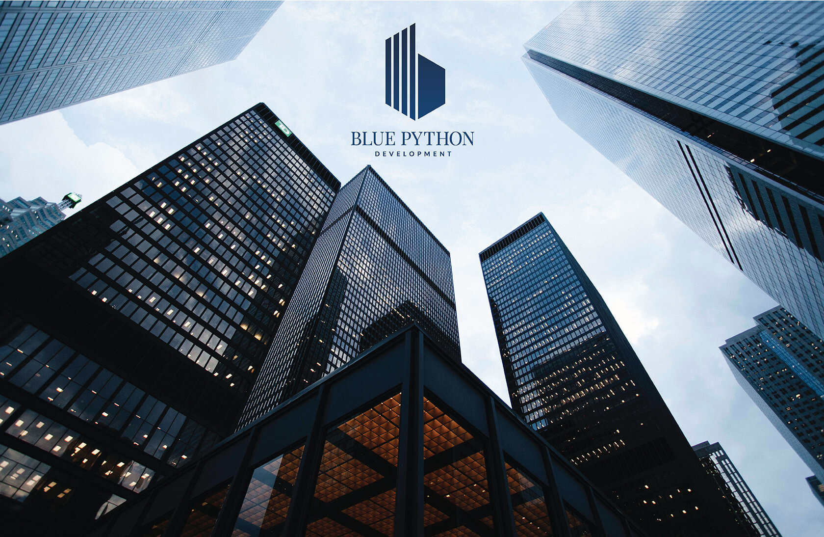
As part of creating Blue Pythons identity, careful consideration was given to the logo design.
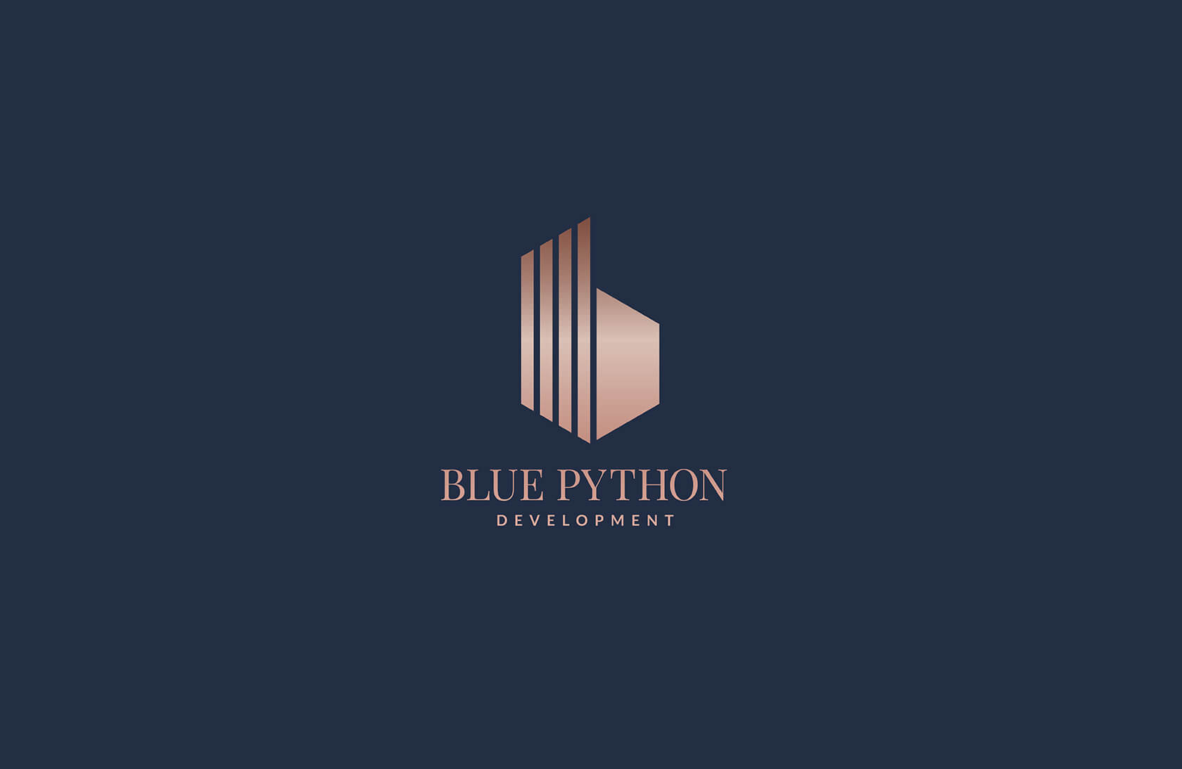
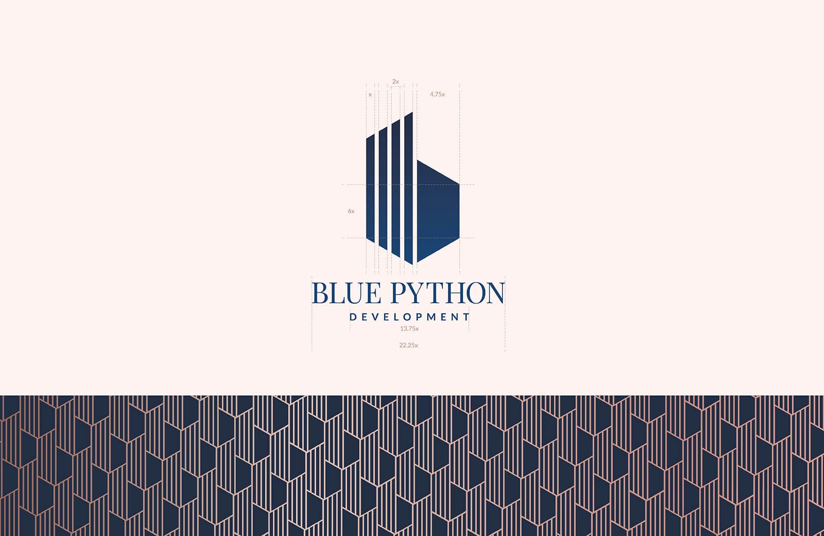
The logo represents the initial ‘b’ of the brand with three standing bars on the left, that has a direct indication to the industry and, are also representing bars of an upward graph for high returns on investment. The enclosing home-like shape on the right suggests the kind of properties that Blue Python deals in.
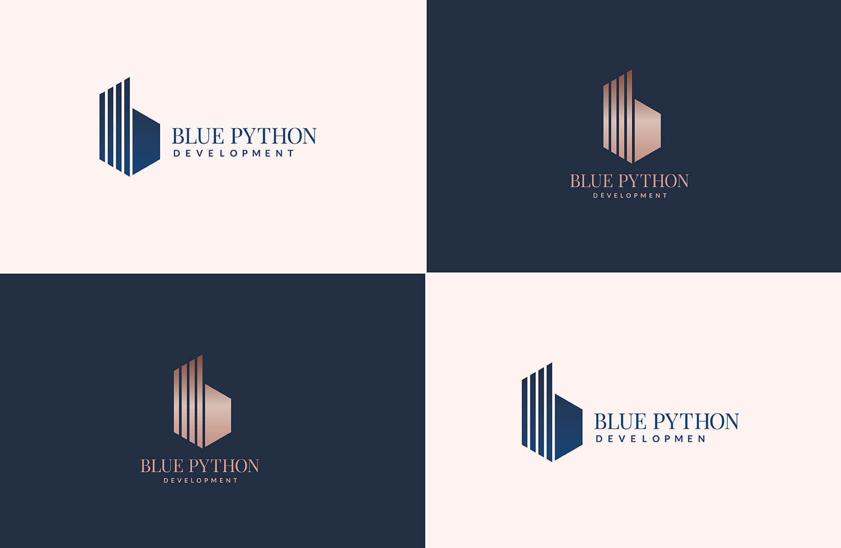
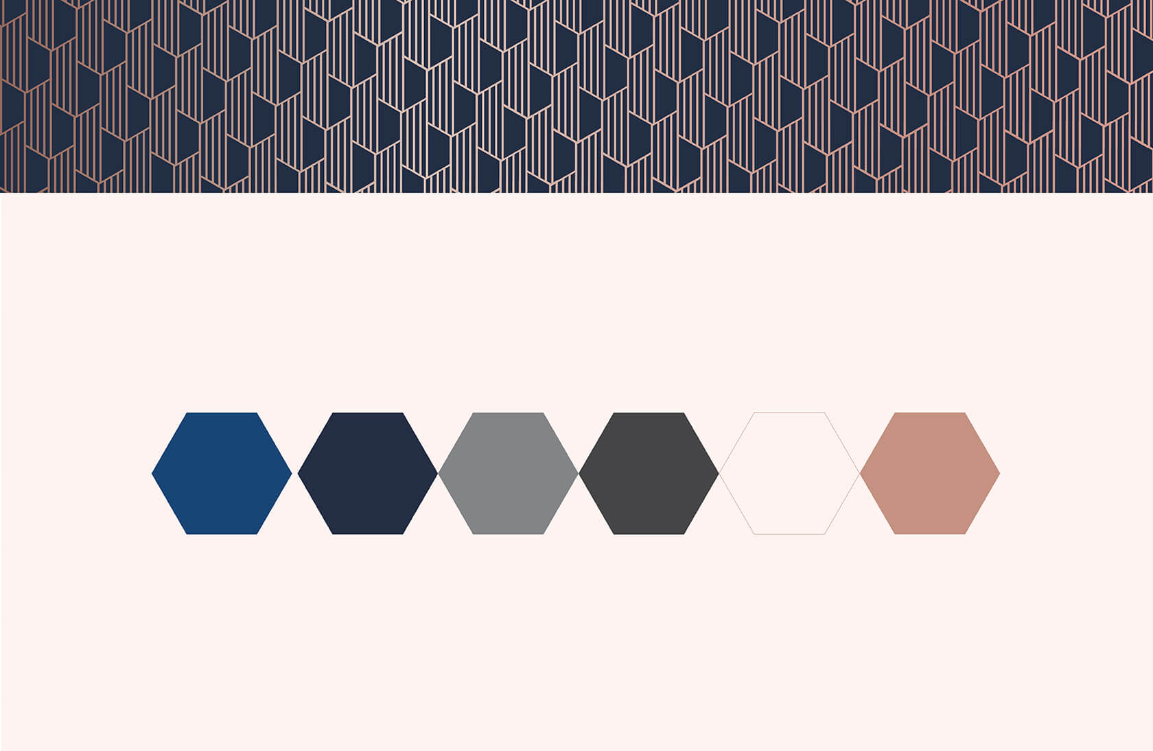
For Blue Python, the use of right colour and typography was the main focus since the appearance had to be of a brand that is high quality and reliable.
The choice of the first colour was easy, blue. But we chose to go for a darker blue with the ever elegant rose gold as the second colour for a more rich and elegant feel.
We selected playfair display and lato typefaces which we thought will help in protecting energy and enthusiasm into the entire brand communication.
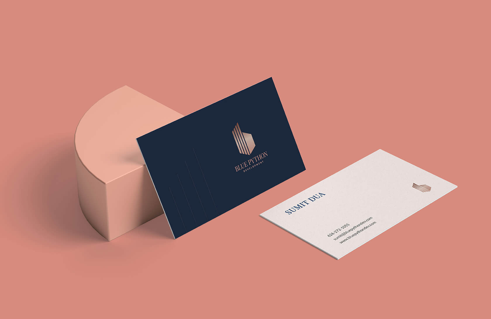
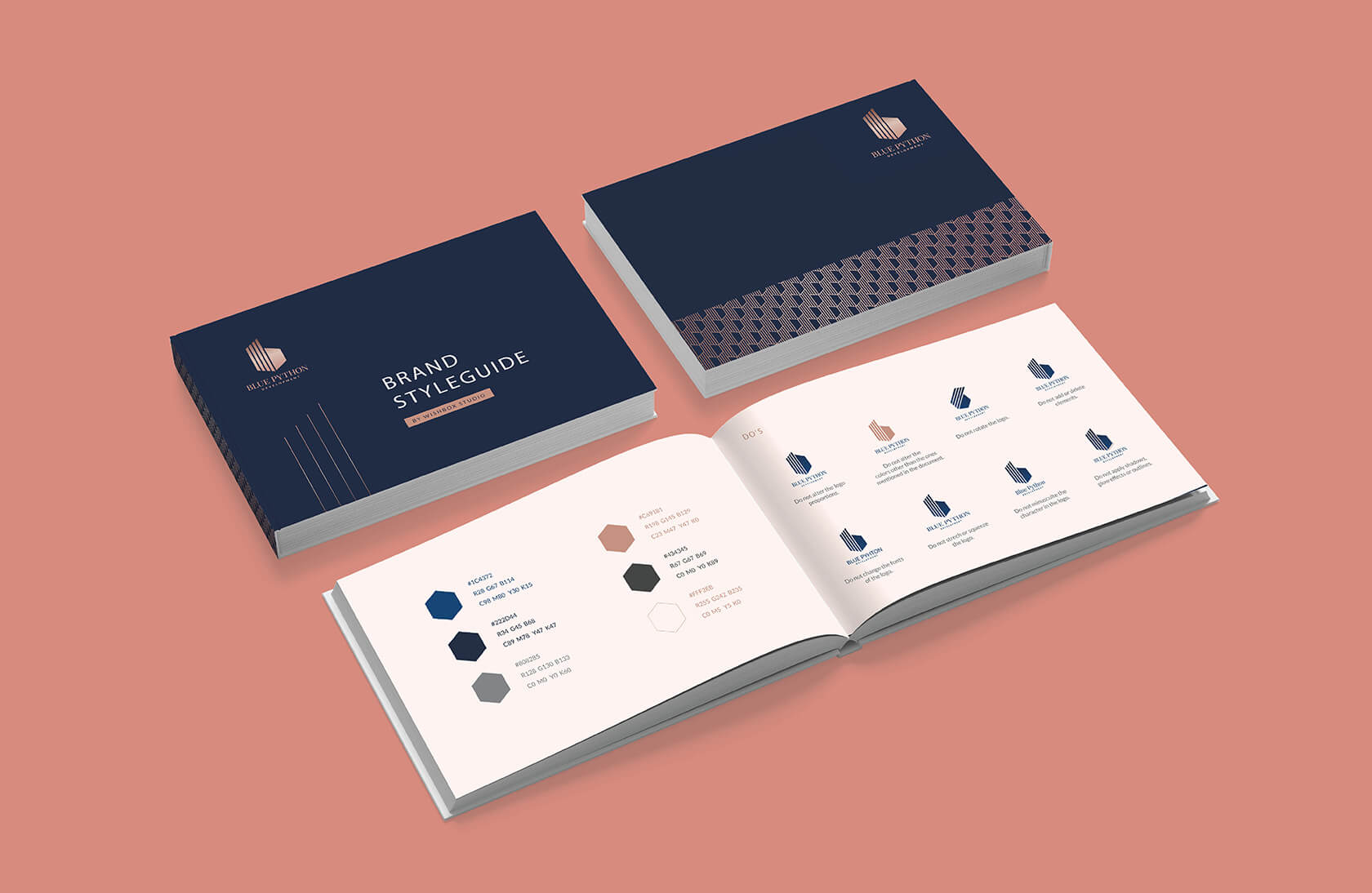
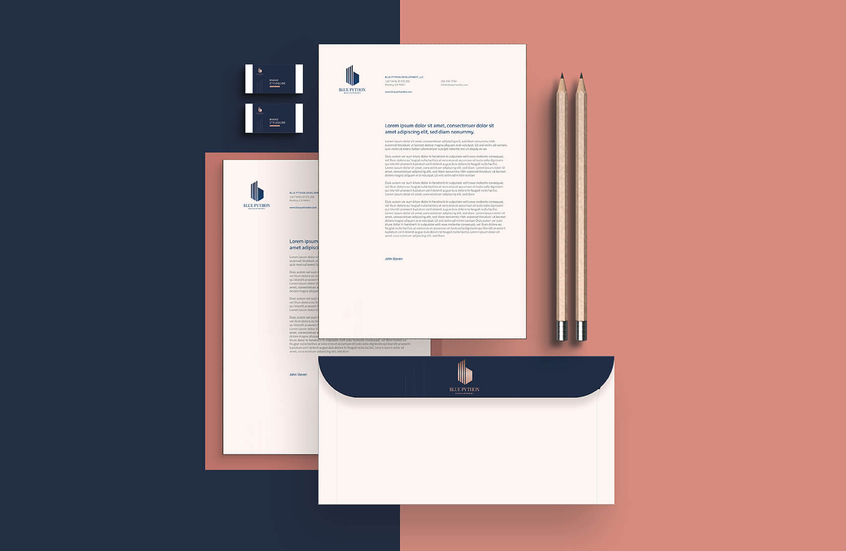
Creating a ‘Brand Identity’ isn’t solely the responsibility of a logo. This responsibility is shared by all the other brand collaterals as well.
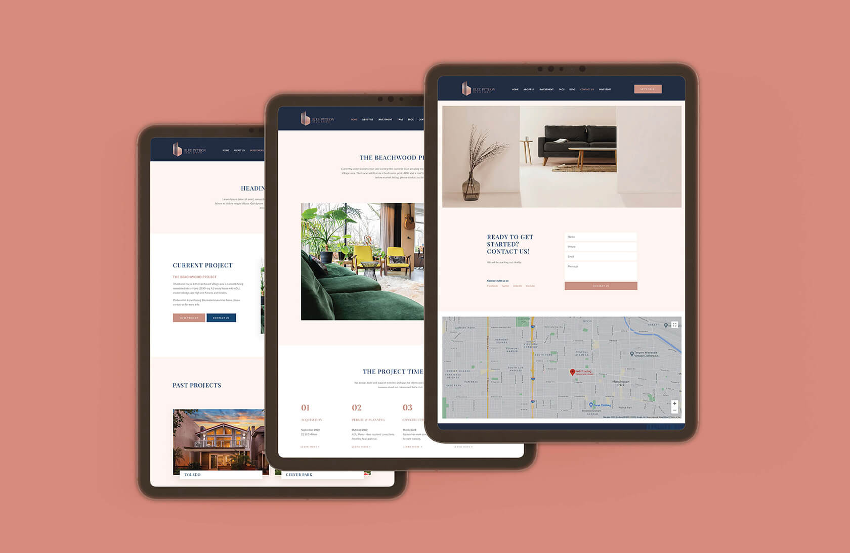
You can also have a look at their website here