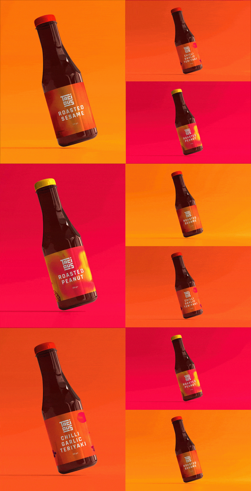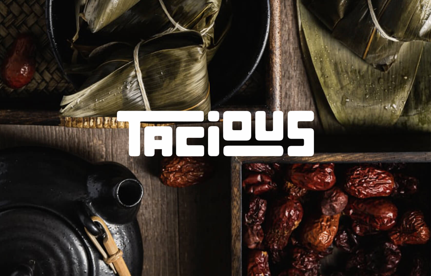
A gourmet asian sauces and condiments FMCG brand that caters to all your asian cuisine cravings, Tacious comes from the house of Kampai and Mai Bao, with an innate knowledge of asian flavours.
Team wishbox was approached for the branding and packaging and our main focus was to keep the brand identity open to expansion into other cuisines in the future.
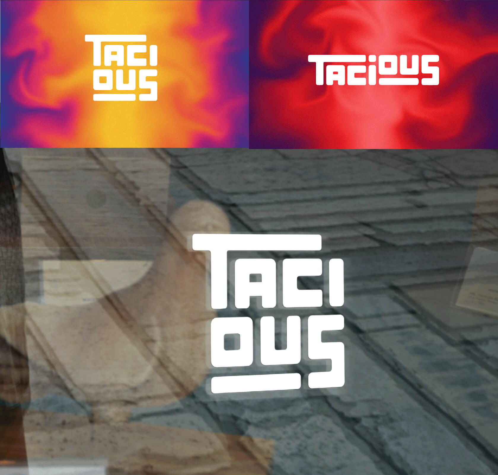
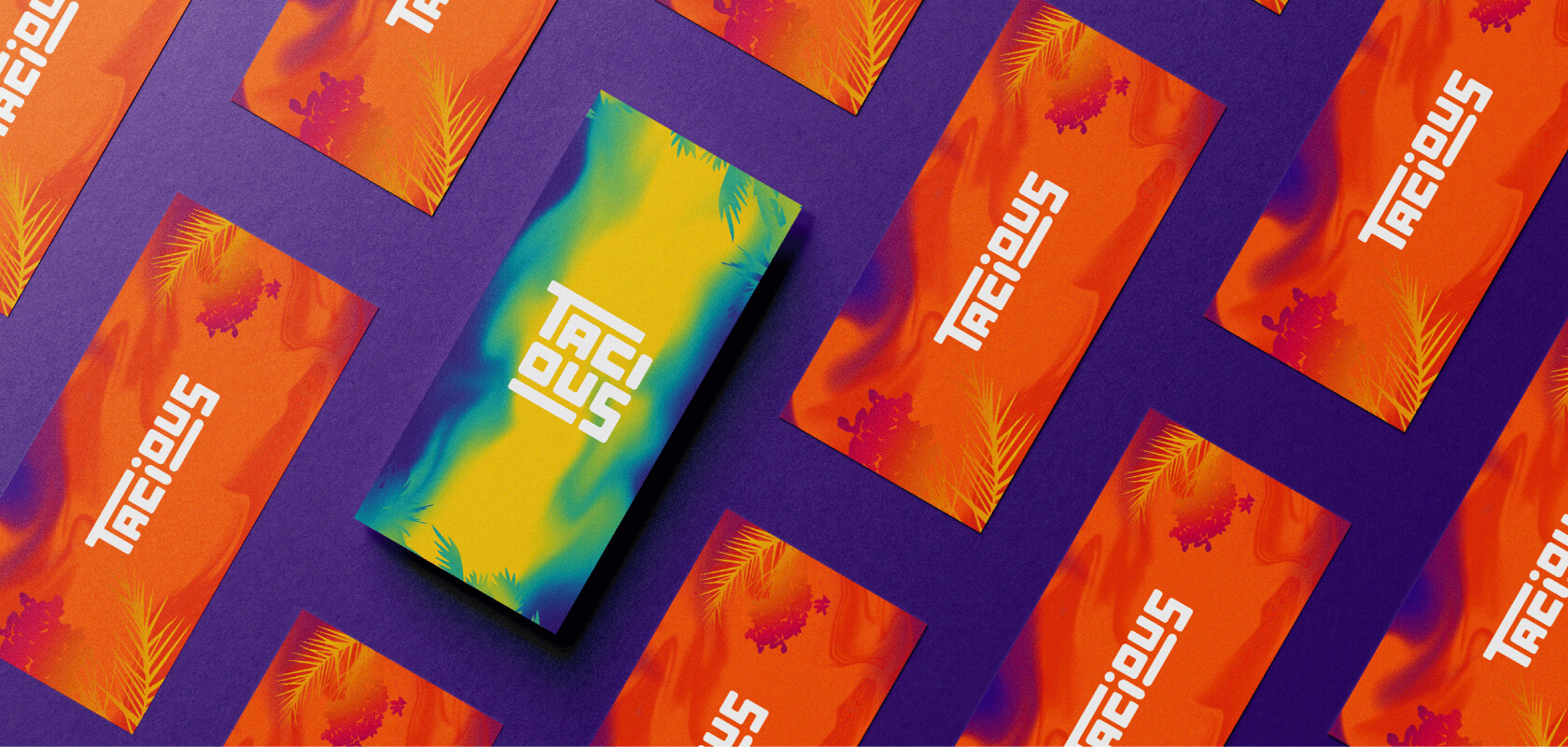
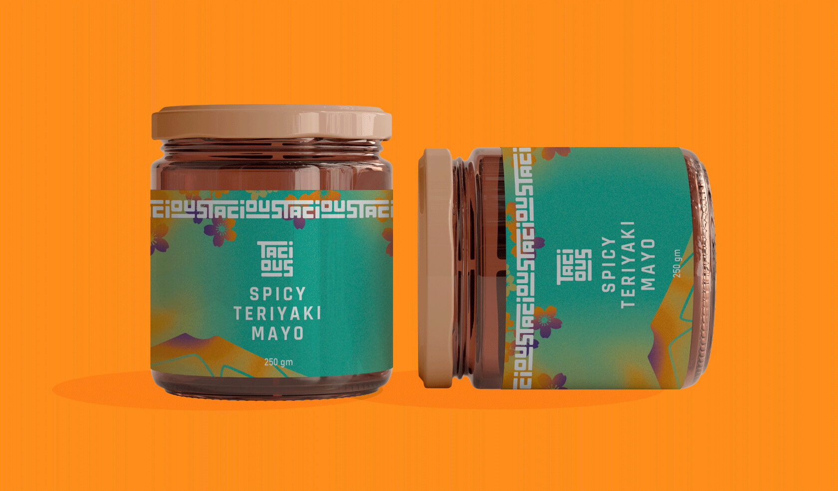
The logo for Tacious is entirely typography based, designed keeping in mind the future expansion plans into various other cuisines and dishes. The typography for the logo plays with sizes and is experimental, representing the brand’s identity of being fun and inventive, keeping the brand both premium and approachable.
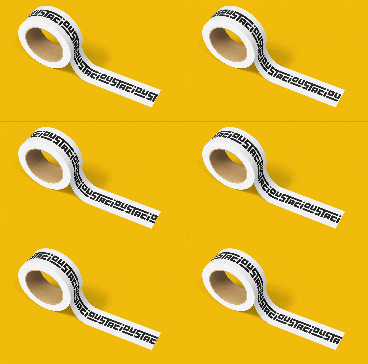
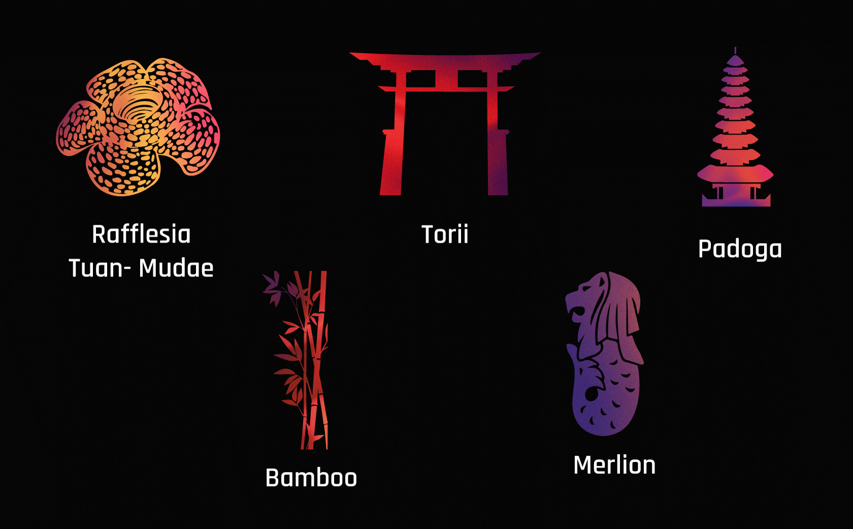
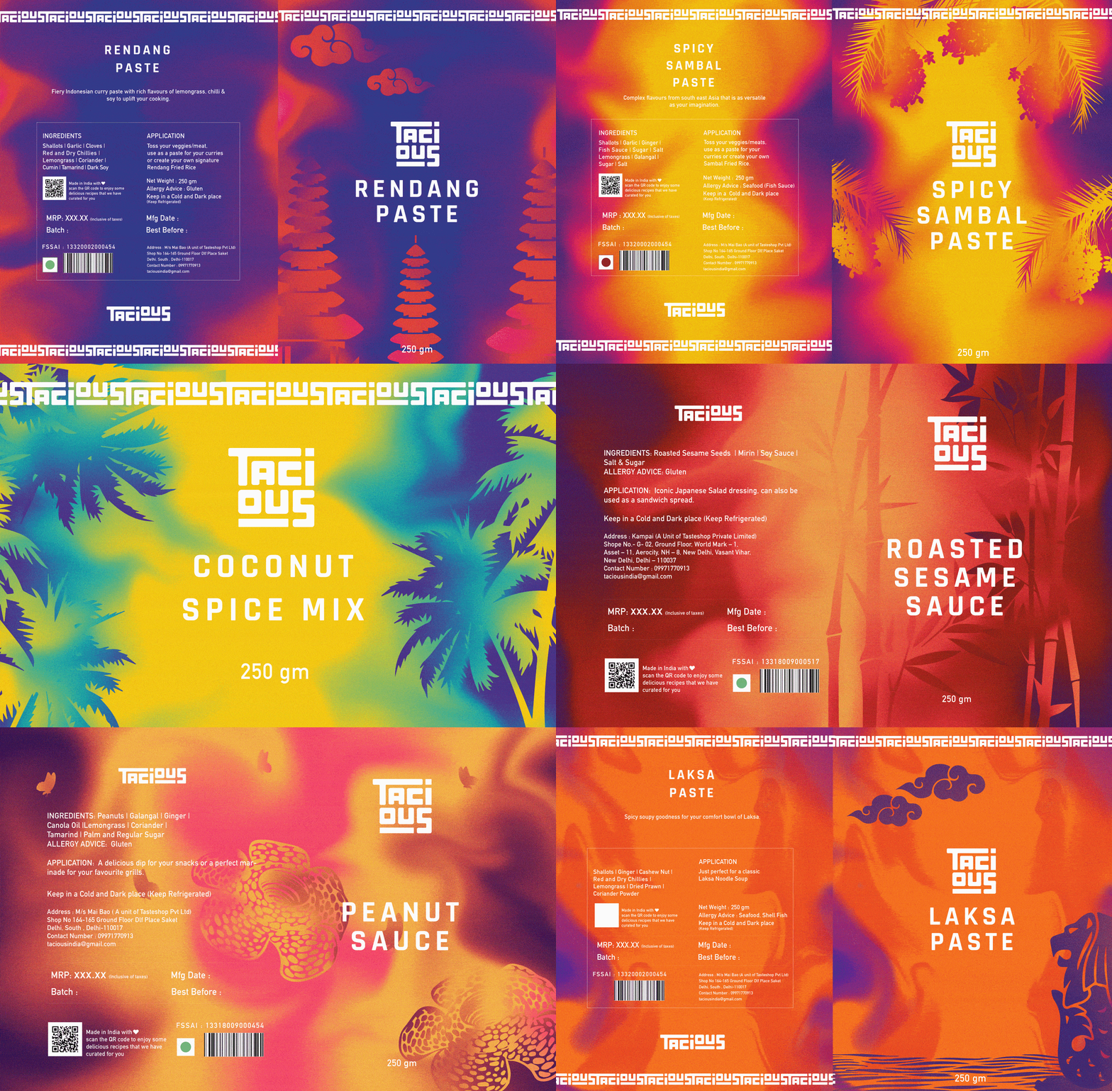
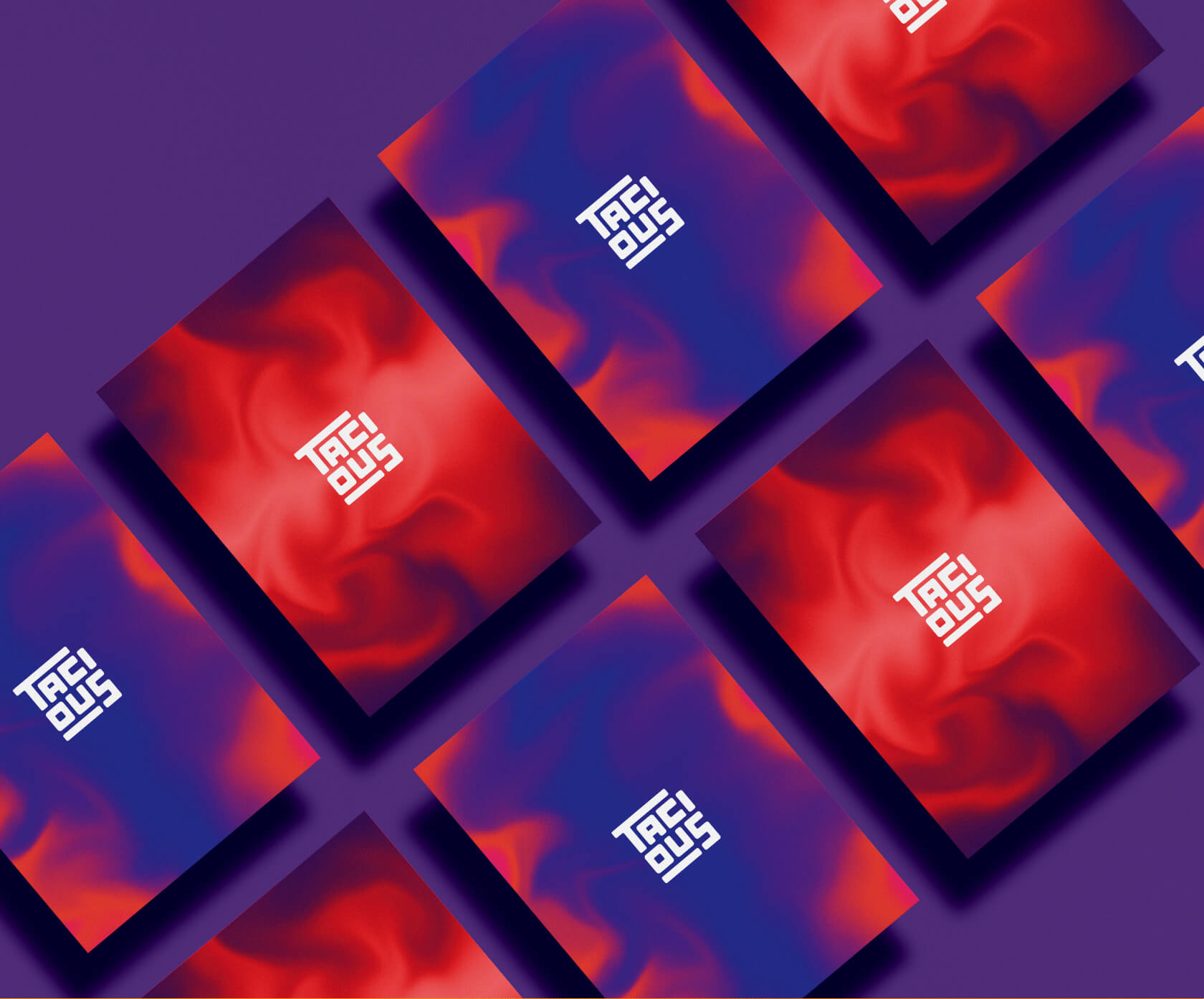
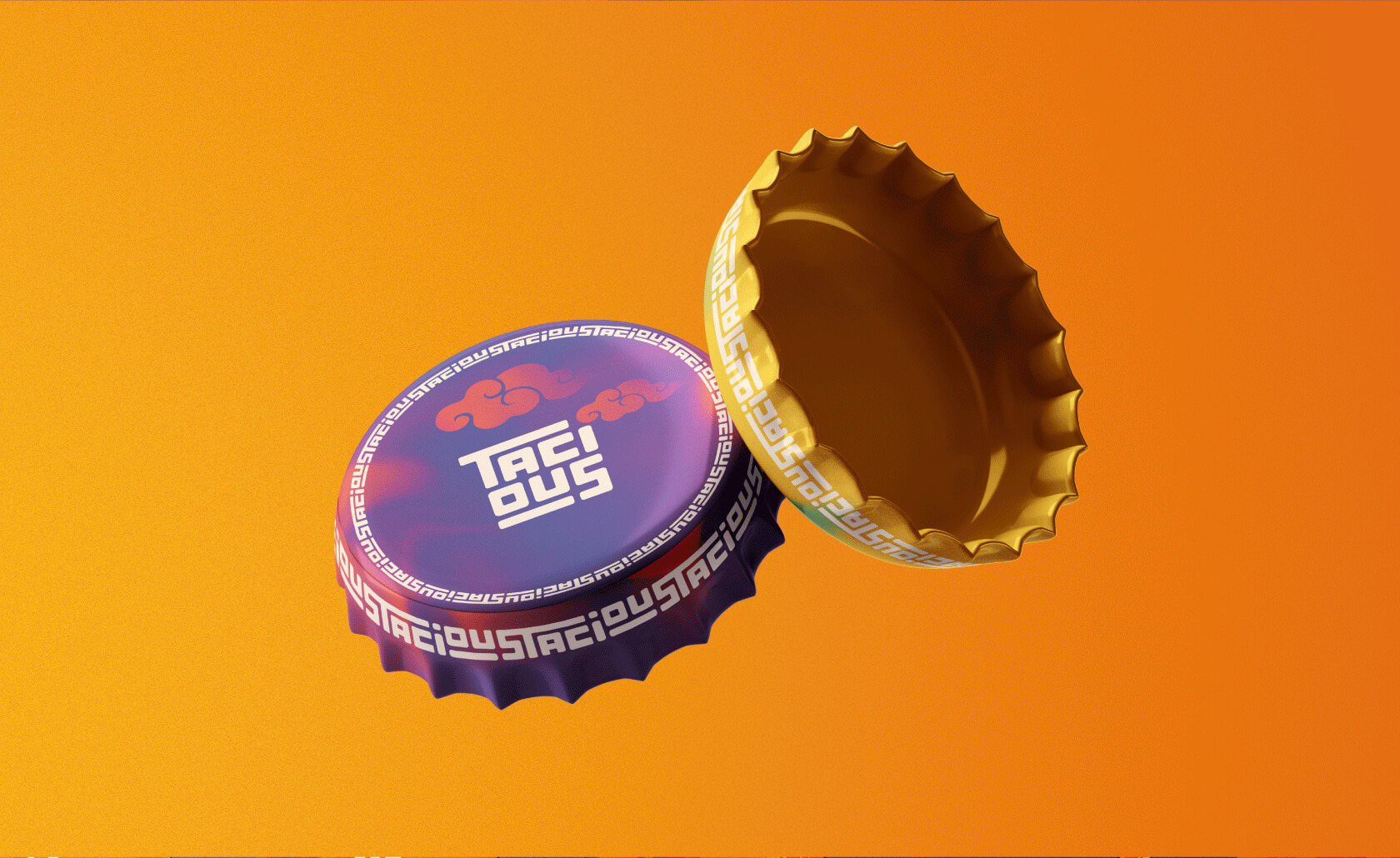
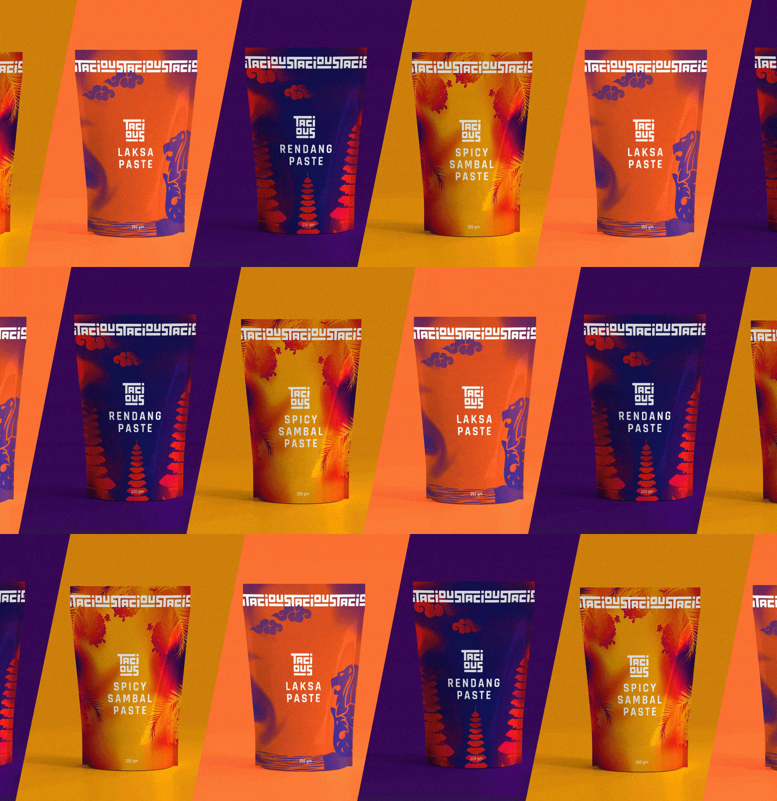
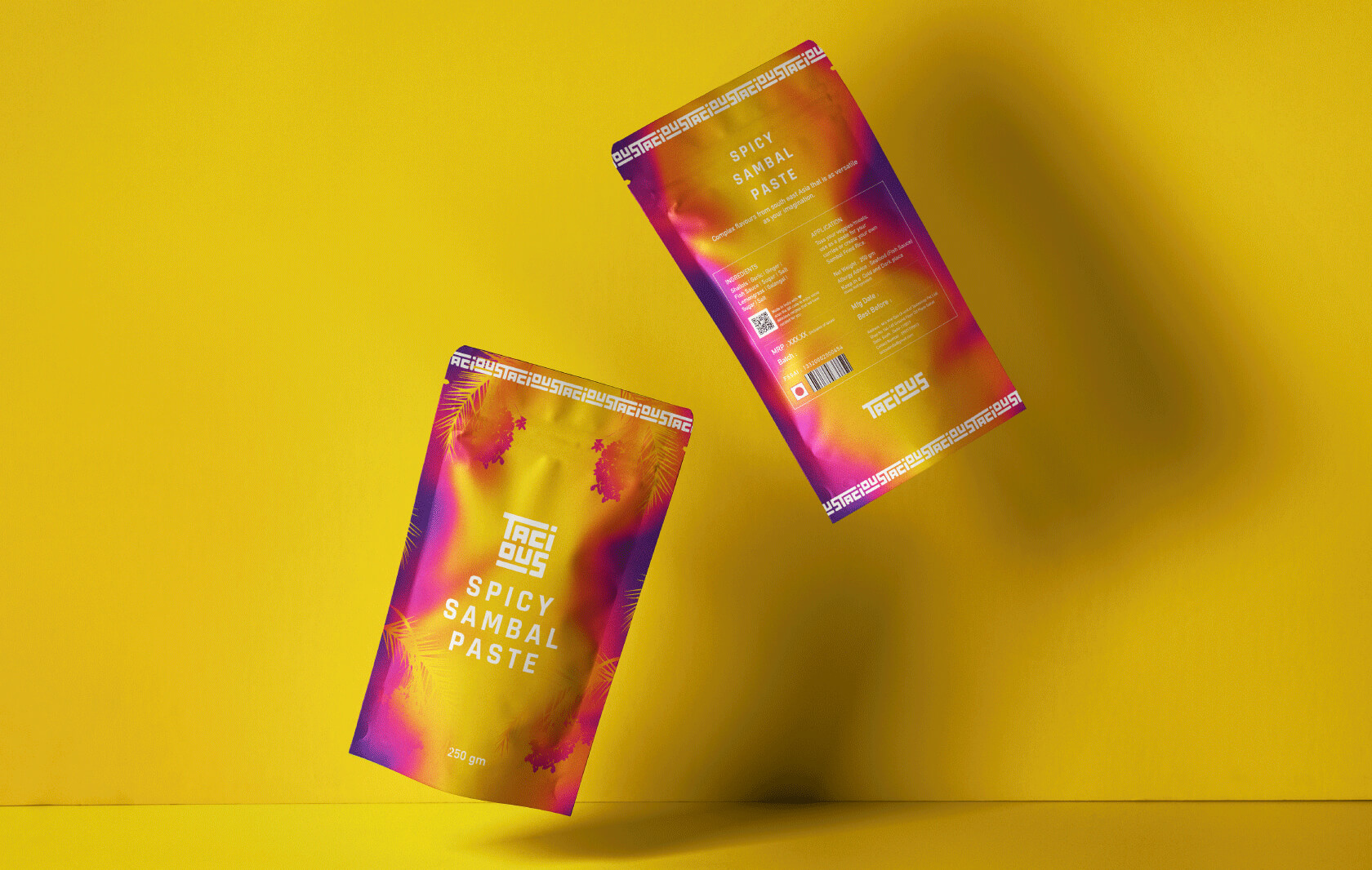
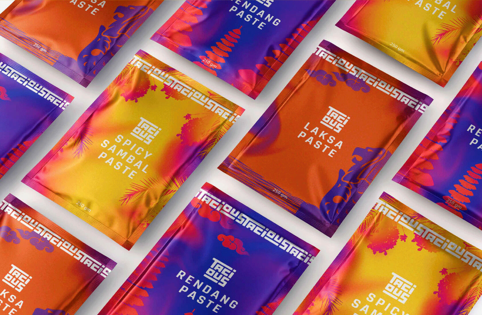
The overall theme for the packaging of Tacious was chosen as: heavily textured gradient meshes, aiming to show a burst of various flavours mixing into each other. The typography for the logo was extended into the packaging. We created a border using the typography which makes their packaging cohesive and unique. We also added various illustrated elements into the packaging that represent the place of origin of that product. These elements are meant to establish an instant connect with the audience about what the product is without having to read the fine print.
Tasty, delicious, appetizing, flavourful, rich, spicy, sweet & savoury = TACIOUS

