The restaurant industry in India has seen an explosion of pan-Asian cuisine over the last decade. From ramen bars to dim sum kitchens, urban diners are increasingly drawn to the comfort and depth of Asian soul food. Into this landscape came Burosu, a restaurant whose name is derived from the Japanese word for broth and whose food philosophy is grounded in home-style cooking simmered with care.
Burosu is not fine dining. It is something arguably harder to define and design for: everyday food that feels special. Rich in Asian heritage, the menu is built around comforting recipes that satisfy a genuine craving. When Burosu approached Wishbox Studio, the task was to build a brand identity that was as bold and flavourful as the food itself.
The Design Challenge
Lifestyle brand design for a restaurant requires a particular kind of confidence. The identity needs to do several things at once: attract attention in a crowded market, communicate the nature of the cuisine and build enough personality to earn loyalty beyond the first visit. For a pan-Asian soul food brand, there was also a risk of leaning too heavily into generic Asian visual codes, the kind of clichéd iconography that makes one restaurant look like every other.
Wishbox resisted this. The brief was clear: the Burosu identity needed to feel distinct, ownable and genuinely expressive of the brand’s personality.
The Visual Identity
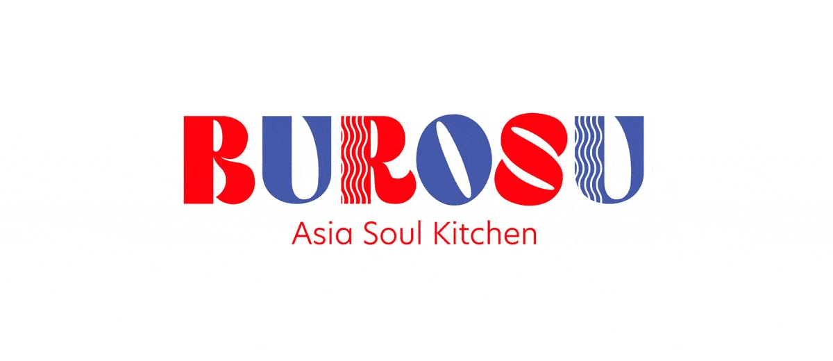
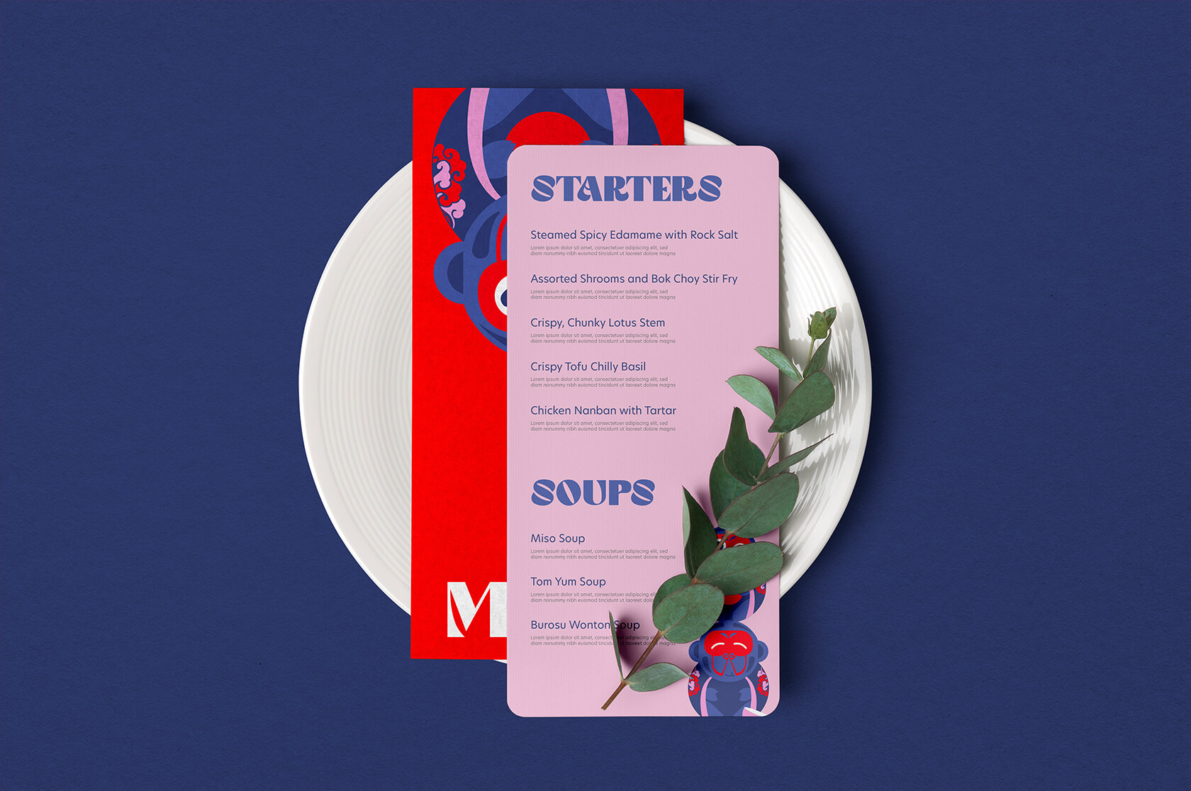
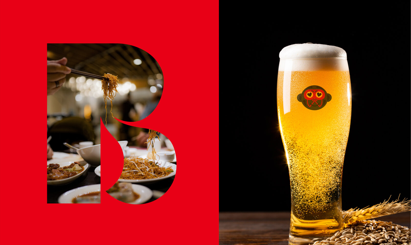
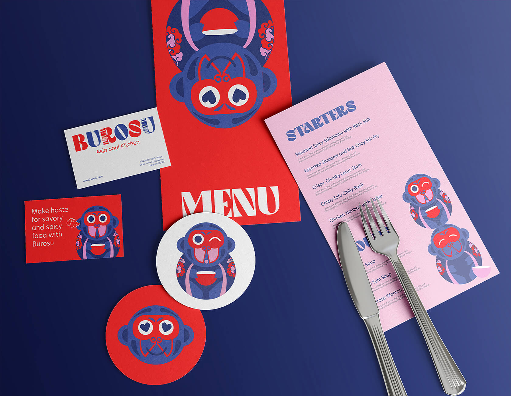
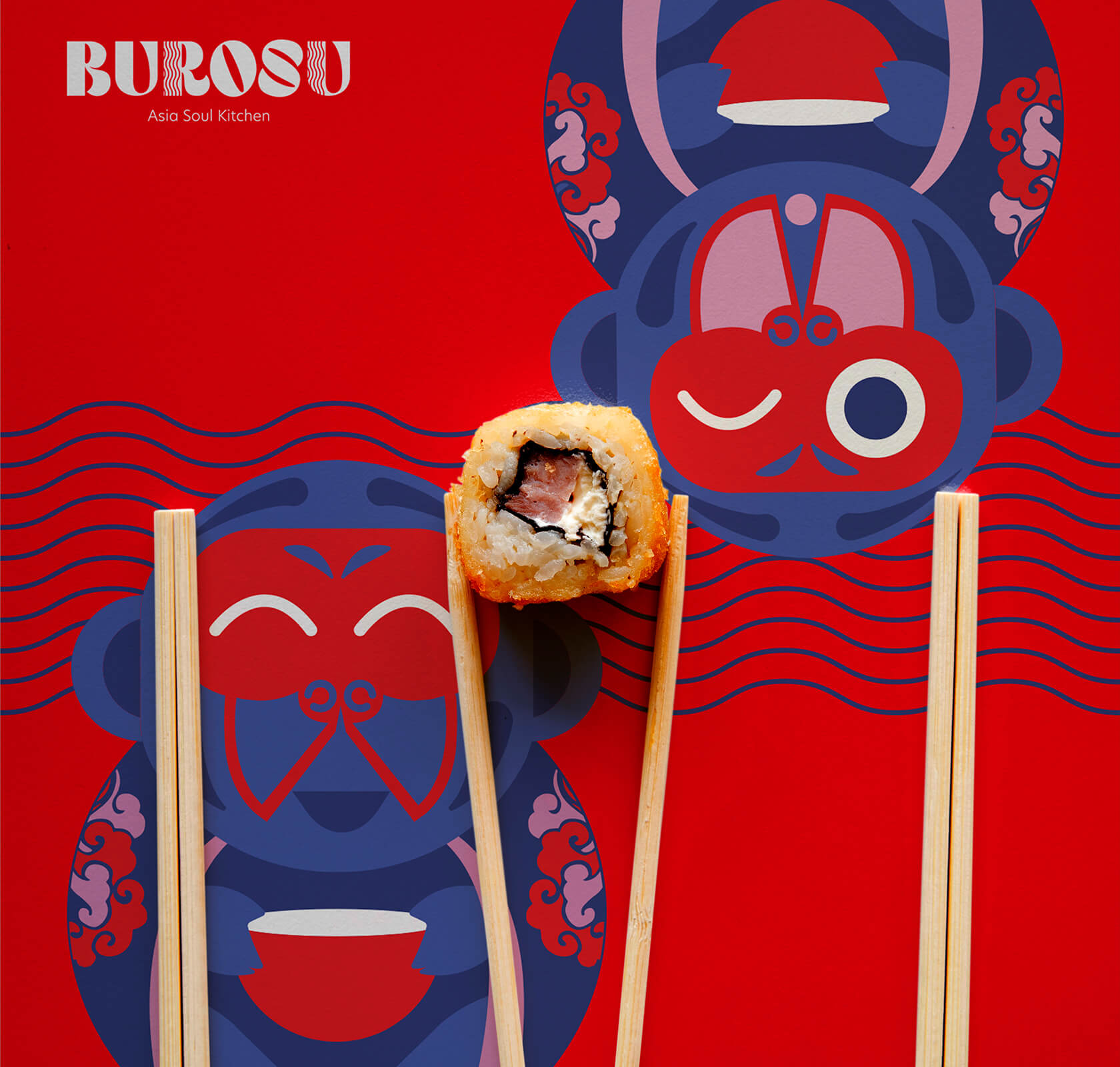
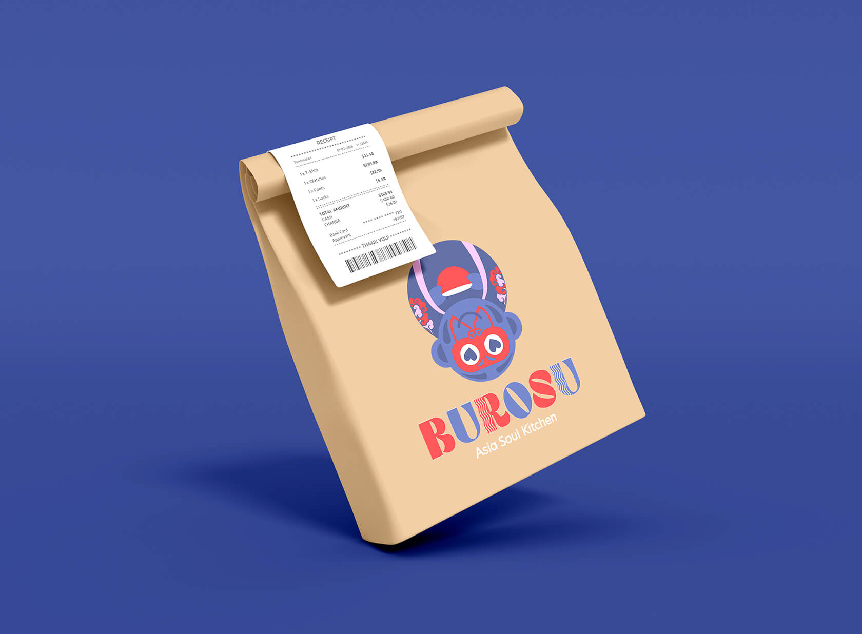
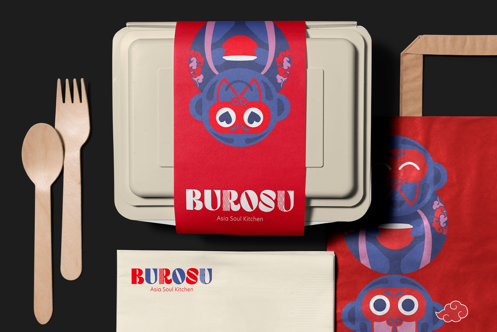
The logo design for Burosu starts with a bold chunky typeface that has an immediate presence. This is not a typeface that whispers; it commands attention and stays in the memory after a single encounter. The goal was instant brand recall and the typography delivers it.
Within the letterforms themselves, Wishbox embedded a layer of meaning that rewards closer attention. The letters R and U carry subtle wavy lines that reference noodles, the centrepiece of so much Asian comfort food. This detail is not laboured. It is intuitive enough to feel natural and specific enough to build a genuine connection between the brand name and the food it represents.
The Mascot
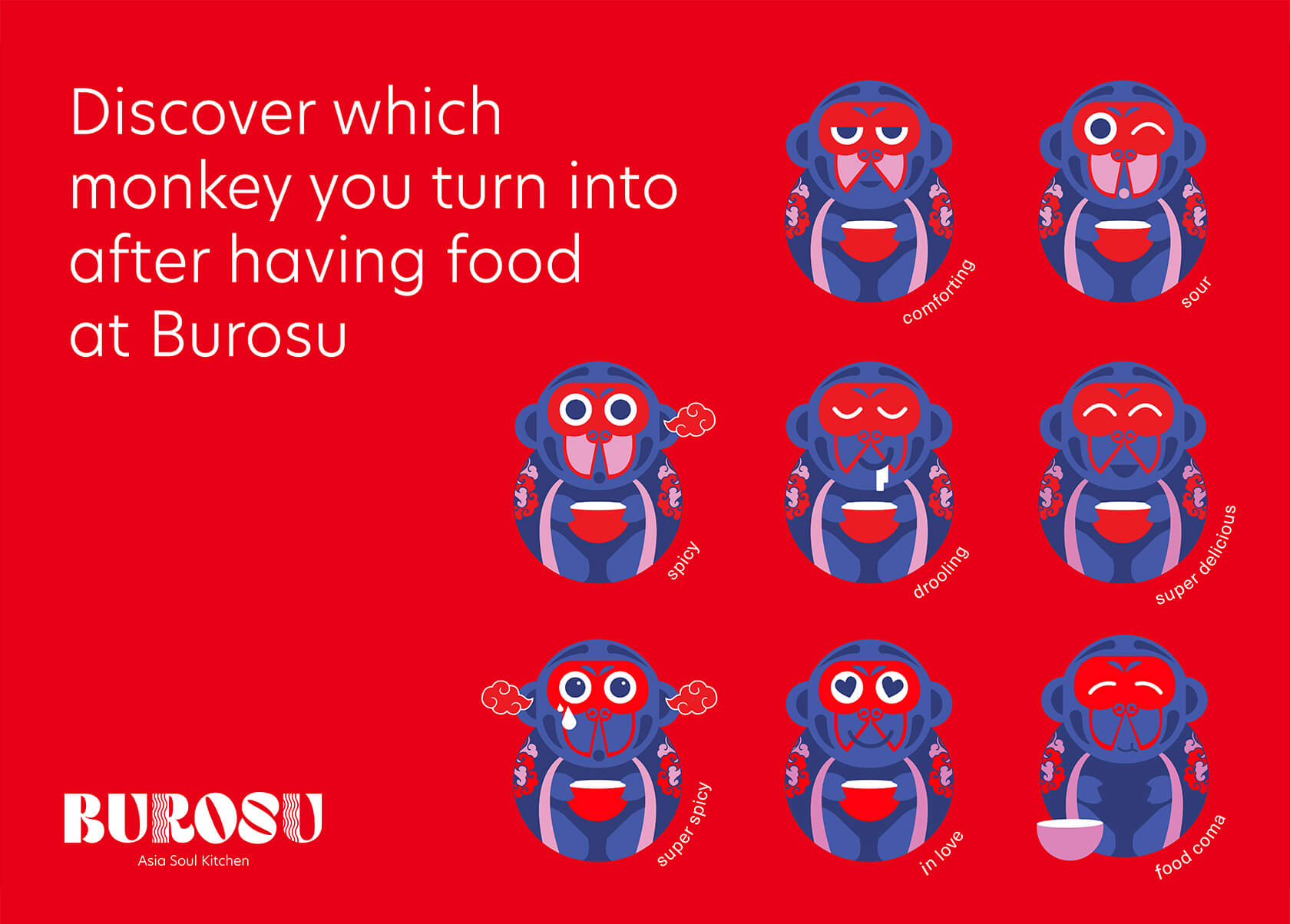
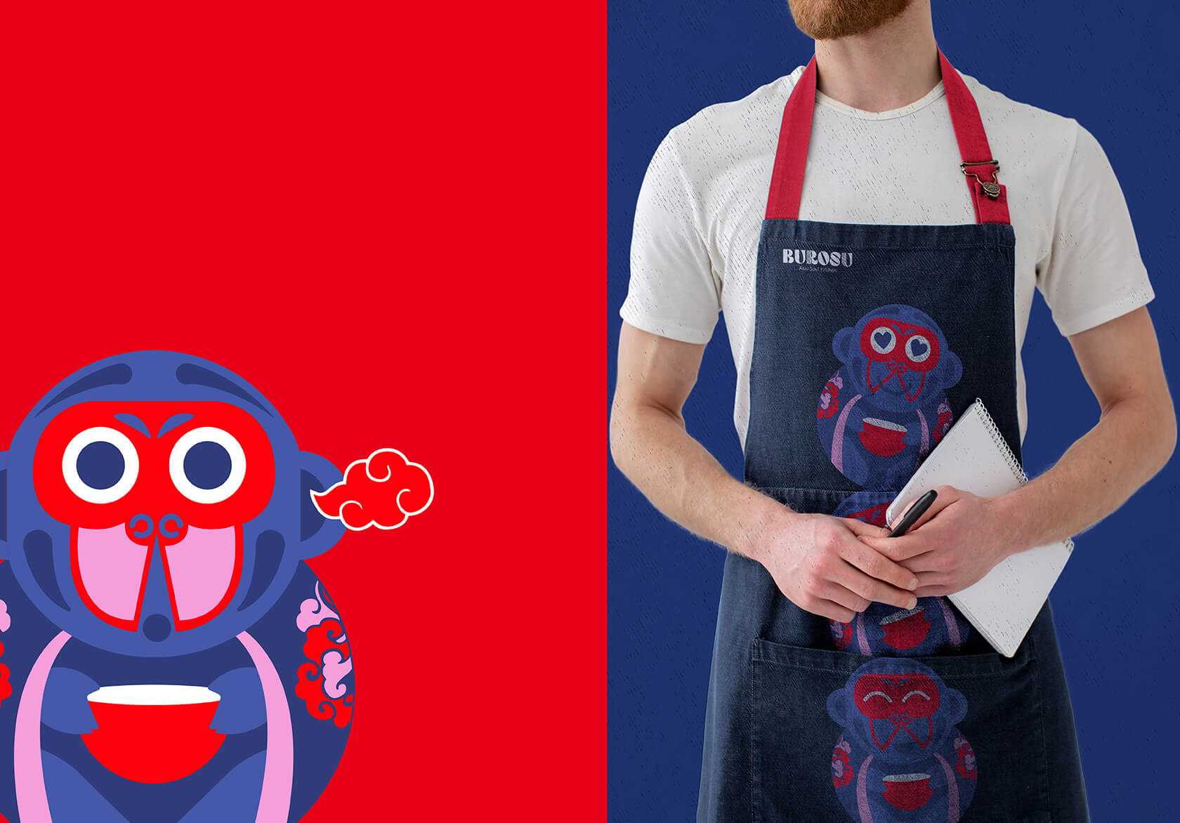
Perhaps the most distinctive element of the Burosu identity is its brand mascot: a quirky, expressive monkey rendered in a range of food-based emotional expressions. The mascot was created to give Burosu a face, a character that could carry the brand’s personality across digital platforms, packaging and in-store materials.
The choice of a monkey is deliberate. It is playful without being juvenile and expressive without being cluttered. The mascot can convey hunger, satisfaction, delight or mischief, all emotions that are deeply relevant to the experience of eating comforting soul food. In logo and packaging design, a well-conceived mascot becomes one of the most valuable long-term assets a brand can have. For Burosu, it is the embodiment of the brand’s spirit.
Who the Brand Speaks To
Burosu’s target audience is the urban diner who wants flavour, comfort and a bit of personality in their eating experience. They are not looking for ceremony; they want food that feels like it was made with love and a dining experience that has genuine character. The Burosu identity speaks directly to this appetite.
The Result
Wishbox’s brand identity for Burosu is a case study in how bold visual choices made with precision can cut through noise. The typeface earns attention. The embedded noodle detail earns affection. The mascot earns loyalty. Together they form a cohesive identity that is ready to grow with the brand, across merch, digital content, packaging and every other surface where Burosu meets its audience.
Big ambition. Small brand presence?
Let’s design the strategic positioning that attracts the right opportunities.