top


The premium fabric and linen market in India occupies a quietly significant place in the lifestyle retail landscape. As consumers grow more discerning about the materials that furnish their homes and wardrobes, the demand for quality textile retail, backed by provenance, craftsmanship and considered design, has grown steadily. Chandrika is a brand that understood this shift early.
A luxury linen and fabric retail outlet that both imports and manufactures cloth for a premium lifestyle, Chandrika is not simply selling fabric. It is selling a sensibility. The materials it offers are chosen with care and the clientele it serves expects that care to be felt at every touchpoint, including the brand itself.
The Brief
When Chandrika approached Wishbox Studio, the brief contained a productive tension that made it genuinely interesting to solve. The identity needed to be chic, modern and stylish, qualities associated with contemporary luxury branding. At the same time, it needed to carry a tone of earthiness and sophistication, qualities more typically associated with heritage and craft.
These two sets of values are not contradictory, but they require careful calibration to hold together. A brand that leans too far into modernity can feel cold and disconnected from the tactile warmth of fabric. A brand that leans too far into earthiness can feel heavy and dated. The task was to find the point where these sensibilities meet.
The Design Approach
Wishbox approached the Chandrika identity with the same precision the brand applies to its materials. Product branding for a luxury textile label draws heavily on the language of restraint, the understanding that quality announces itself through what is left out as much as through what is included.
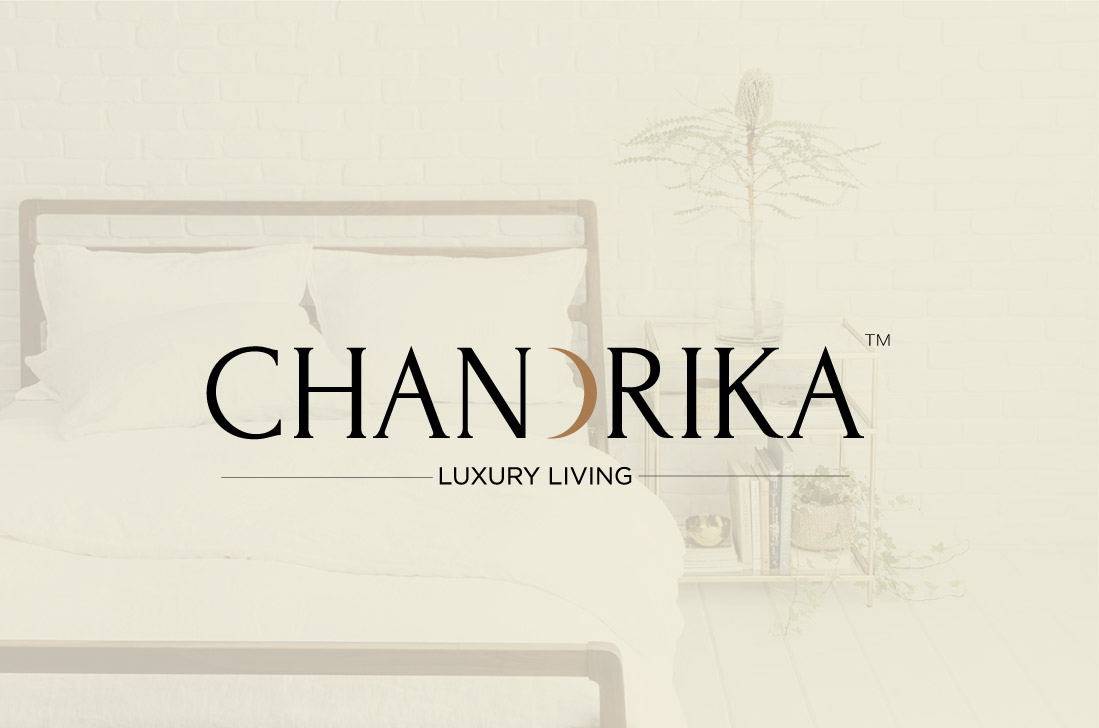
The resulting identity is clean without being clinical. It carries visual warmth without becoming ornate. The palette and typographic choices reflect the dual nature of the brand brief: there is an elegance to the overall system that speaks to the modern luxury consumer, while the tonal choices ground the identity in something more elemental, the feel of natural cloth, the richness of well-sourced fabric.
This balance is difficult to achieve in FMCG packaging design and product collaterals, where the temptation to over-decorate is constant. Wishbox resisted this, letting the identity do its work with confidence and economy.
Who Chandrika Speaks To
The Chandrika customer is someone for whom the quality of material is not an afterthought. They are likely furnishing a considered home or building a wardrobe with an eye toward longevity over trend. They understand the difference between fast fabric and something that has been sourced and made with genuine care. For this audience, the brand identity is a form of reassurance, a signal that the values they bring to their purchasing decisions are shared by the brand they are buying from.
The identity also needs to work for interior designers, stylists and other professionals who may source from Chandrika on behalf of clients. For this audience, sophistication and clarity are equally important. The brand must convey authority without being inaccessible.
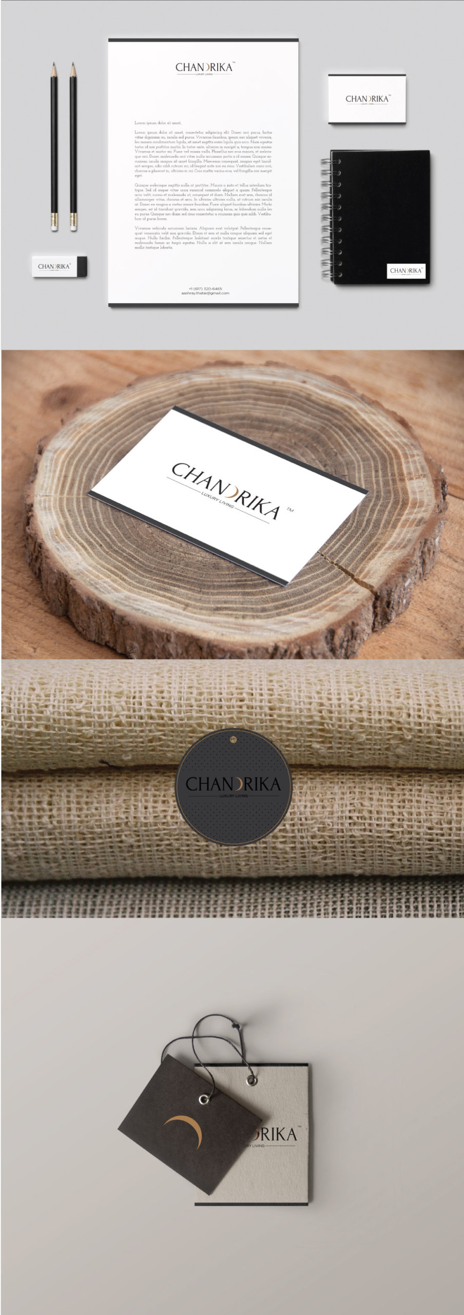
Collaterals and Brand Extensions
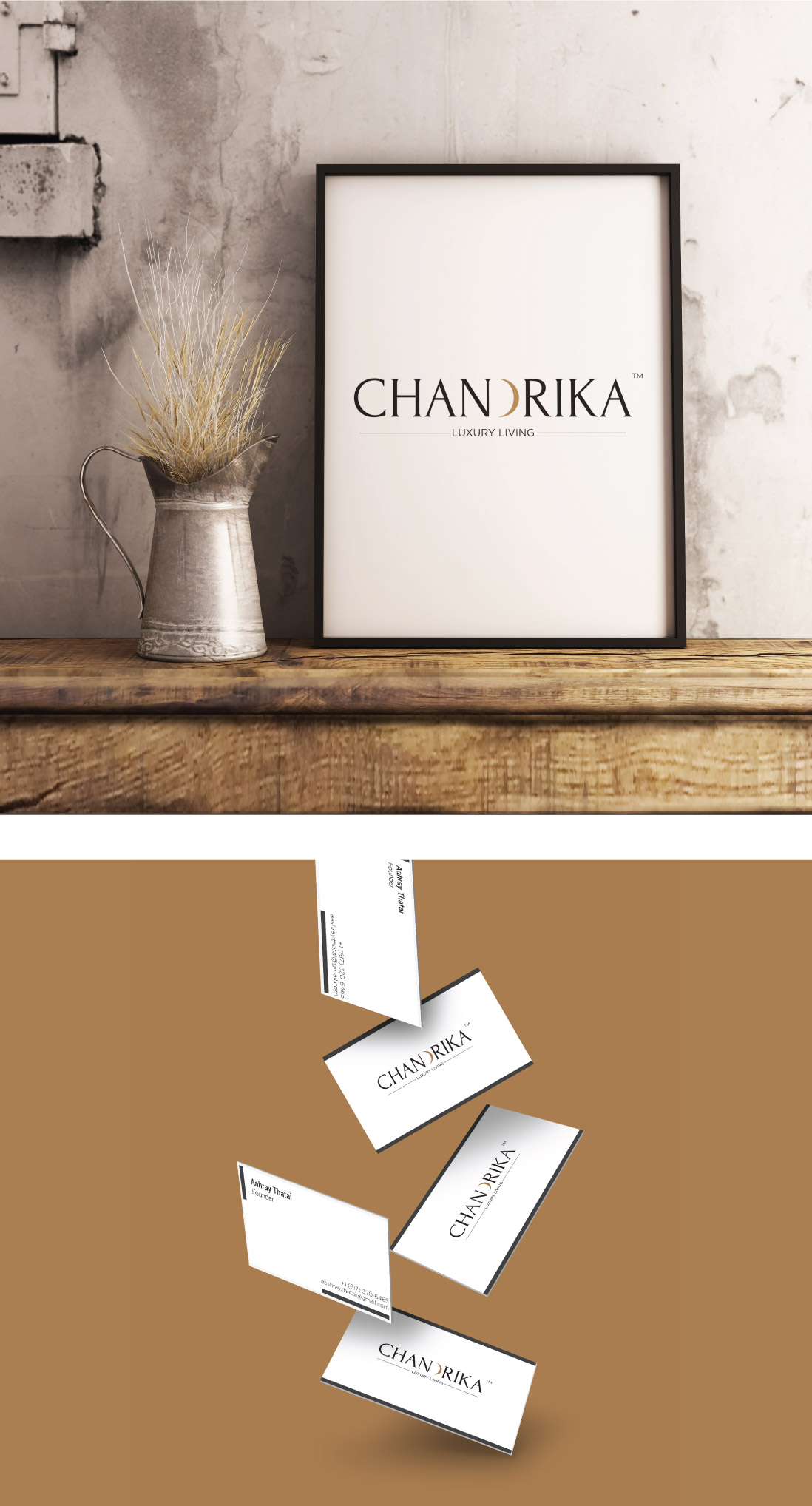
The brand collaterals designed by Wishbox for Chandrika carry the visual language of the core identity into every interaction. Stationery, packaging and brand materials all reflect the same calibration of modern refinement and earthy warmth. In luxury retail, the unboxing and in-store experience are inseparable from the product itself. A piece of beautifully sourced linen wrapped in packaging that fails to match its quality creates a dissonance that undermines the entire proposition.
By ensuring the visual system extends coherently across all collaterals, Wishbox gave Chandrika a brand presence that feels complete, from the first point of discovery to the moment the fabric is in the customer’s hands.
The Broader Impact
Chandrika’s brand identity is a case study in how premium positioning is built through design decisions that mirror a brand’s actual values. The identity does not claim luxury through obvious signifiers of wealth. Instead, it earns it through restraint, coherence and a visual language that feels genuinely aligned with the materials the brand sells. For a fabric retail brand operating in the premium lifestyle segment, this kind of authenticity is not just desirable; it is the foundation on which customer trust and long-term loyalty are built.


Big ambition. Small brand presence?
Let’s design the strategic positioning that attracts the right opportunities.