Mango Tree

Key Findings
While most people love handicrafts, they are viewed as too expensive. Due to the handcrafted nature of handicrafts, production value of goods run high, making it seem like a business that cannot be scaled and was thus non-sustainable.
There were mental associations of traditional as being completely separate from modern, with no overlaps. This stereotype had to be broken if artisanal skill was to be properly positioned in the modern luxury market.
Millions of Indians are still heavily dependent on indigenous modes of production, traditional crafts and methods to earn their livelihood. These artisans form the major chunk of the non-agriculture based rural economy with handmade products and goods. There are around 7 millions craftspeople according to official records and up to 200 million, as per unofficial sources in the country!
Context
The world has started inching towards sustainability. In a connected world that has a new-found consciousness, the meaning of ‘luxury’ in the future will change; it is going to be handcrafted indigenous crafts, each with their own stamp of uniqueness, that is re-interpreted through all types of design.
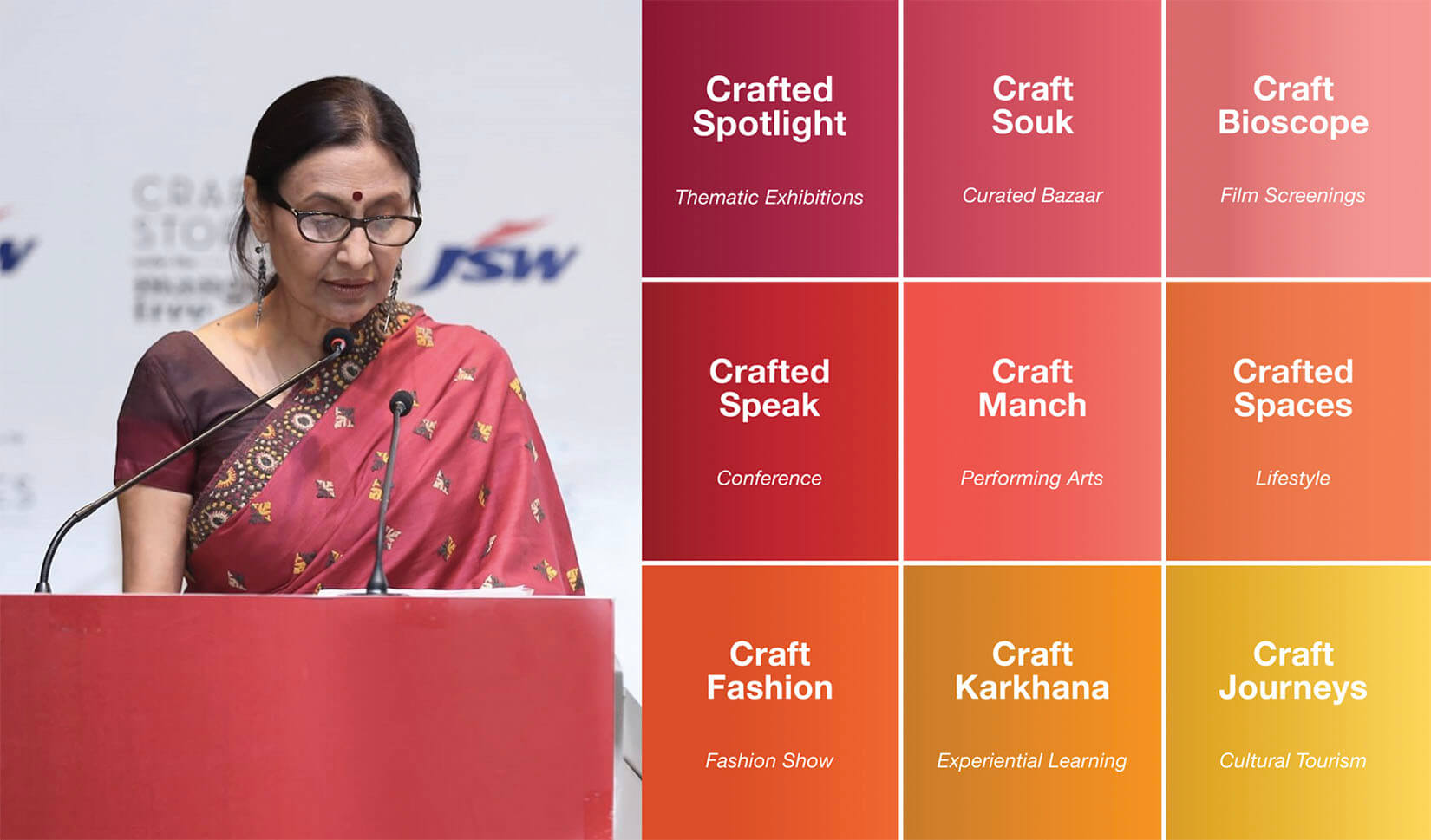
With this thought in mind, Anjana Somany, the founder, director of Mango Tree, India organized ‘The Business of Handcrafted Sustainable Luxury – A conference on Guiding the Future of the Indian Handicraft Sector’.
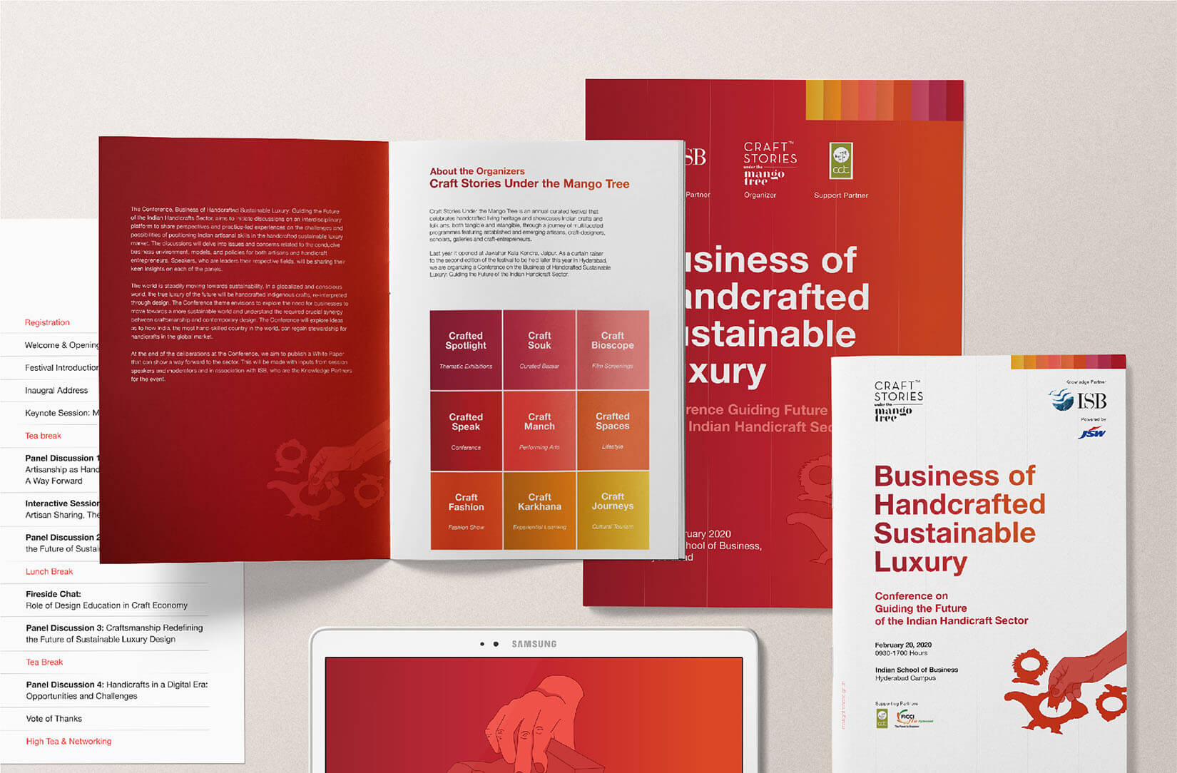
The theme ‘Business of Handcrafted Sustainable Luxury’ envisions to explore the need for businesses to move towards a more sustainable world and understand the required crucial synergy between craftsmanship and contemporary design. The Conference was to explore how India, the most handskilled country in the world with a massive human resource, can regain stewardship for handicrafts in the sustainable luxury market.
This was an important topic for deliberation for Anjana Somany, since she herself had been immersed in the field of culture, with a focus on music, crafts, and theatre for the past forty years. With her feet planted firmly in the market for handcrafted, artisanal skills and crafts, under her company Craft stories Under the Mango Tree, she felt that this conference was a must-have in a world that was now opening its eyes to sustainability. She partnered with Wishbox Studio to create the visual identity of the conference and also to create a hype about it amongst the target audience.
The Problem
The conference aimed to initiate reflections and conversations on an interdisciplinary platform to be able to objectively view and share perspectives on Indian artisanal skills. The focus was on the challenges, opportunities, and positioning of these skills in the handcrafted sustainable luxury market.
The biggest challenge was that most people view traditional art and craft as something that belongs well into the past. There is an automatic association of the traditional craft with the ‘vintage’ which is why there is a declining trend in use of these techniques in modern crafts and businesses. This stereotypical association was to be broken, and new explorations were to be made.
Design wise, while we were to highlight that the conference was about hand-crafted luxury, we had to be very careful so as to bring in a modern look and feel to the mix so as to highlight its position in the modern market. We were to bring in a new relevance of the traditional, in a new world that wanted sustainable luxury. Our biggest challenge was to ensure that the visual language, while modern and relatable, had to have touches of the ‘organic’, with a special focus on the word ‘handcrafted’.
For the past four decades, Mrs. Anjana Somany has been doing exemplary work in the field of arts and crafts. She is the Member Founding Committee Crafts Council of Andhra Pradesh and Delhi Crafts Council and has conducted workshops and exhibitions in India and on international soil. However, on the PR front, the primary problem was that while she was a pioneer in her field, she had been doing so silently, leading a private life and her achievements had not been documented by the media at all. There were no notable impressions on search engines and she had been doing all this work from obscurity.

The Brief
Our design brief was focused on creating a recognizable identity for a festival that was focused on hand-crafted art and fashion, but to make it seem like these traditional craft belonged in the modern world. We were to seamlessly pair the two, and make this amalgamation seem natural.
On the PR front, we were to aggressively promote the conference so that there was a noticeable spike in audience participation. The aim was to bring as many people as possible to the conference, and also to ensure that this audience had some relevance to the field.
Strategy in Design
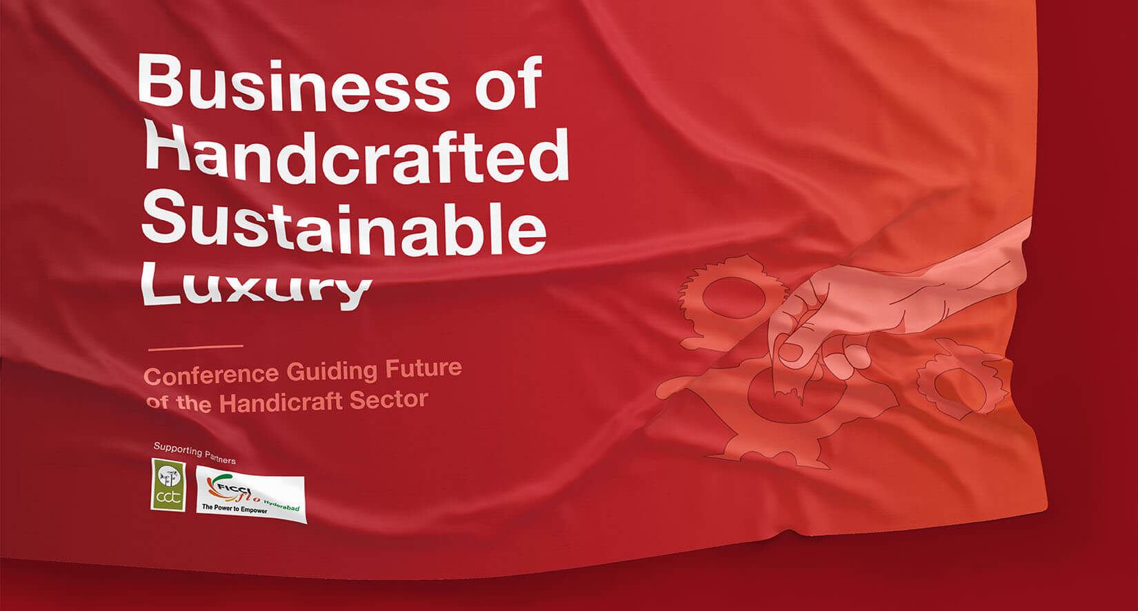
On the design front, we immediately knew that there needed to be a special focus on the fact that the conference was about ‘handcrafted’ luxury. We wanted to take the hand as a powerful symbol as the main identity and translate it across all the campaign’s collaterals, but this was to be juxtaposed with a completely modern colour palette with craft colours.
The modern twist was given with gradients. This immediately gave traditional a very contemporary feel. This was to create a contrast and really highlight what the festival itself was about; in the age of automation, we were still focusing on the importance and uniqueness of things that were handcrafted, and also showing that this could be a sustainable modern business as well.
Strategy in Public Relations
In order for the media and the target audience to pick up on the conference, and to generate a substantial buzz, we understood that for the media, Anjana Somany was a novice and they had to be educated about her accolades and contribution to the arts and crafts industry of the country. We wanted to introduce Anjana to the world and consequently get hooked on to what she was propagating through the conference. By initiating a public dialogue about Anjana, we would then get the media and the public interested in the conference as well.
Approach in Design
The campaign needed to have strong mass-appeal, that would be a perfect balance between organic and contemporary. We hoped to create a campaign that would:
1. Create a recognisable identity that would be cohesive
2. Create a visual language that could be inclusive of both organic hand-crafted techniques, as well as give a modern spin to the idea of hand-crafted.
We identified three key factors that would contribute in the making of the visual identity of the campaign:
1. Recurring symbol
2. Colour palette
3. Font
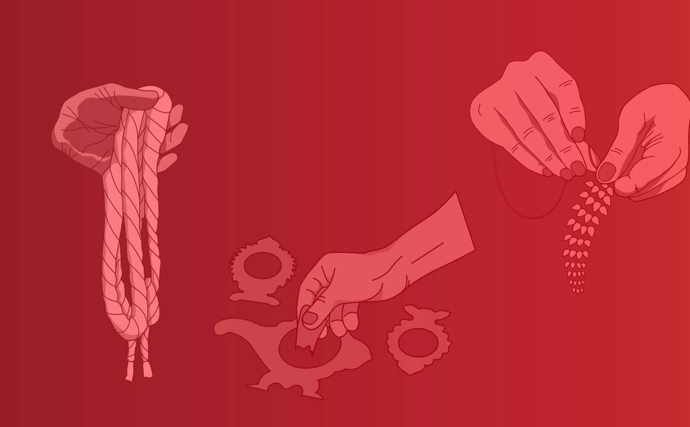
We controlled these three factors to be able to marry traditional elements with something very contemporary. We created a set of illustrations of hands engaged in skilful artisanal actions, engaging in age-old customs and traditional ways of a very raw, direct art, that had been passed down from generations to generations.
We wanted to highlight just how much skill was really required for crafts such as block printing, weaving, kalamkari, embroidery, lak bangle making, palm leaf engraving, which are steeped so deeply in our heritage now.
The purpose of doing this was to reinforce the ‘hand-crafted’ aspect of the subject of the conference and to also show that the minutest of details go into making these crafts. It was important to use hands as a powerful, recurring symbol so as to highlight the special, direct connection between the artisan and his craft.
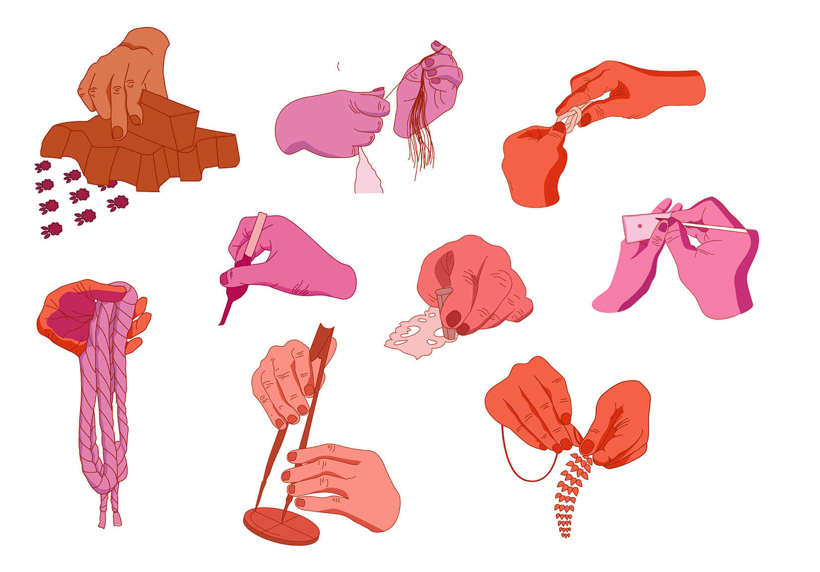
The colours we chose were those that can easily be found in traditional arts and crafts; the redness from bricks, the ochre from natural turmeric, the lilac from natural dyes. But these colours were to be used in a completely nuanced way, with linear gradients and razor sharp bars, things that are so ‘digital’. This too, was done to establish the position of artisanal skills in the modern luxury market.
While both the symbol and the colour palette took inspirations from the handcrafted luxurious aspects of the conference, the fonts we chose to go with were bold, sans serif, and very modern, taking the scale to the other end of the spectrum.
Design Implementation
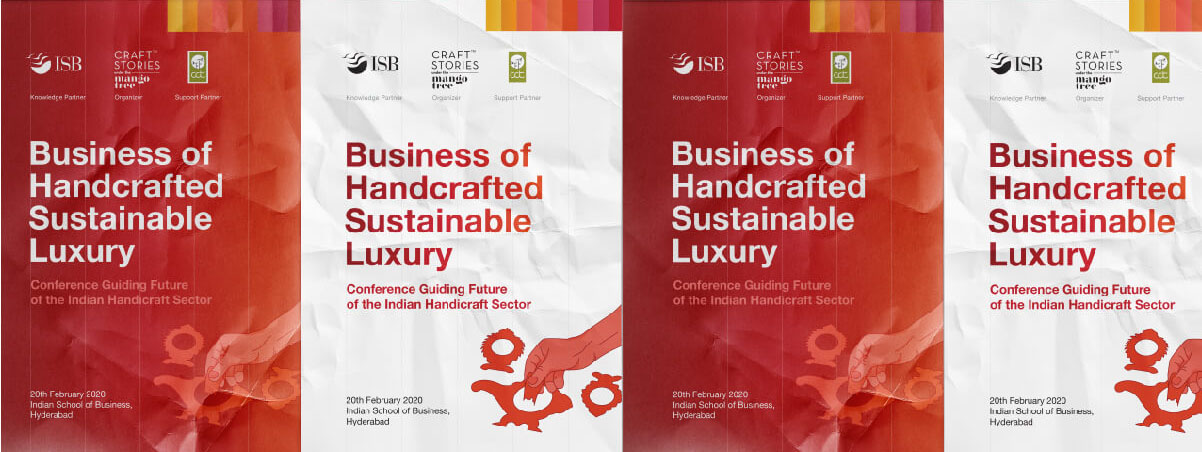
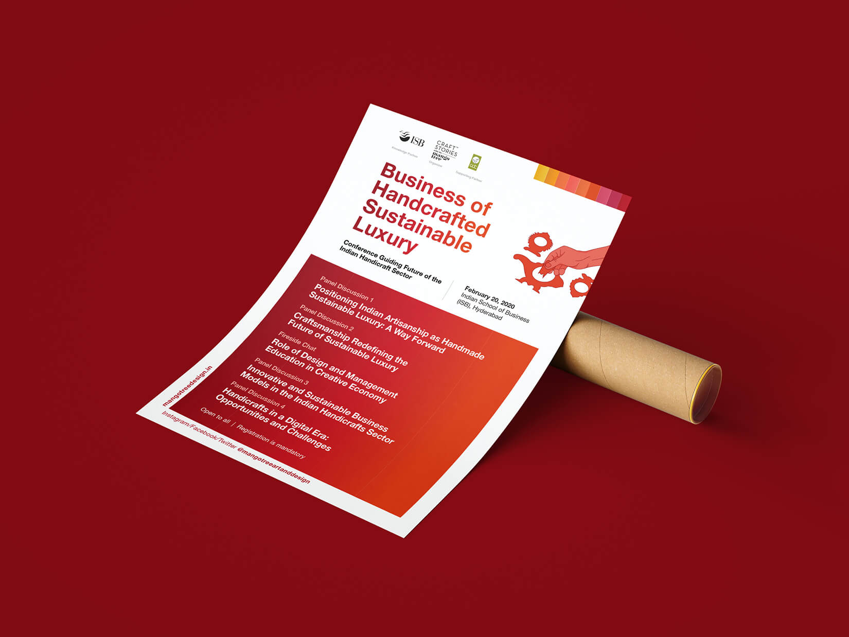
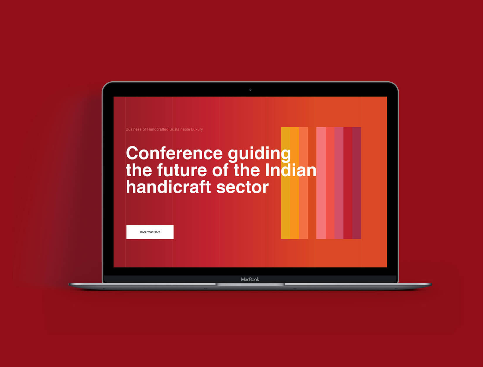
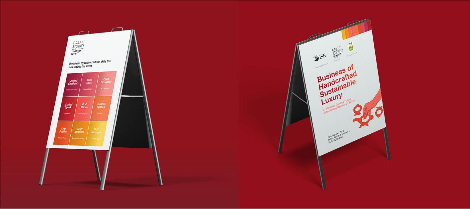
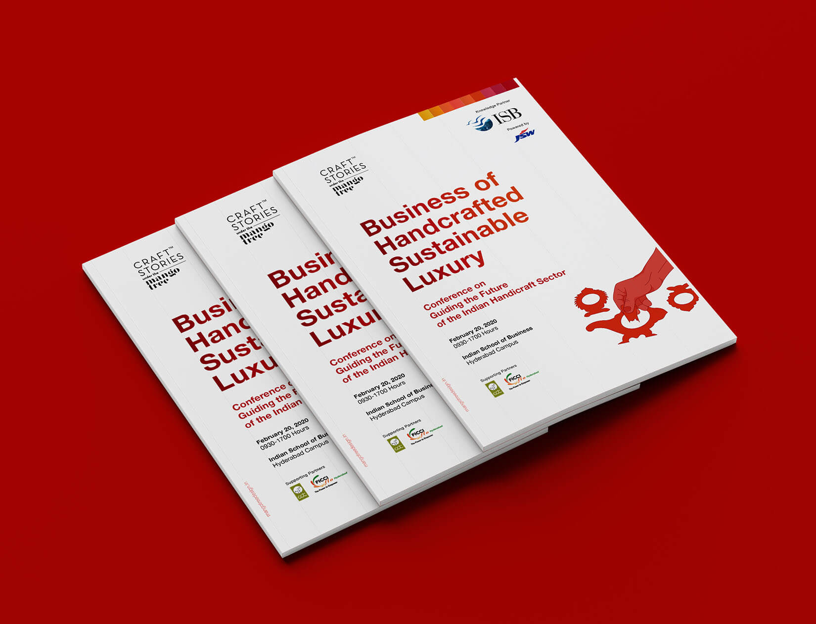
We had to ensure that our design strategy was consistently backed up by all the collaterals of the conference. Our deliverables included identity cards for participants, guests and crew, event standees & banners, event backdrops, podium designs, sponsorship and conference brochure, printable and e-invites, newsletters along with social media posts and website design.
We were to handle their social media handles and to ensure that our UI/UX was tailor made towards nudging the audience towards registering for the conference.
Social Media also played a very integral part of our strategy. We planned and managed their practically non-existent social media platform for two nearly two months. This task started with literally kickstarting their pages on Instagram and Facebook. Both were very visual mediums which would provide the necessary visual aid that the conference required, and also had rich databases of an audience that was welcome to attend the event. Attention was ripe for the taking, if only we could implement a carefully planned out social media strategy.
To execute the Social Media plan successfully in a timeframe that was short, we decided to break down our plan into a step-by-step process so as to cull out our ‘social media goals’, so to speak.
1- Announcing the event
2- Introducing the branding for this year’s event
3- Telling people what to expect from the event
4- Announcing various attractions of the event
5- Telling people about our panelists
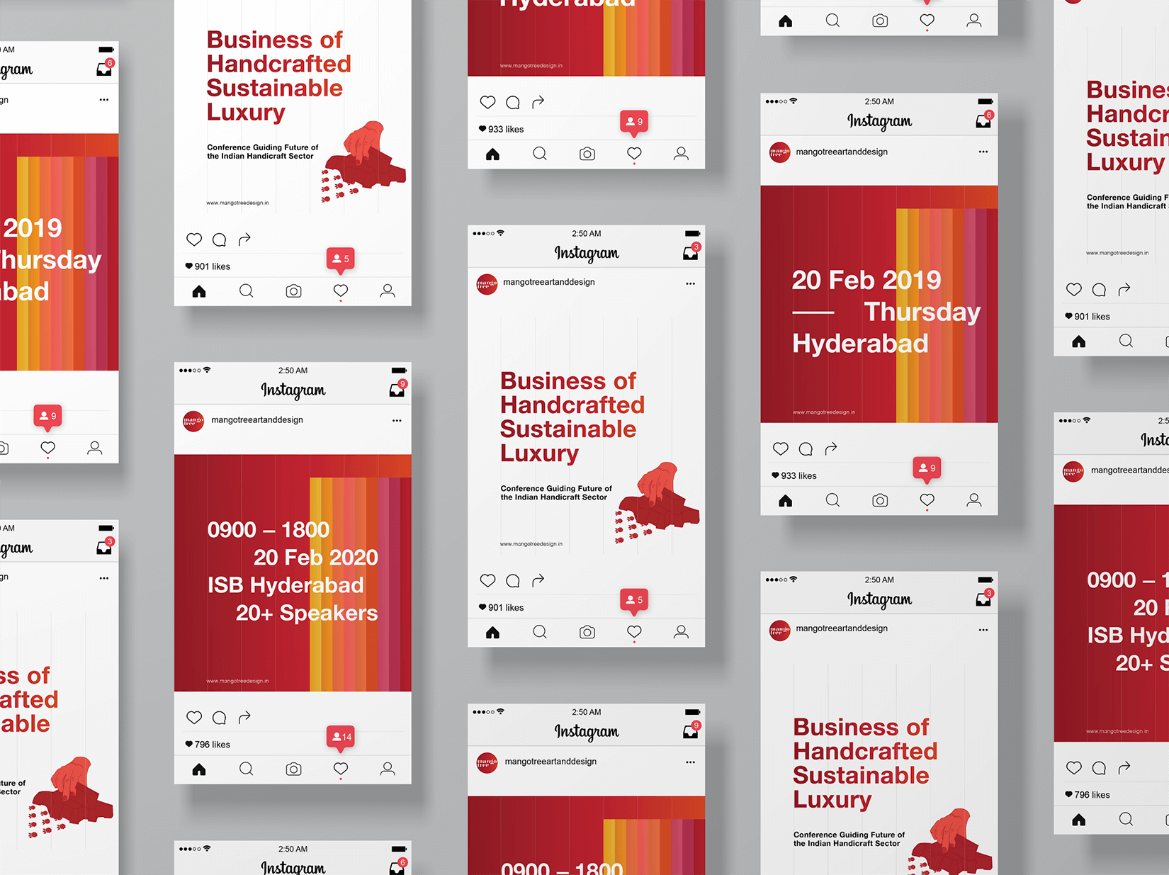
By following this plan and achieving our set-out goals, we believed we could garner enough attention towards the event. A large part of this job was to design visually consistent, engaging creatives (static as well as animated) and to regularly post them online. This was to be done with razor-sharp focus on getting more engagement, that would in turn lead to more registrations to the event. Our aim was to get a minimum of 300 registrations for the conference, which was an especially challenging task, given that we were to convince people to fly pan-India to come attend.

Additionally, we came up with other measures to increase registrations for the conference. For instance, we created invites and posted them on facebook groups of all notable design and business colleges of the country to generate curiosity among young, aspiring professionals, who hoped to be patrons of the industry. An event page was also created on Facebook so as to generate buzz. By selectively targeting the audience, we wanted to be able to connect the conference directly to the people who would most certainly enjoy it. The same was done with printed posters in colleges and universities in Hyderabad, where the conference was to happen. This targeted a younger segment from colleges and universities who genuinely had nuanced tastes and a developing sense of aesthetic and would thus be drawn towards the conference.
On the day of the conference itself, we had to tackle another problem; it was to be a closed, ‘by registration only’ event where even the media wasn’t allowed. It was crucial for us to make sure that the interest that had been built online should not be left peaked on the very day of the conference and that social media should play an important role in remotely disseminating the conference. This is where our design and PR team worked in complete tandem. While the PR team ensured steady, regular and live coverage from the conference on D-day, the design team was quick to consistently manage social media platforms and get Mango Tree posts out to the target audience. Tons of snippets, videos and pictures were shared with an almost full day coverage on the day of the conference. As a result, their pages got a lot more followers and there was sufficient online enthusiasm for the event.
In the conference brochure, we covered all aspects of the event and spoke about Mango tree as an organization. The symbol of illustrated hands was carefully carried forward in these print collaterals. Each page was designed to make optimum use of space and the printing was done on 100% recycled paper.
For the identity cards, we assigned three different colours for speakers and guests, organizers and crew members, and participants to ensure quick identification and minimize confusion.
To design the event collaterals, we received a plan of the event venue to help us plan the numbers, sizes and locations of a range of print collaterals. This facilitated a balanced spatial distribution of communication targeted towards the attendees.

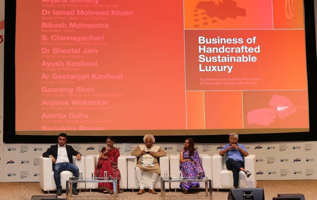
The conference was a day long event with multiple panels and speakers. This made events backdrops an important part of the design system. The conference opened with a four minute long animation introducing Craft Stories under the Mango Tree; featuring the identity of the conference and names of all the guests and panelists. We designed projector slides to suit various parts of the agenda for the event.
Approach in Public Relations
We supported the conference by ensuring strategic media relations and tracked relevant art and lifestyle connections to initiate pre and post-event stories. We also showcased Anjana as an epitome of creativity who was on a mission to tell stories of the multiple facets of craft while highlighting its intrinsic worth and value to modern life. This was to acquaint the media and the patrons of art with the curator of the show and her achievements in the field. This started generating a steady hum about the conference. The conference was a private affair and while journalists were not to be let in for the conference, our PR team had to ensure that multiple people could still follow the show through online channels. Our team took control of the situation and went on ground, where we recorded quotes from the speakers and dignitaries present at the conference and created a plethora of post-event releases and stories.
Results
The campaign was very well received and had a very unique look and feel to it. It managed to start a very tangible discussion on the issues and concerns related to the conducive business environment, models for growth and policies for both artisans and handicraft entrepreneurs in India. Doyens of the industry from all walks of life participated in the conference. They acknowledged the need for a sustainable tomorrow laid on the foundation of craftsmanship and handmade artisanal products. HT Brunch had featured Ms. Somany’s point of view on feminism in their Women Special issue. The news on the conference was covered by the likes of Deccan Chronicle, The Indian Express, The Hindu etc.