The Export Compliance Handbook for GIZ: Making Regulation Readable
There are categories of publication that almost nobody volunteers to read. The compliance handbook sits firmly among them. And yet, for the businesses, regulators and trade professionals who depend on these documents, the quality of the handbook directly determines whether the information inside reaches the people who need it. When GIZ, the German development agency operating across global development priorities including trade and economic cooperation, commissioned Wishbox Studio to design an export compliance handbook, the challenge was as much pedagogical as it was visual.
The Brief
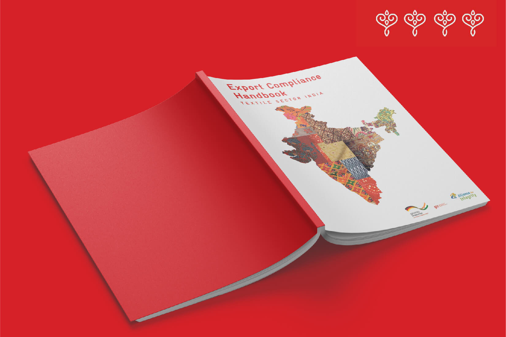
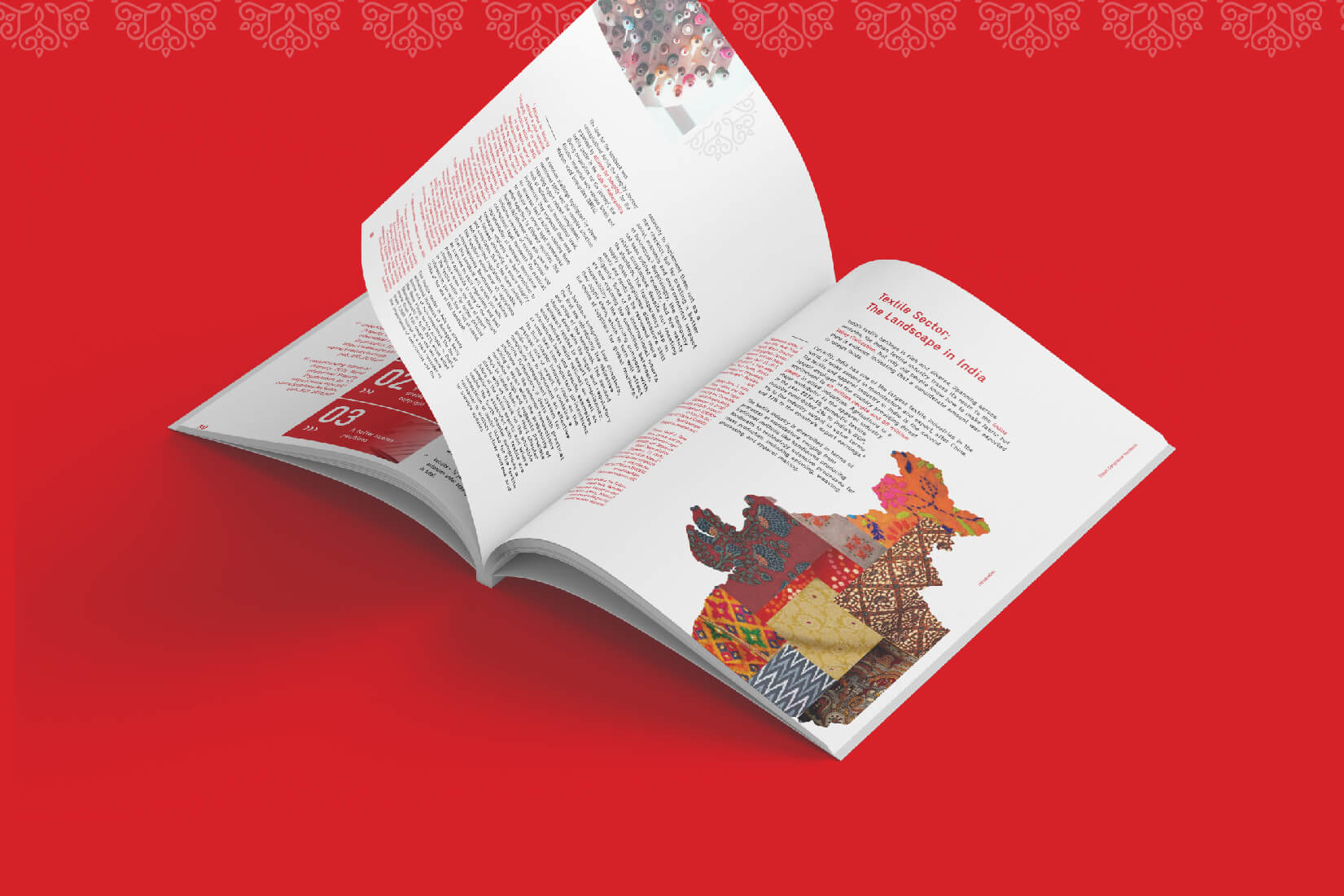
The handbook needed to communicate complex regulatory information to a working audience of exporters, compliance officers, trade consultants and government stakeholders. The content covered procedures, documentation requirements, regulatory frameworks and case-specific guidance, the kind of material that is often presented as wall-to-wall text and consequently often goes unread. Wishbox was asked to bring the discipline of compliance handbook layout design to bear on a document that needed to be both legally accurate and genuinely usable.
The Design Approach
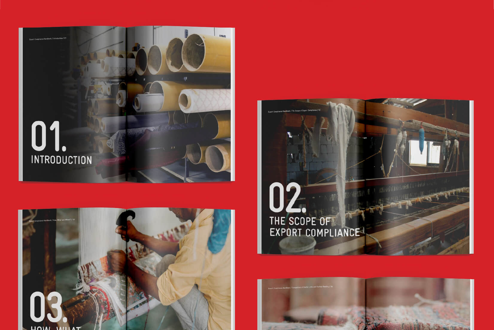
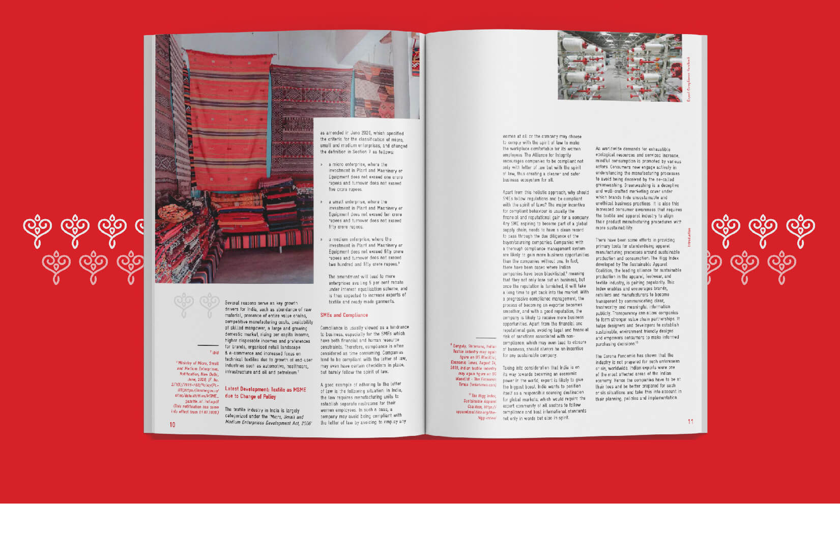
The first design decision was structural. Wishbox worked with the GIZ team to map the handbook’s content into a hierarchy that mirrored the way users actually consult compliance documents. Few people read a handbook front to back. Most arrive at it with a specific question and need to find the relevant section quickly. The layout system was built around this reality, with strong navigational cues, clearly differentiated section openers and consistent visual signposting throughout.
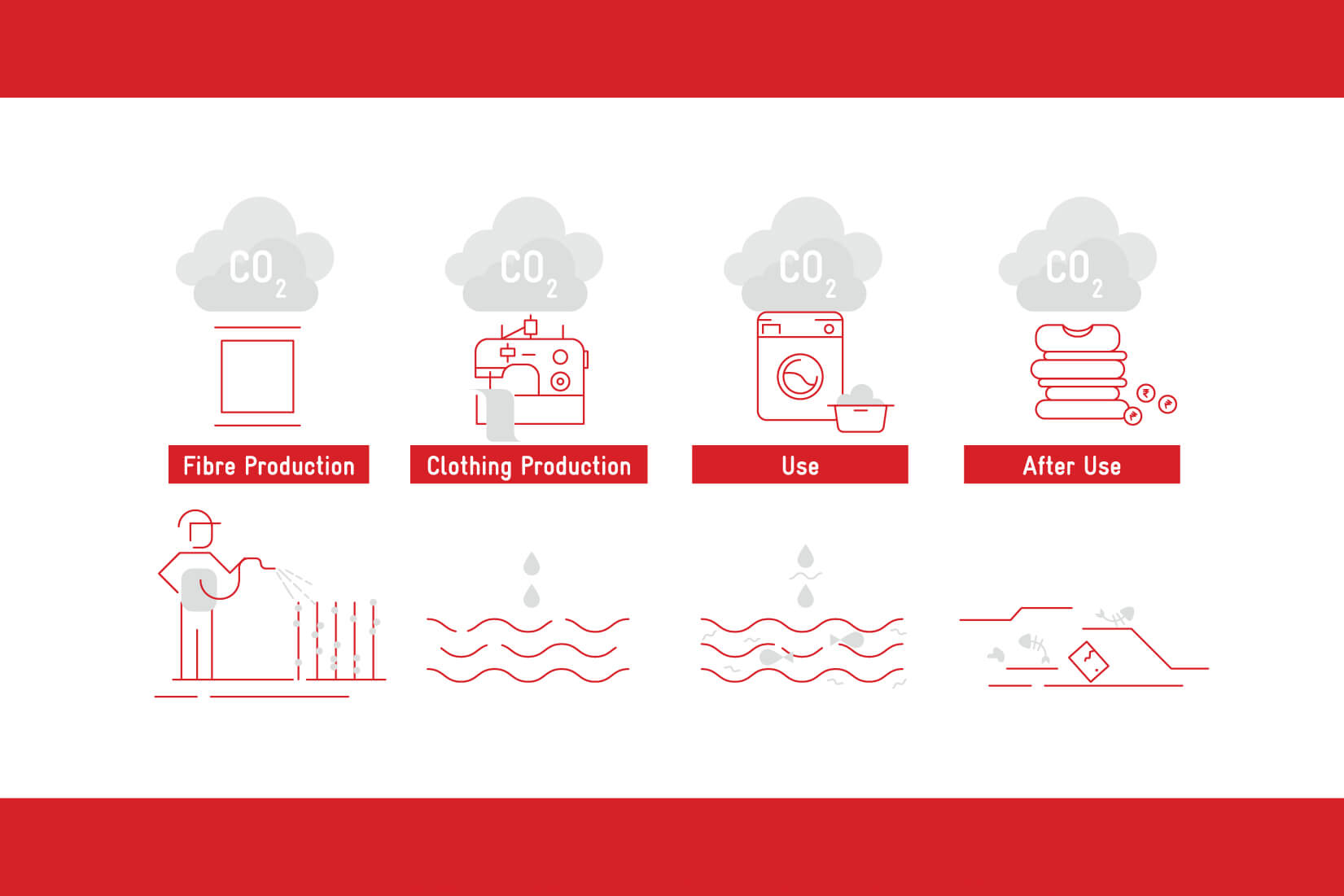
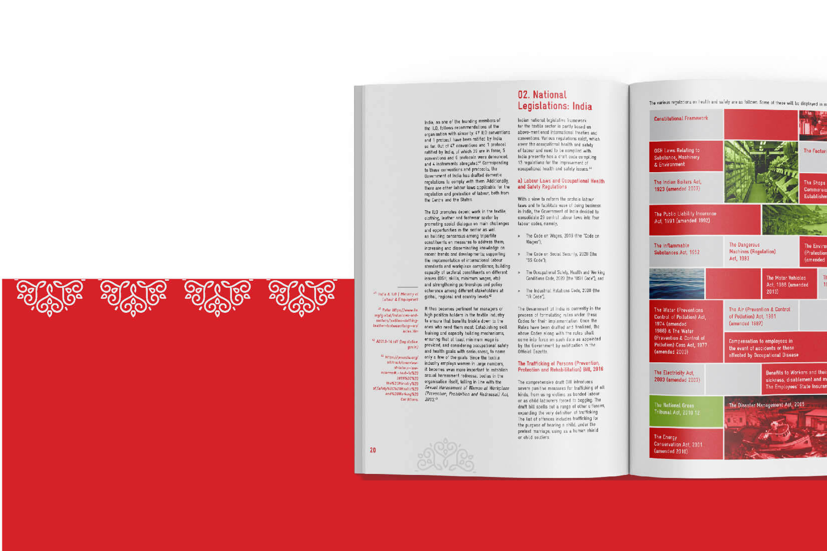
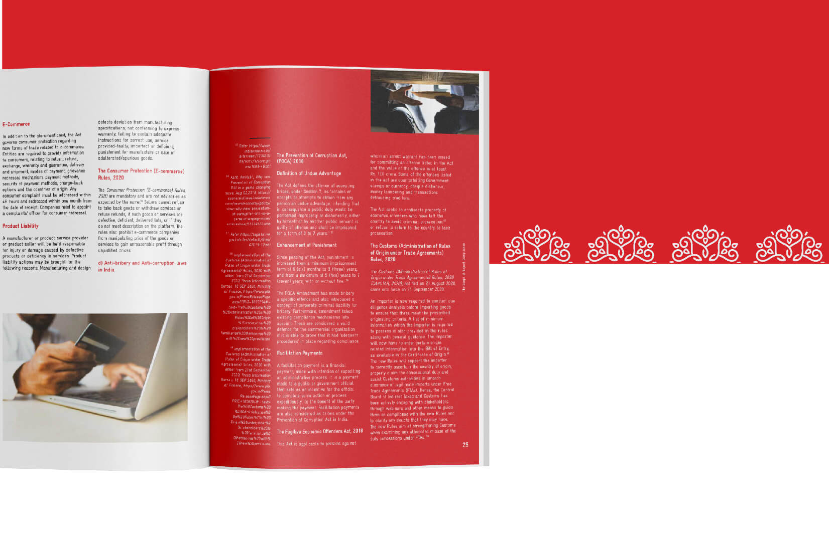
Within sections, the design used a combination of running text, callout boxes, procedural diagrams and tabulated information to break up content density. Diagrams were developed for processes that benefited from visual explanation, such as documentation flows and approval pathways, while detailed regulatory information was retained in carefully typeset reference tables.
Institutional Tone
As a government publication design project produced for a major international development agency, the handbook needed to carry institutional gravitas. Colour was used functionally rather than decoratively, with a restrained palette that supported navigation and emphasised key information without ever feeling promotional. Typography was selected for sustained reading comfort across long passages of regulatory text.
Who Uses This Handbook
The handbook’s audience is professional and purposeful. Exporters consult it to understand compliance requirements for specific markets. Trade consultants use it as a reference in advising clients. Government officials engage with it as a benchmark document for sectoral guidance. Each of these user groups needs the handbook to deliver accurate information efficiently, and the design was built to support all of them.
Why This Kind of Design Matters
In institutional report design and compliance publishing, design is often treated as decoration applied after the writing is done. Wishbox’s approach inverts this. The design is structural, helping to organise meaning rather than simply present it. For a document whose value depends on being used, this distinction is the difference between a handbook that sits on a shelf and one that genuinely serves the businesses it was created for.

Big ambition. Small brand presence?
Let’s design the strategic positioning that attracts the right opportunities.