Designing for the Gates Foundation: When Stakes and Standards Are Both High
Working with one of the most influential philanthropic organisations in the world is a particular kind of design assignment. The Bill & Melinda Gates Foundation operates at a scale and with a research discipline that sets the bar for global development. When Wishbox Studio was engaged on report design work for the Foundation’s India portfolio, the brief came with the expectations that scale implies.
The Brief
The report needed to communicate programme work, partnership outcomes and impact data with the rigour the Foundation is known for, while remaining genuinely readable for a stakeholder audience that includes some of the most informed readers in global philanthropy. In foundation report design agency work, this combination, rigour and readability, is the central craft.
The Design Approach
Wishbox approached the project with information architecture as the first concern. The Foundation’s work spans multiple programme areas, geographies and partnership structures, and the report needed to make these relationships legible without flattening their complexity. The design began with structural mapping, identifying the most important narrative threads and the data that supported them, before any visual decisions were made.
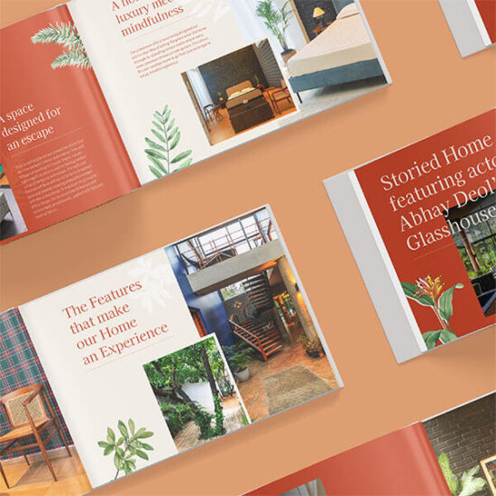
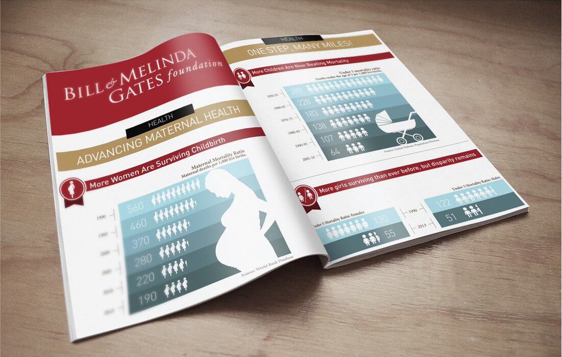
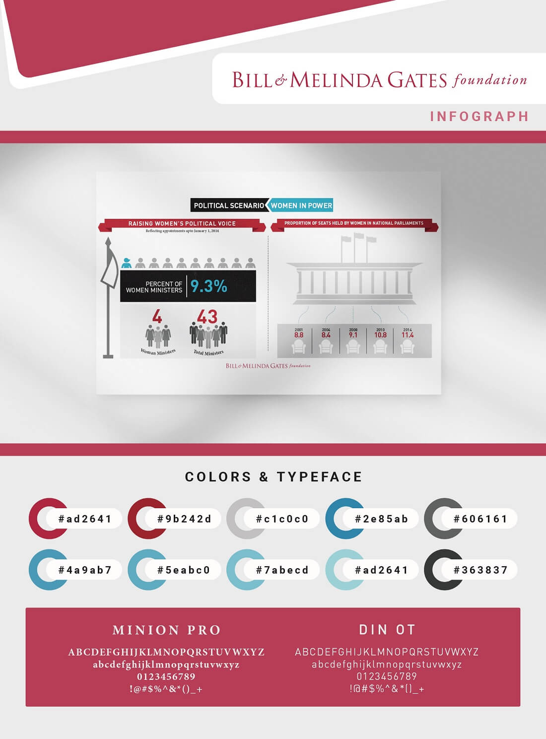
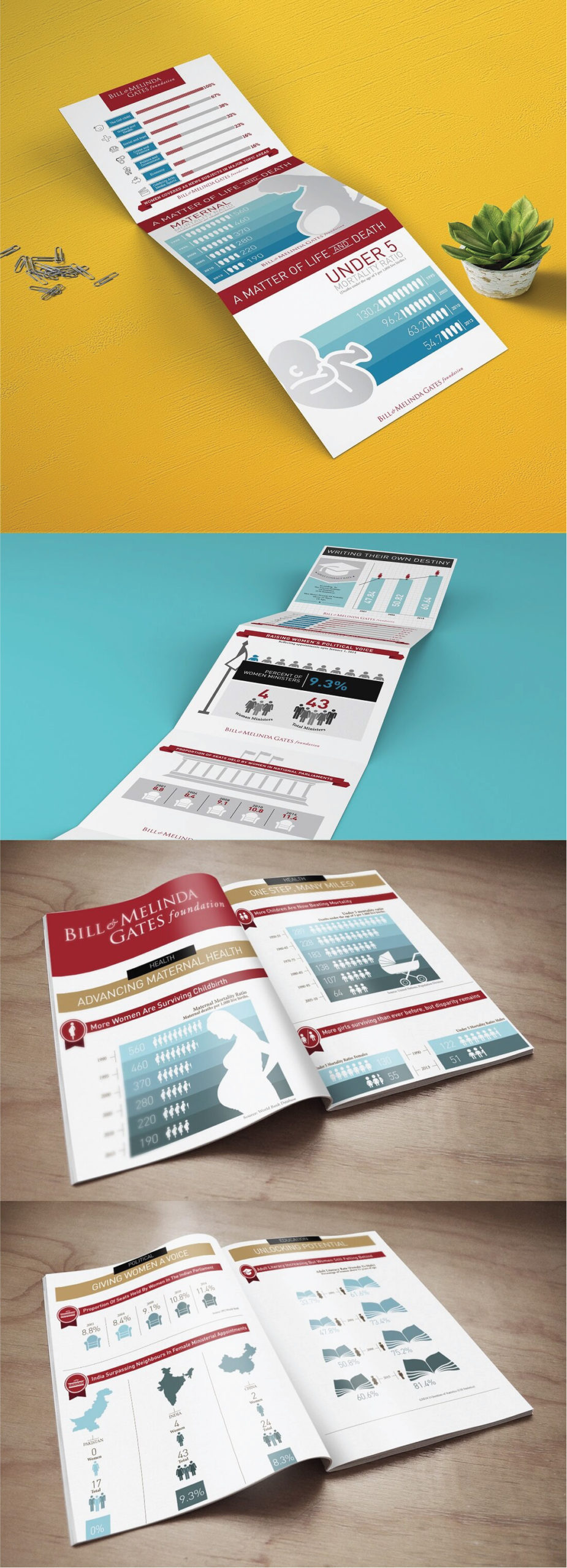
The visual system that emerged is institutional in tone but not austere. Typography was chosen for sustained reading comfort across long-form content. Photography was treated with editorial restraint, with images selected to ground programme narratives in real-world context rather than to decorate. Data visualisation was approached with particular care; in an annual impact report design for an organisation of this profile, charts and infographics are read closely by people who know how to read them. Misleading or unclear visualisations would fail the document.
Honouring the Content
The Gates Foundation produces some of the most carefully sourced impact data in development. The design choices throughout the report were made in service of letting that data speak with maximum clarity. White space was used generously where the eye needed rest. Hierarchy was deployed to surface the most important findings without burying the supporting detail. The reader is guided rather than instructed.
Who Reads This Report
The audience for a Gates Foundation report spans peer foundations, government partners, multilateral institutions, researchers, journalists and the broader development community. Each of these readers brings a different kind of expertise and the design needed to serve them all. A peer foundation officer reads for benchmarking. A government partner reads for partnership context. A researcher reads for citation and reference. The layout was built to support each of these reading modes within a single coherent document.
The Broader Significance
In NGO communication design at this level, the report is often the most strategic document an organisation produces. It travels far beyond the room where it is launched, influencing how the work is understood and where future partnerships emerge. Wishbox’s role was to ensure the design delivered the Foundation’s work to its readers with the clarity, dignity and visual discipline it deserved.
Big ambition. Small brand presence?
Let’s design the strategic positioning that attracts the right opportunities.