European Union Film Festival
Key Stats
According to UNESCO Institute of Statistics as of 2015, India produces the highest number of feature films every year. In 2017 alone, a total of 1986 films were produced.
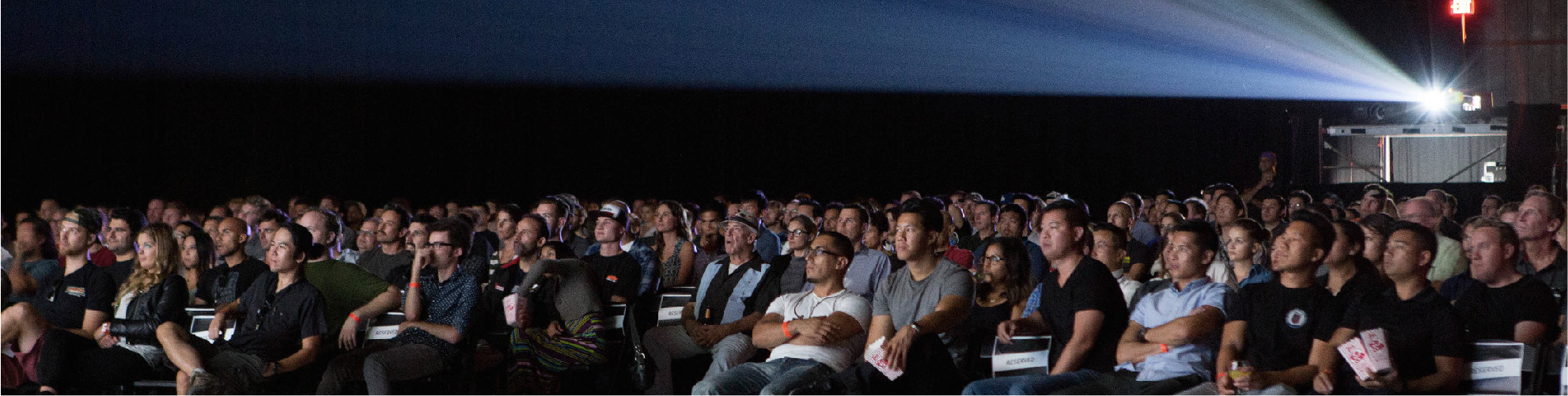
Indians bought 1.03 billion movie tickets, spending Rs 10,948 crore last year, an increase of 11.6 per cent over 2018.
More than seven in ten people in India (72%) prefer watching content in languages other than the ones they speak or understand with subtitles, a new YouGov research has revealed.
Context
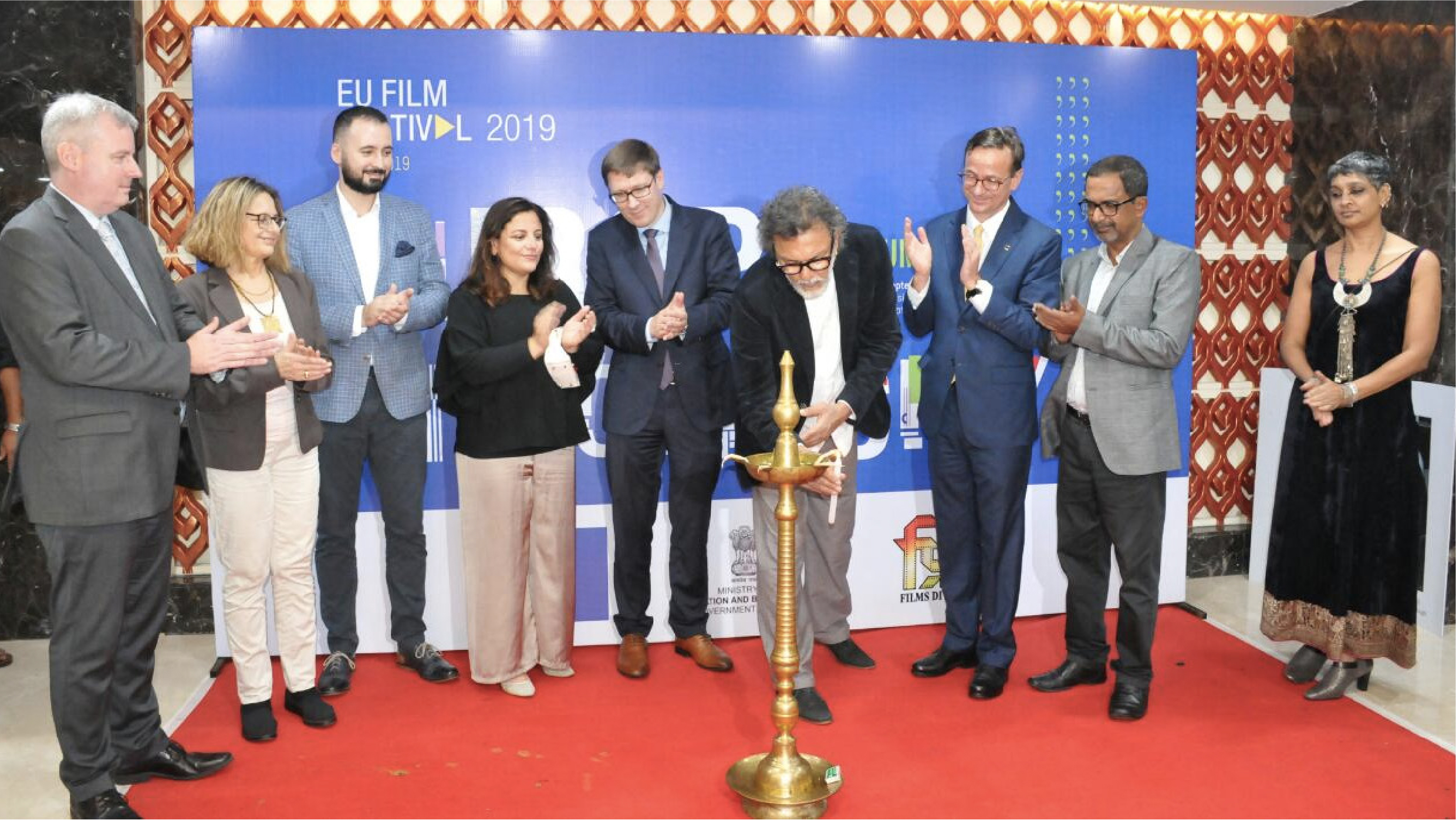
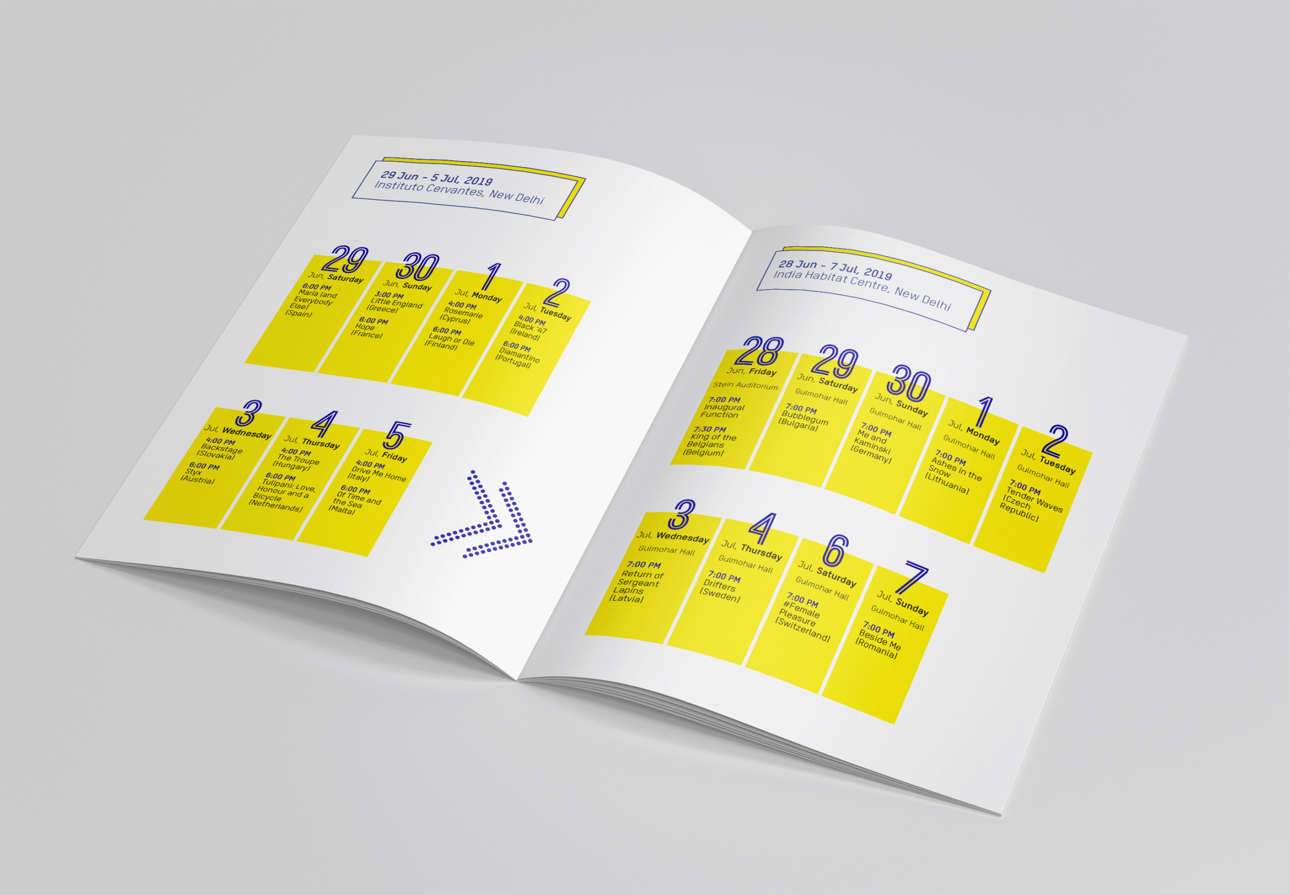
Being the largest producer of films in the world, India is the perfect setting to showcase European cinematic talent. Since both regions share a very rich cinema-going culture, the European Union Film Festival is a good bridge that brings a diverse range of European cinema to an audience that loves watching movies. We were approached by the European Union to create the identity and publicize the 24th annual European Film Festival on a pan-Indian scale. The festival was to start in the capital, Delhi, and end in Mumbai, covering a smattering of 9 cities in between.
The Problem
Even though this was the 24th edition of the festival, it did not have an already existing and impactful visual identity that one could easily identify with. Since the films that the festival showcased fell under the gambit of ‘foreign-language’ cinema, it also ran the risk of being to niche. It thus desperately needed an identity that would have mass-appeal to an audience that is accustomed to the richness and flair of Bollywood, while staying true to the aesthetic of European cinema. The festival also had to traverse a number of cities across a broad span of time and thus also required a PR strategy that wouldn’t fizzle out and would have lasting impact. It needed to not only connect to the right kind of audience that already had an appetite for good cinema, but also be inclusive of an uninitiated audience that simply ‘liked going to the movies’.
The Brief
The brief that came to us was quite straightforward; firstly to strategize and create the identity for the 24th European Union Film Festival and all its collaterals, and secondly to make sure that there was enough palpability about it among the target audience.
Strategy for design (Phase 1)
We immediately knew that this festival needed a cracking identity that could cut through the clutter and stand out in terms of brand recall. We decided strategically take a colourful route so as to stay true to the vitality and diversity of European cinema, whilst also appealing to a local audience that naturally associated cinema with glitz and glamour.
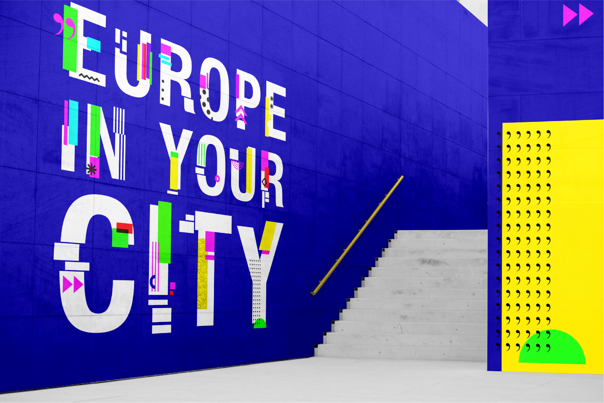
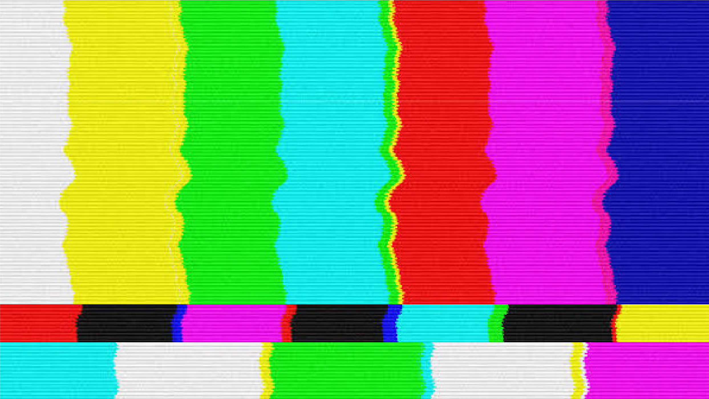
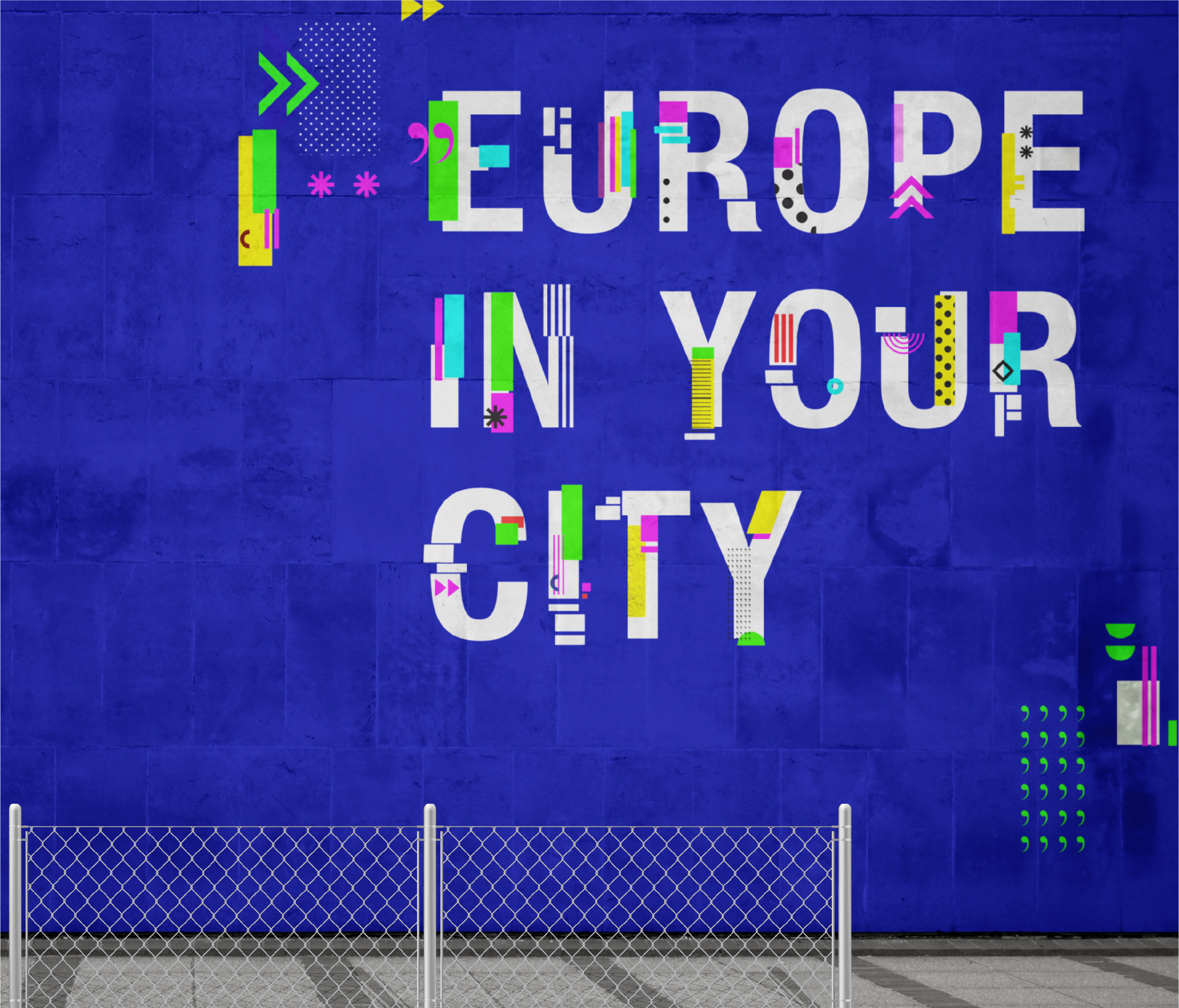
We chose the widely known ‘TV Glitch’ as our inspiration. Glitch by definition is ‘a sudden, usually temporary malfunction or fault of equipment’, this theme resonates with contemporary cinema that deals with ‘social glitches’, highlights the issues modern world is dealing with and bring them to the audience far and beyond physical borders. Once our theme for the festival was cracked, it was only a matter of consistently trickling this across the entire breadth of the campaign’s look and feel.
We also decided early on, to give our glitch theme a twist by going for ‘spot colour’ printing. This was to allow for the neon colours in our palette to really pop and come to life.
Approach to design (Phase 2)
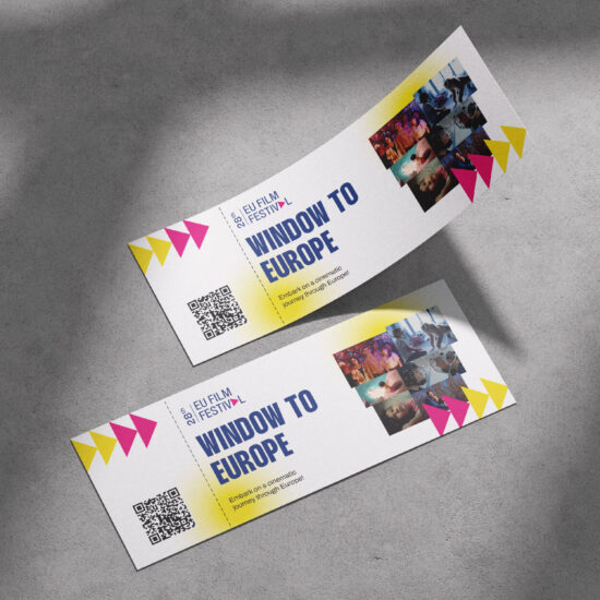
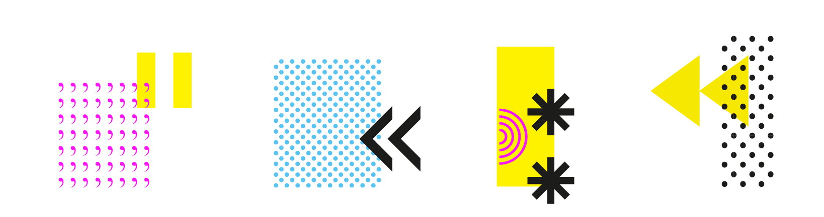
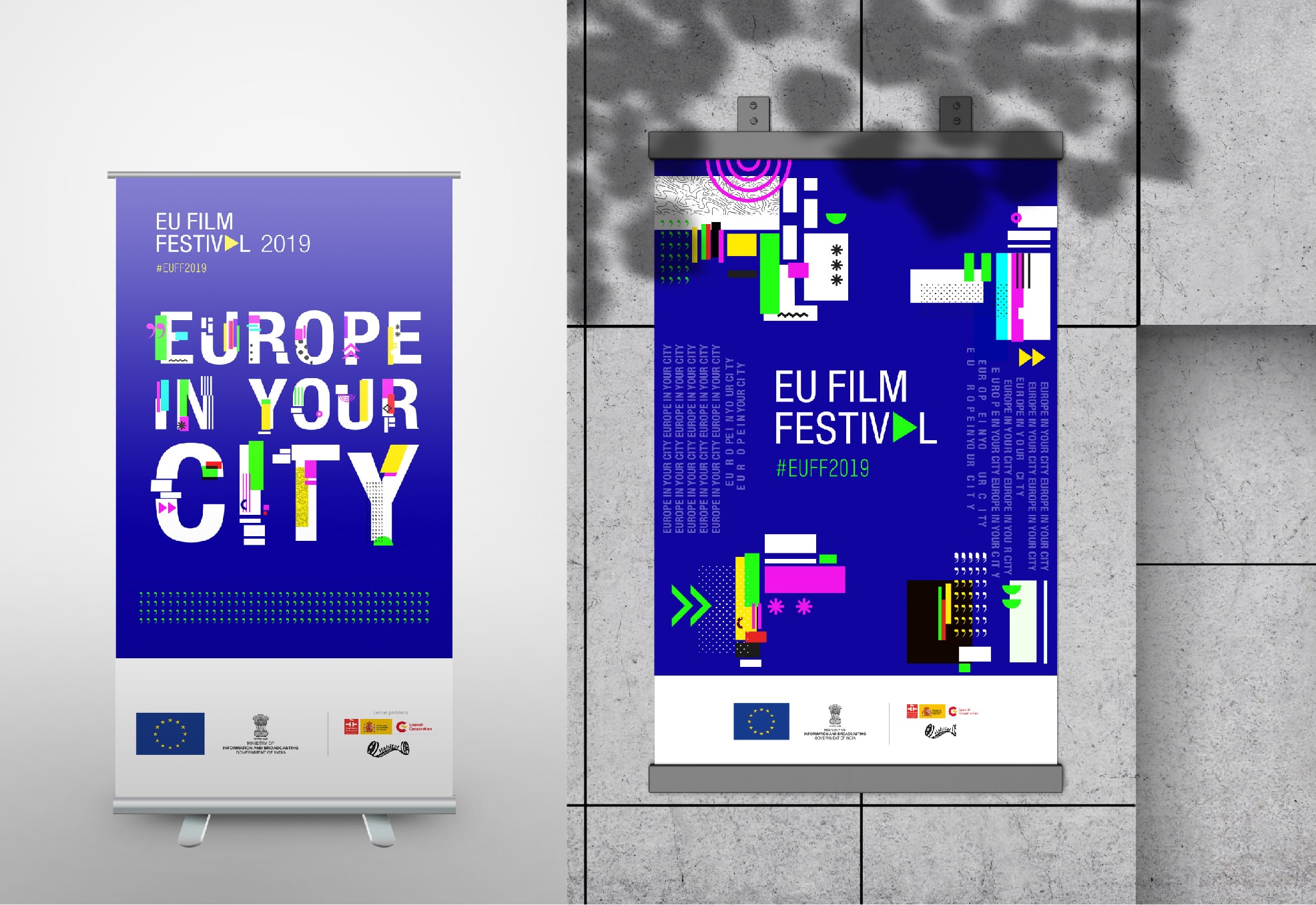
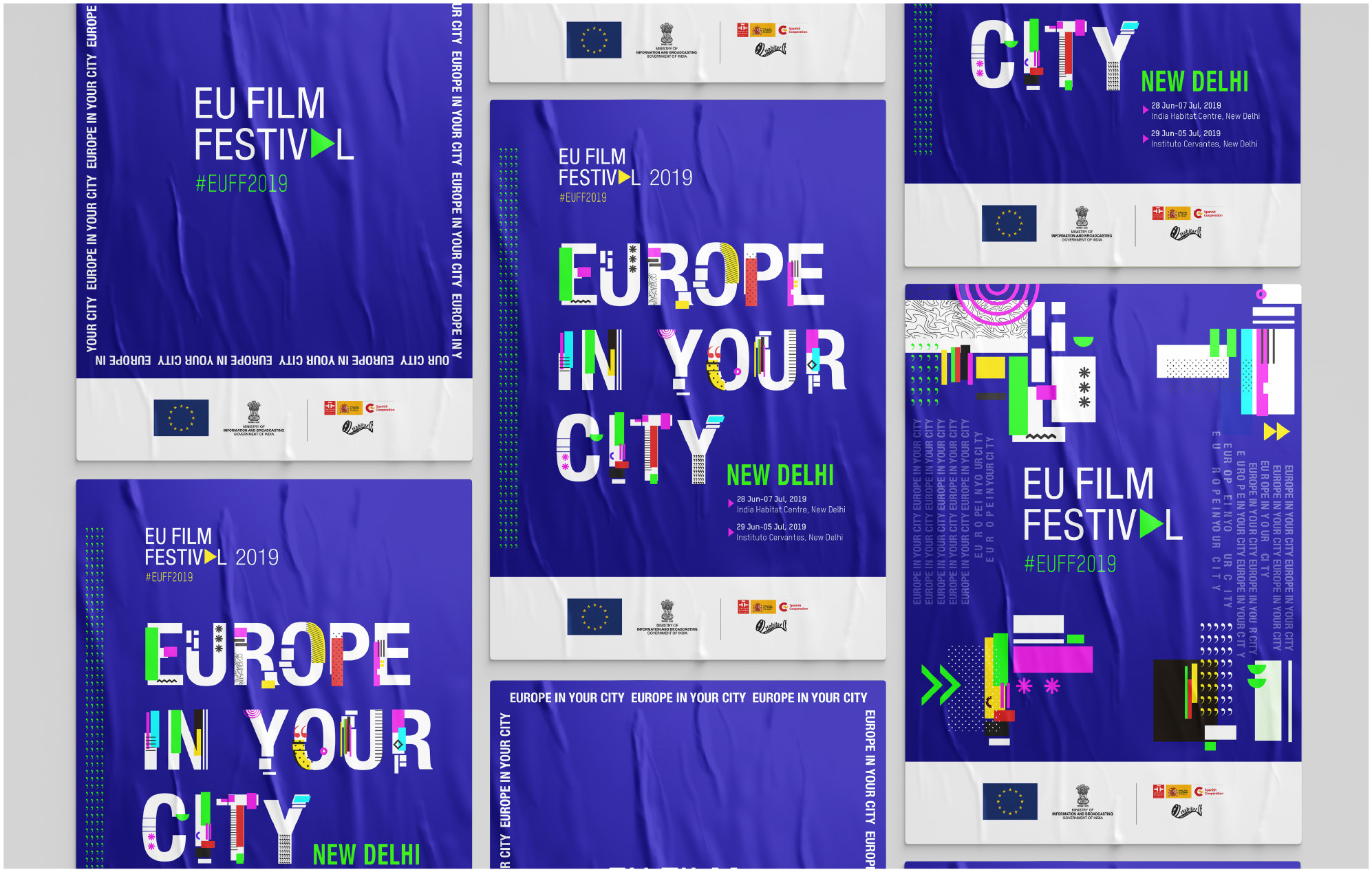
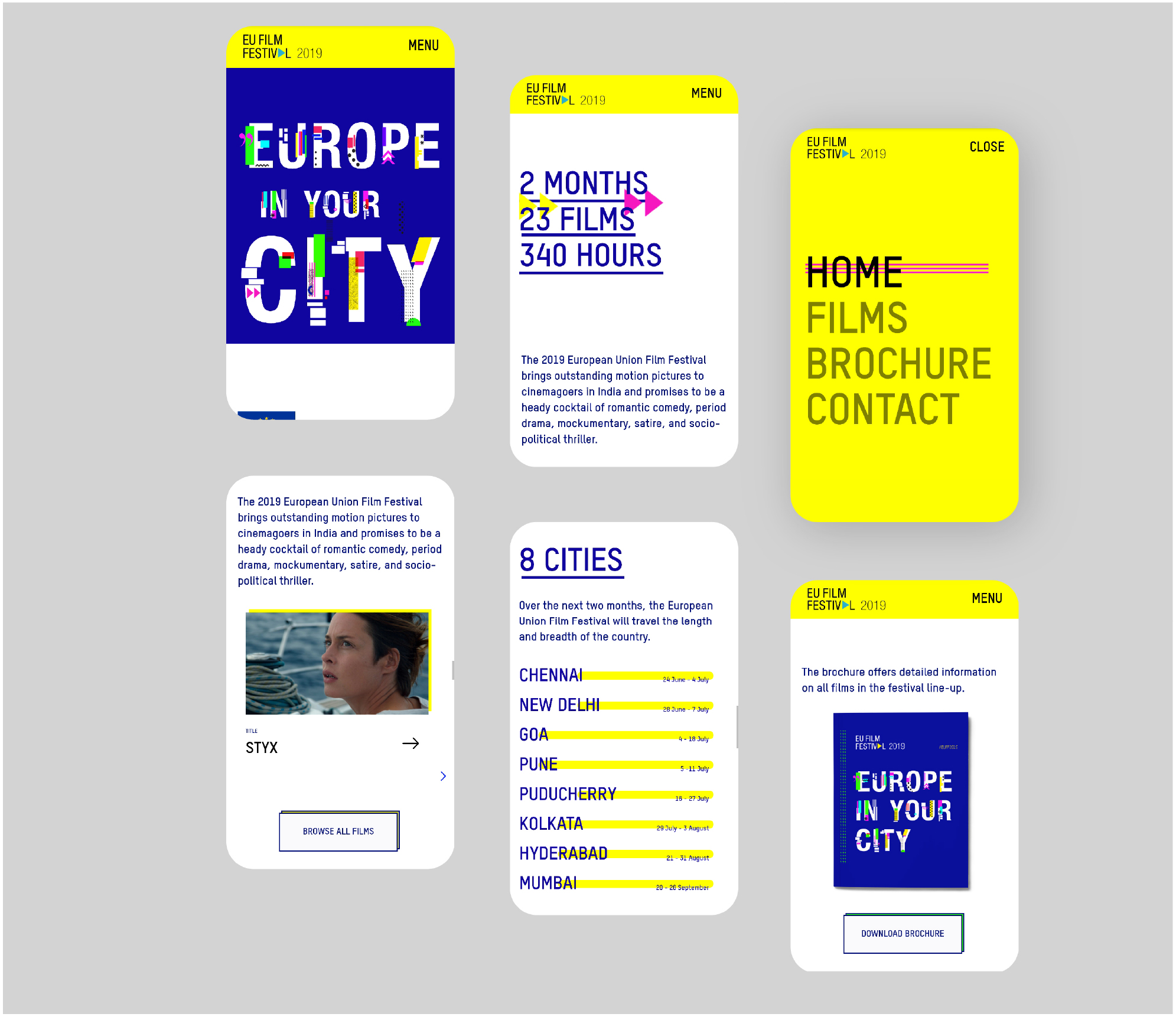
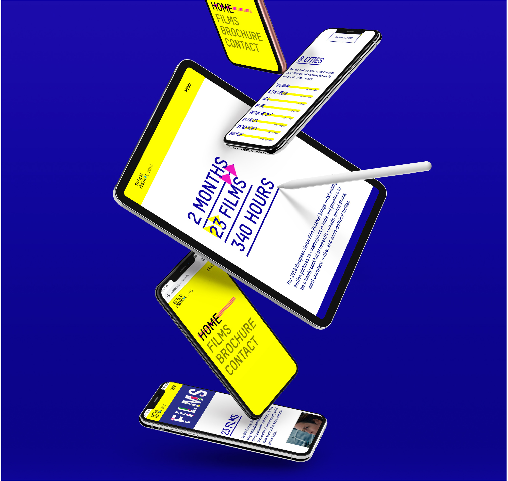
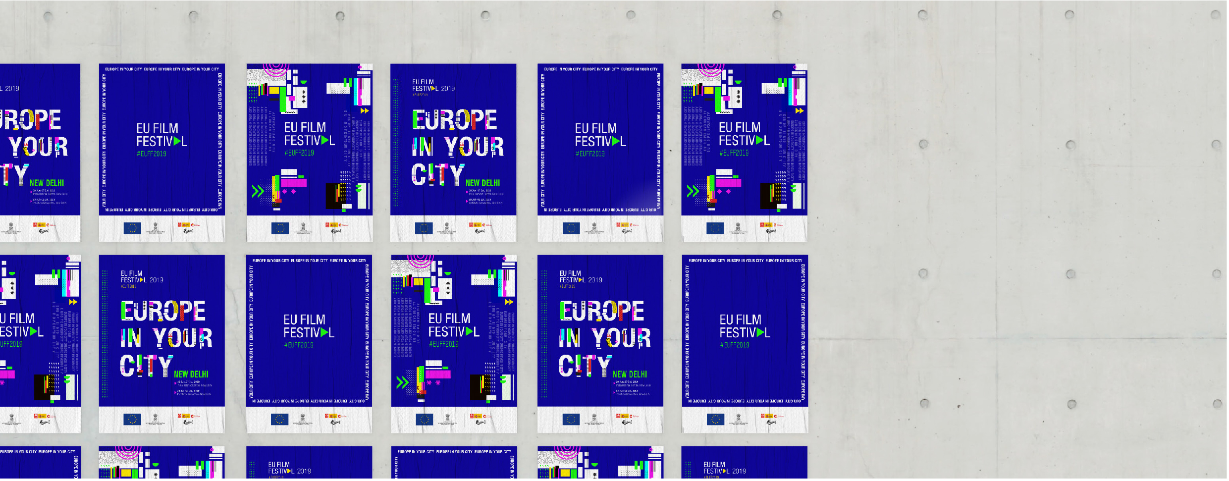
The festival’s tagline was ‘Europe in your city’, and this gave us plenty of scope to play around with colours and typography, in order to marry the aesthetic of European and Indian cinema. Keeping our ‘TV Glitch’ theme in mind, we broke down the text into interesting bits and pieces to create shapes that were resonant with dialogue and conversation. This was seamlessly carried forward to all promotional and communication material for the festival, including the website, brochure, schedules for each city, outdoor marketing collaterals and festival giveaways such as bookmarks and coasters.
We chose a colour palette that was bright and colourful, to cater to an audience that was used to everything Bollywood, but specifically such colours that echoed a very European and modern feel.
For the EUFF logo, we decided to focus on making an identity that was simple, yet flexible. This was because the festival was to have a different campaign identity every year, and we wanted a logo that would seamlessly adapt and fit right into whatever identity the festival would have through the years. To achieve this, we decided to create something minimal, that had a recognizable, but not overwhelming identity.
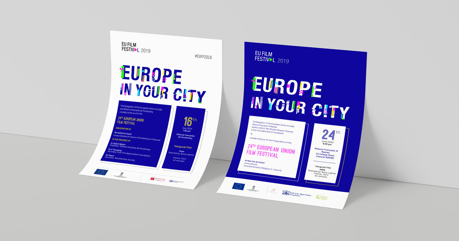
The typeface chosen was clean and compact, to represent the contemporary nature of the cinema the festival was to showcase. The letter ‘A’ from the word ‘festival’, was rotated to form the symbol for a play button. While the words in the logo stay black or white depending on the background, the play button being the focal element of the mark, can take any accent colour other of the campaign branding for the particular year.
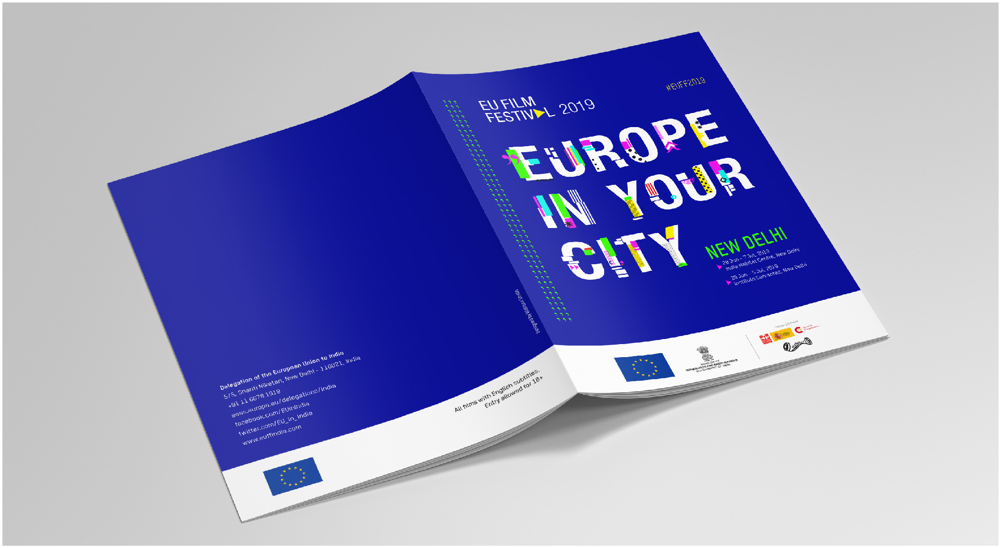
Different compositions were created using abstract shapes with catchy typography for all the collaterals, making sure the campaign is well tied together, and at the same time doesn’t seem monotonous.

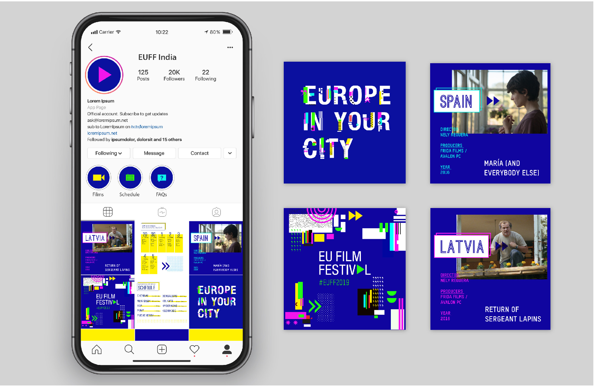
Towards the end, we also started noticing a few visual inconsistencies in the festival’s social media marketing. Here, we stepped in to provide a guide on how to correctly translate the identity, and made a few posts for Instagram as well.
These translated into a very impactful visual identity, which was then to be handed over to our PR team to popularise.
Strategy for Public Relations (Phase 3)
Right off the bat, Wishbox recognised the dangers of the festival falling into a very niche category that would exclude a majority of the cinema-going audience. We realised that the festival had to be positioned in a way that was more inviting so as to cater to a wider audience, with mass-appeal, rather than focusing only on writers, art and film critics.
We started to initiate a dialogue with Indian artists in the backdrop to start to familiarise the audience with the festival, but soon also moved towards a TG of cinema novices who just wanted to enjoy good cinema and wanted to learn something from a nuanced European aesthetic.
Approach to Public Relations (Phase 4)
We had approached the film critics, art and lifestyle writers and initiated interviews of Mr. Raimund Magis, Chargé d’affaires, Delegation of the European Union to India. We had also invited our clientele to the festival and had helped EUFF in doing some BTL activities in Mumbai.
On the celebrity front, we roped in director Rakesh Om Prakash Jha as Chief Guest for the premier which was to be in Mumbai. Here, he was interviewed by the team, where he expansively spoke about the significance of EUFF in India. This helped us amass oodles of popularity for the festival.
We researched to find an Indian connection with the audience. After our research, we found out that Vithika Yadav was the actress in #FemalePleasure and Prithvi Chavan was the Co-Producer of ‘Ashes In The Snow’. This was the connection on which we played extensively. We also focused on how accessible the festival was as there was no tariff for anyone to view the films. This helped us to stress on the fact that the intentions of the Delegation of the European Union and embassies of EU Member States were to enable an aspirational audience with the European film fraternity.


Conclusion
The European Union Film Festival was concluded successfully. It managed to create strong recall with a very distinct visual identity and also managed to reach to it’s target audience with a mix of strategic public relations. Indeed, since the festival spanned cities across India, it managed to snowball into something bigger, rather than dwindling off with time.