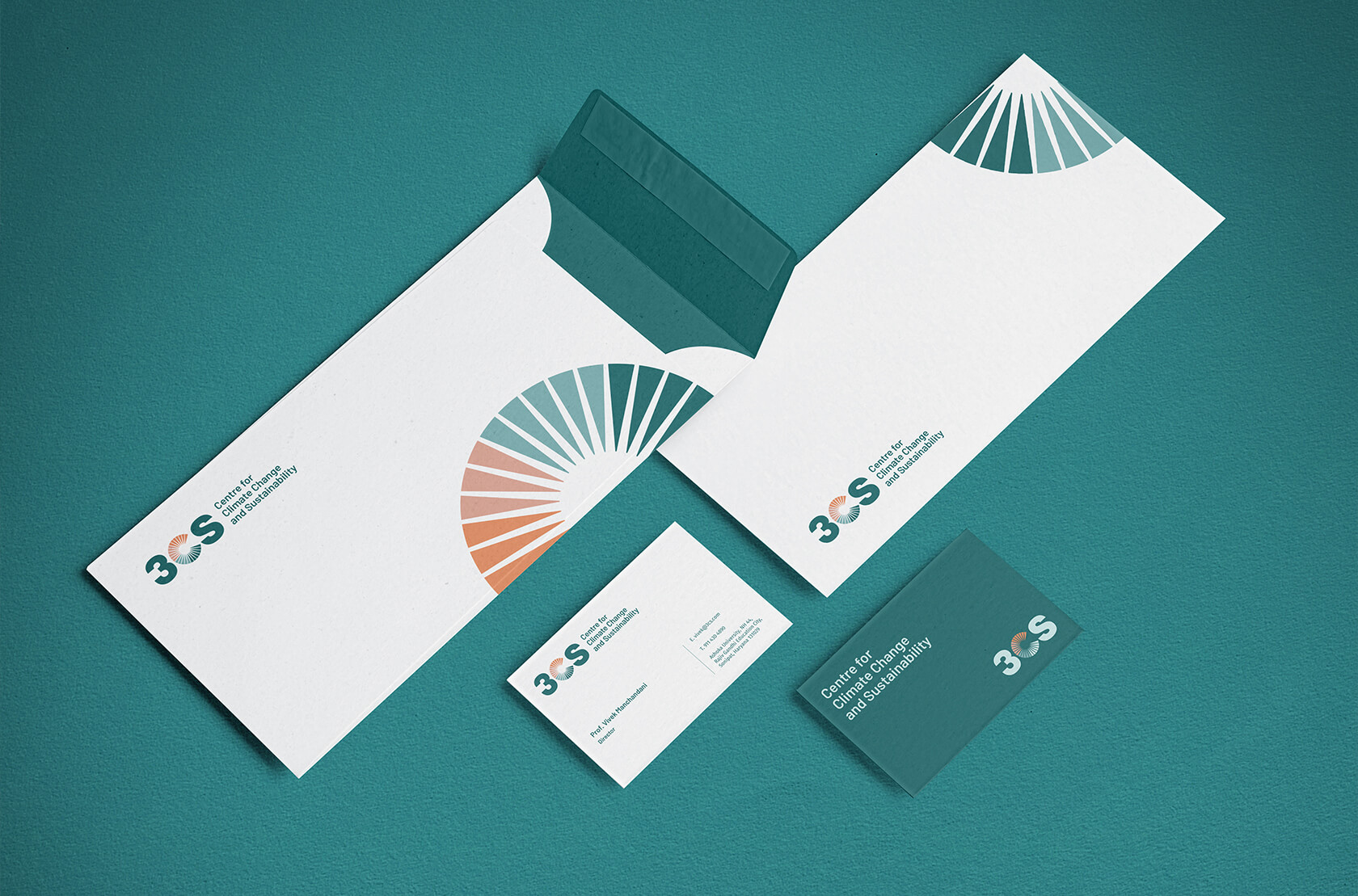
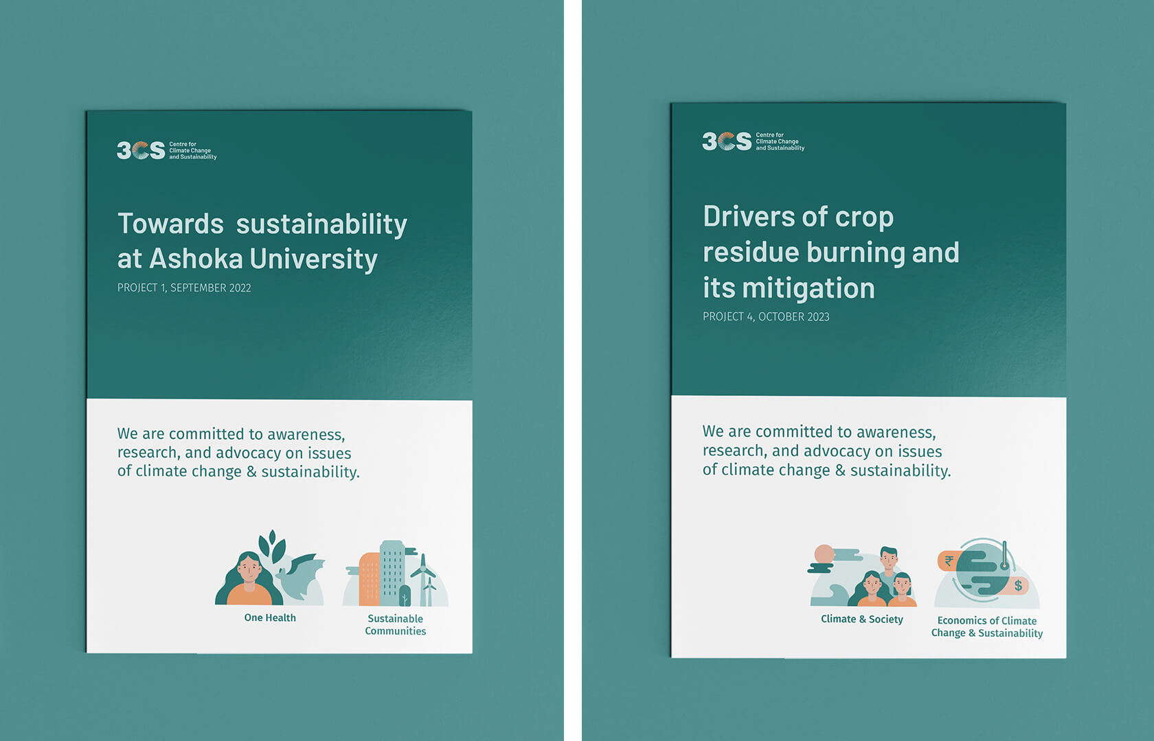
The Centre for Climate Change and Sustainability (3CS) at Ashoka brings together members of the Ashoka community with a shared interest in studying, communicating, and mitigating the effects of future climate change on our society, health, and environment. It harnesses Ashoka’s research and policy expertise, led by Ashoka’s intellectual community of scholars. The brief was to create a brand identity system and website for the Centre.
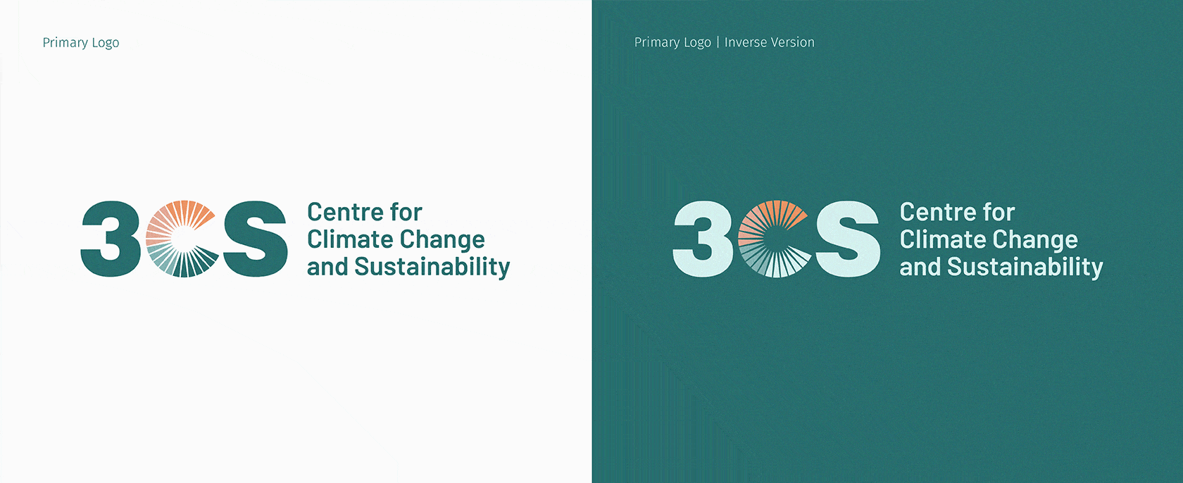
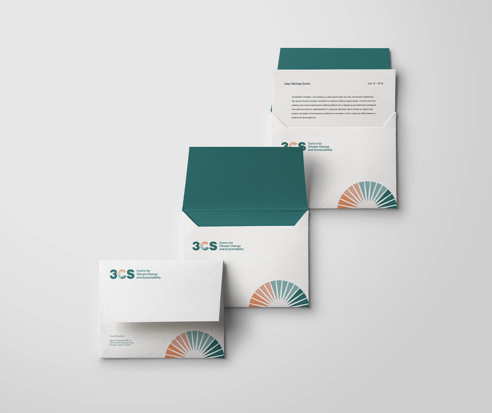
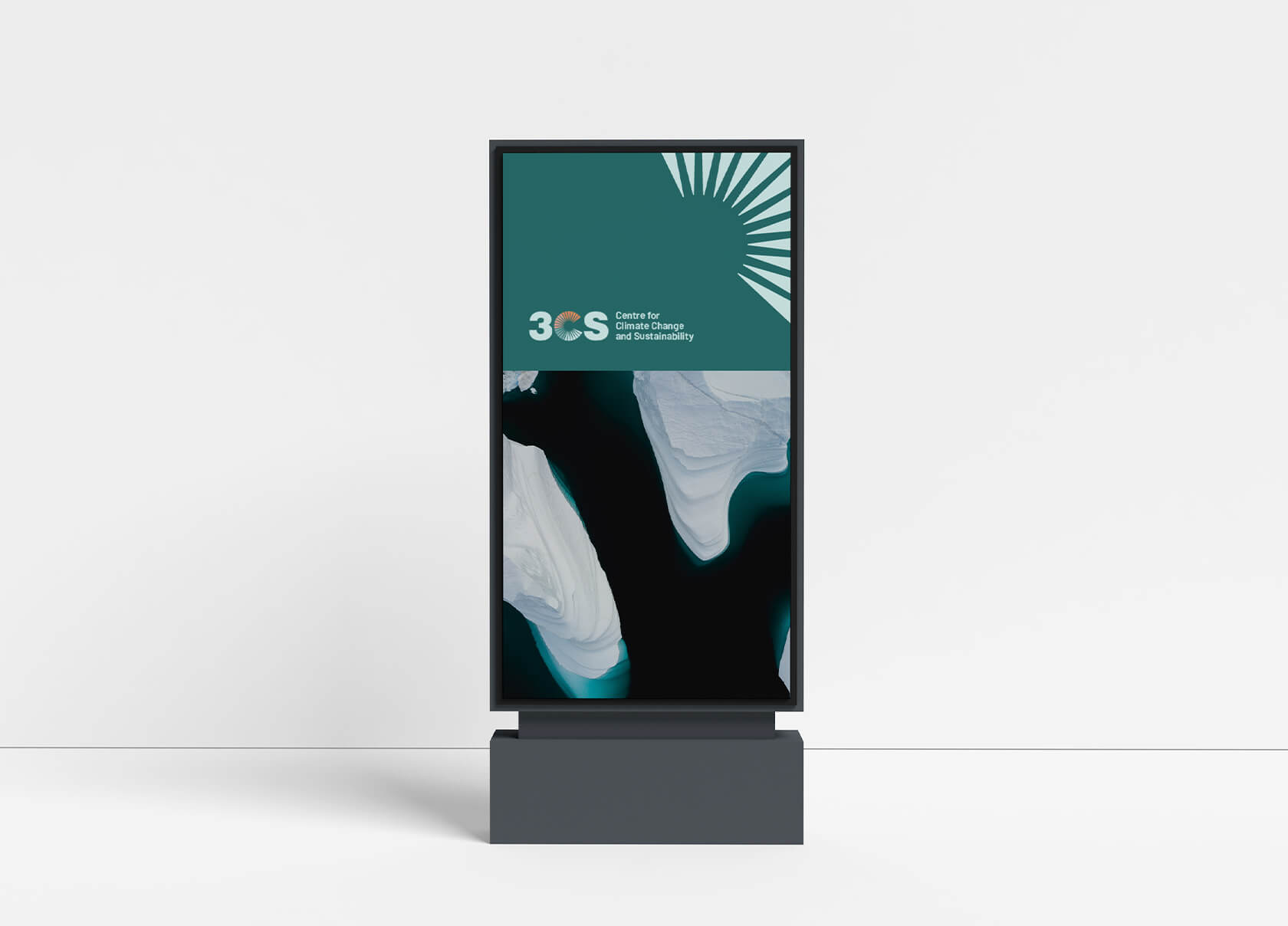
The brand identity for 3CS was designed keeping in mind the Centre’s vision and to establish the organization as professional, approachable, and dependable. The logo features the Centre’s acronym, 3CS. In the logo, ‘C’ has been constructed using spokes that represent the sun, which is a symbol of hope and a better tomorrow. The colour progression from warmer tones to cooler tones within ‘C’ depicts the goal of the Centre, which is to curb climate change. The warmer tones represent higher temperatures progressing towards cooler tones, which represent lower temperatures. To connect better with the idea of sustainability, we have used shades of green in the logo.
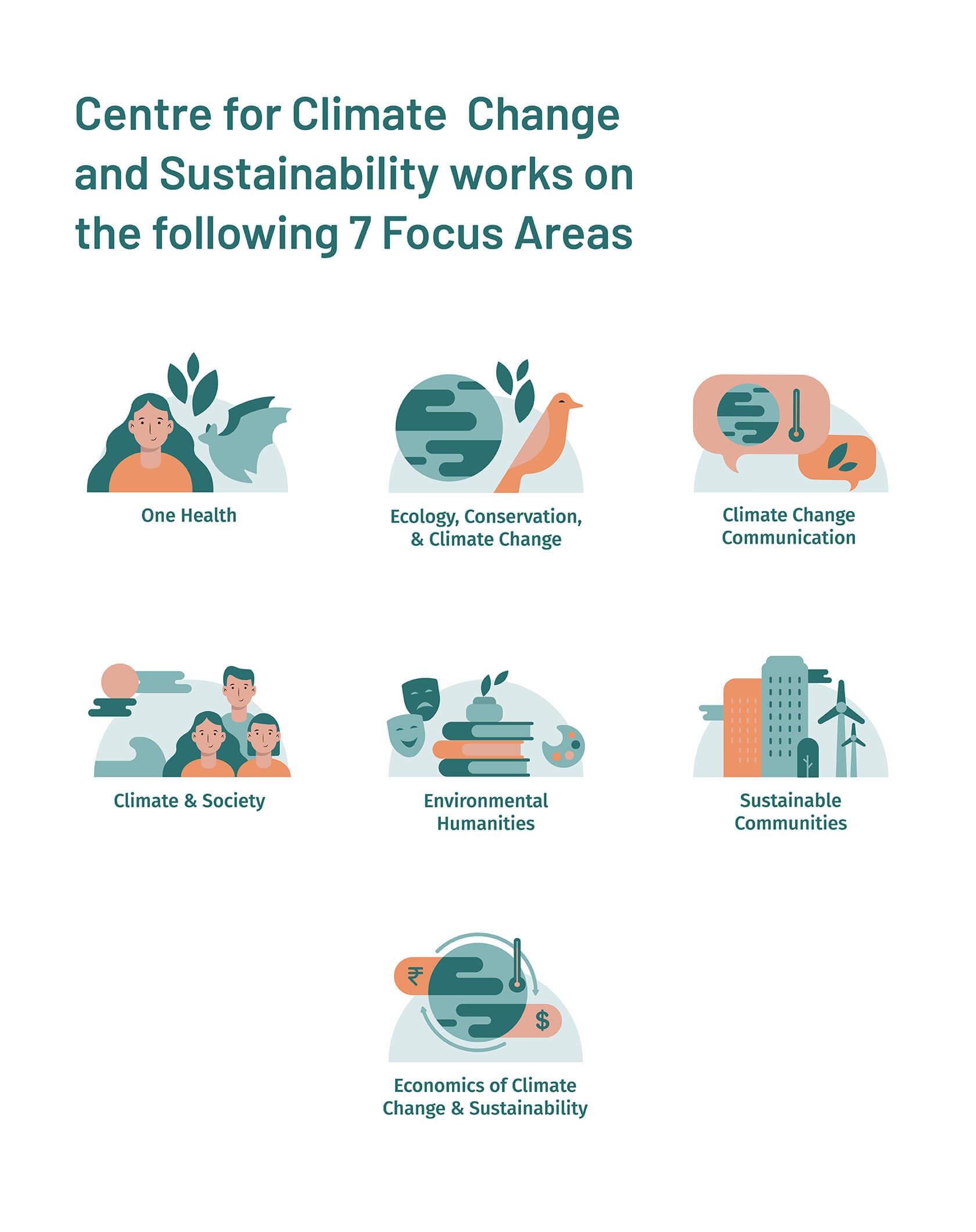
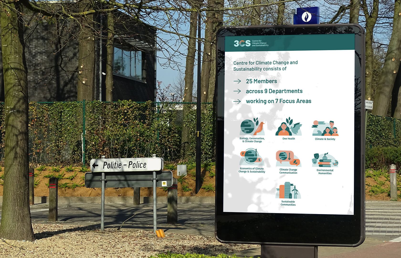
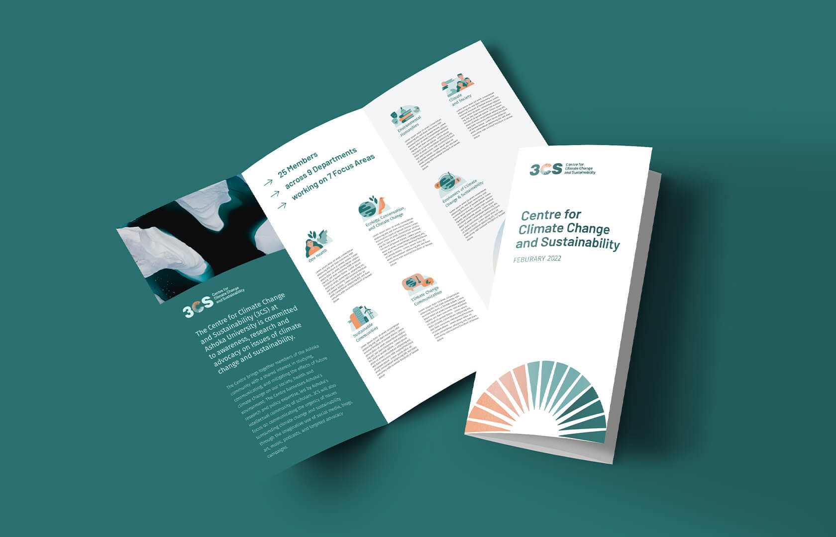
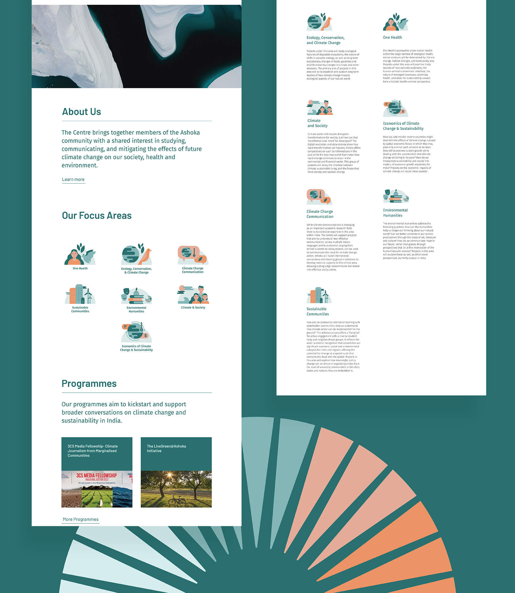
An very important part of the brand identity system were the 7 focus area icons. The Centre’s entire research falls under the seven focus areas, thus making them a very important aspect of their work. While designing the icons, our aim was to strike the right balance between professional and approachable. Taking inspiration from the curves of the logo we agreed upon the style for the icons which is characterized by rounded edges/shapes/corners and distinct human and animal figures. They are detailed yet clean and incorporates the use of all the brand colours.
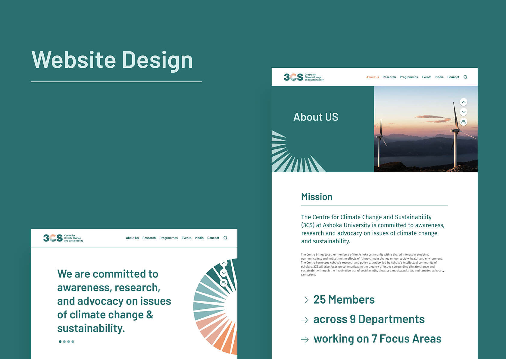
The Centre’s website is its most important brand platform. On the website, visitors can learn about the Centre’s mission, programmes, upcoming events, research, blogs, and more. Keeping in mind the target audience, we made sure that the website didn’t appear monotonous and made use of the brand elements as effectively as possible. We designed the website with a contemporary approach that includes a modern navigation system, restrictive use of colours, sleek tables and button styles, minimalist cards, and a grid-based footer.
You can also have a look at their website here


Big ambition. Small brand presence?
Let’s design the strategic positioning that attracts the right opportunities.