The rise of the Gradients!
Colour is powerful. Colour is an evolution and holds the power to change, integrate and even have us perceive it in many different ways. We’re in a new age, a new year and we’re already witnessing a very different colour era. Design refers to this as the comeback of the flat design era. It seems like we’ve been washed out of ideas and are looking for new ways to blossom colours on to our design palettes. Gradients have literally emerged a hero overnight and there seems to be no end to this.
From image overlays, fine-spun textures to backgrounds over interface elements, we’ve been witnessing a peculiar pattern. The two-colour or gradient effect has been making its way back to the design industry. Constructed through the use of two or more colours, we see the beauty of gradients when two or more colours begin to fade into each other. Constructing a new gradient equals creating a brand new colour, a fresh tone with a tinge of modern flavors.
Solid Gradient
The comeback of the gradient particularly encompasses the flat colours stock. Away from most design jazz such as shadows and 3D attributes, flat design projects are rather simple, user-friendly and bold and bright. Flat design projects are less traditional and have been known to break the rules of the colour game. Leaving behind the idea of the traditional mix and match, we’re looking at a trend that says throw out as many colours you’d like on that palette and give it a whisk.

image credit : freepick
Two-Tone
The duotone gradient show has been thriving off late. You’ll be surprised to know how well designers have been mixing up colours. Let’s take an example of the Holm Marcher website. The website is interactive, radiant, fresh, immersive, inspiring and minimizes the use of additional details and instead keeps it simple. The two tone concept brings an identity to the Marcher website, also showcasing a definite consistency on almost all pages. You’d also notice a tinge of soft blues used to highlight certain sections of the website.
Background Images and Gradients
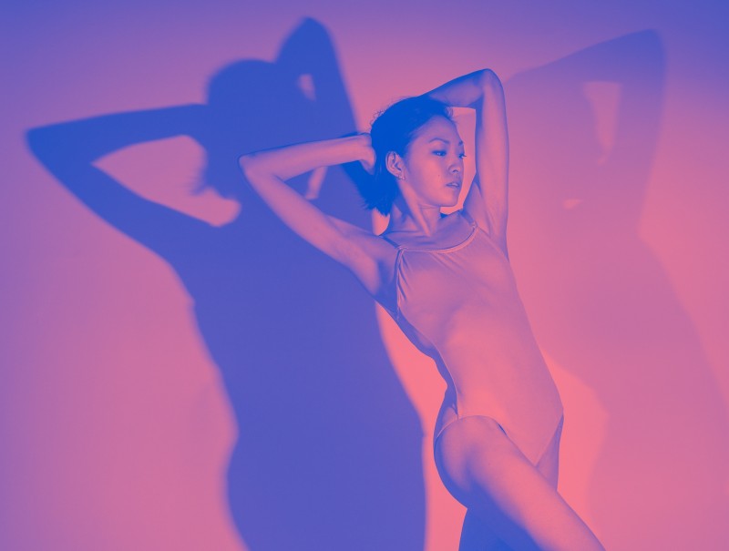
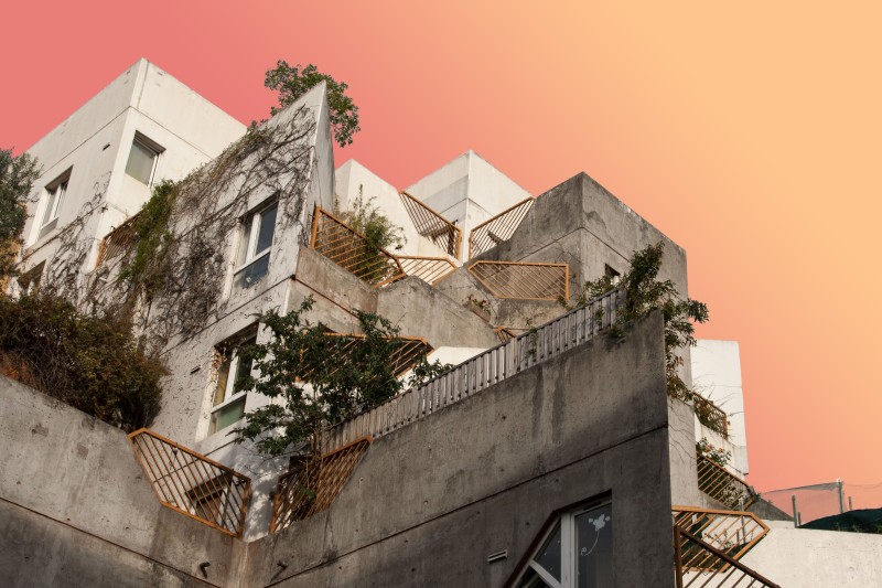
We’re also witnessing a comeback of backgrounds with depth, owing our gratitude to gradients. Incorporating 3D attributes and realism to design, 2018 may just see a sack full of new colours, depth, potential and tales that could probably rock the foundations of design.
Gradient Overlay
With the rise of the gradient overlay, we’re seeing little of the single colour overlay. This is especially chosen for much larger images or call to action elements that would need a little push to stand out. Quite a complicated process, the trick lies in constructing a clear balance between the colour and image. The struggle here is balancing the integrity of the message you’d like to reach out and the colours and images.

image credit : creativemarket
UI Elements
Gradients are also making their way back to UI elements in a rather subtle language. We’re seeing a shift in the use of gradients for websites. The sole purpose of adopting gradients for websites is to simply enrich its user experience than for its aesthetic bit. We’re not only seeing how design and colours have evolved over the ages but also how we’re now restricting its purpose to sheer utility.

image credit : pinterest
Text and Gradient
Text and Gradient can lend playfulness to any mundane looking graphic. It adds another layer of drama, that immediately gets attention from an onlooker. It’s not a surprise that along with many other variations, this style seems to make a comeback in brand logos, print ads or billboards. In 2018, text gradient is going to rule both online and offline graphics.

image credit : pinterest
In all, gradients are memorable, joyful, playful and realistic. Take for example the Instagram logo, how do you remember the logo? We’re sure you’ve picked the multi-colour gradient over the square box element as your first memory. Well, that’s just how powerful colours and gradients really are!